| Сегодня 7 июля, вторник |
|
|
|
Какой рейтинг вас больше интересует?
|
Главная /
Каталог блоговCтраница блогера PSDTUTS/Записи в блоге |
|
PSDTUTS
Голосов: 2 Адрес блога: http://psdtuts.com Добавлен: 2008-10-26 20:48:58 блограйдером DrakAngel |
|
Create a Conceptual Mixed Media Illustration – Psd Premium Tutorial
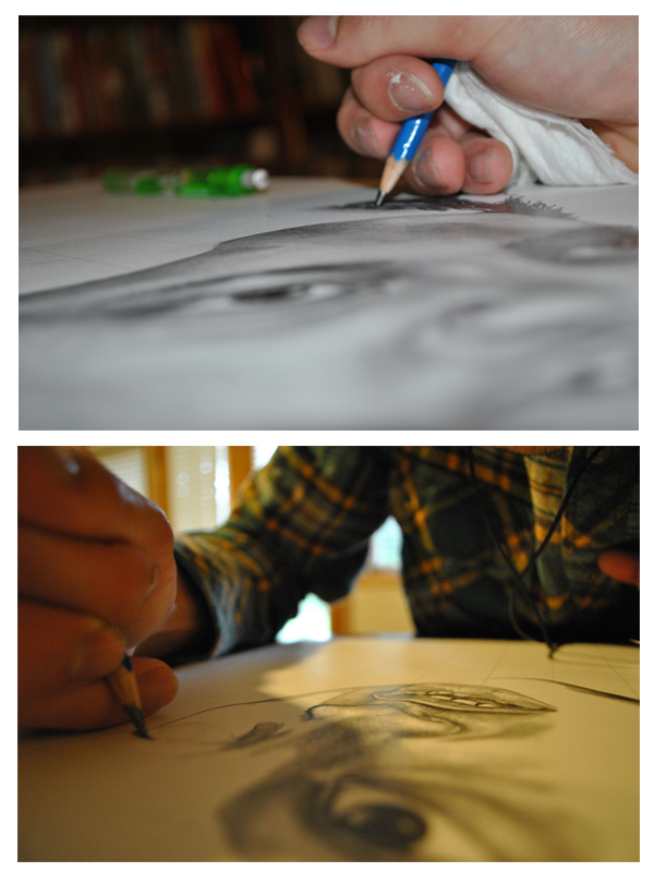
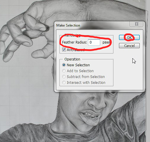
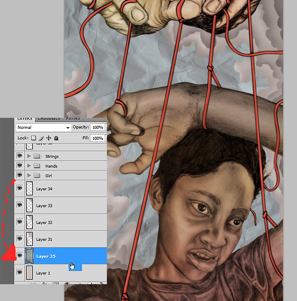
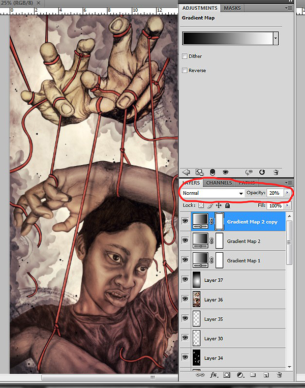
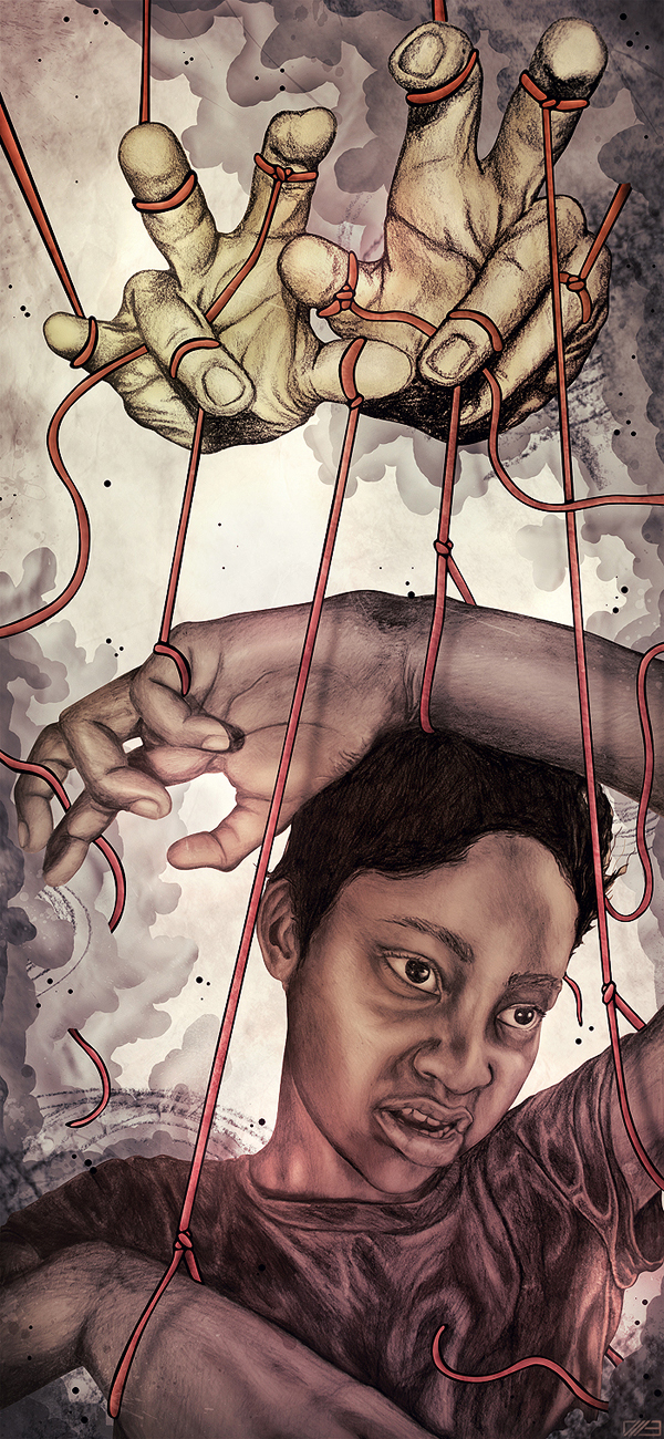
2011-09-15 17:00:49 (читать в оригинале)You can often create unique pieces of art using several types of media. In this Psd Premium tutorial, author Isaac Andrew Burton will combine hand-drawn sketches, stock photography, and Photoshop to create a mixed media illustration. This tutorial is available exclusively to Premium Members. If you are looking to take your Photoshop composition skills to the next level then Log in or Join Now to get started!
Professional and Detailed Instructions Inside
Premium members can Log in and Download! Otherwise, Join Now! Below are some sample images from this tutorial.
Final Image
Psd Premium Membership
You can join Psd Premium for as little as $9/month. Premium membership gives you access to the source files for all our tutorials as well as access to premium tutorials like this one. This also includes the rest of the sites in our network including Vectortuts+, Webdesigntuts+, Phototuts+, Nettuts, and more! Premium Members can Log In and download this tutorial. Otherwise you can Join Today!
Understanding Light, Shading, and Shadow in Photoshop
2011-09-14 18:00:58 (читать в оригинале)Photoshop is an excellent tool for manipulating photographs but it can also be used as a means to create stunning digital art. This tutorial is part of a 25-part video tutorial series demonstrating everything you will need to know to start producing digital art in Photoshop. Digital Art for Beginners, by Adobe Certified Expert and Instructor, Martin Perhiniak will begin by teaching you how to draw in Photoshop. At the conclusion of this series you will know all you need to produce your own concept art and matte paintings in Photoshop.
Today’s tutorial Part 8: Understanding Light, Shading, and Shadow in Photoshop will explain how to use different types of lighting to help you define three dimensional objects. We will also discuss how to create an appropriate shadow given a light source and how that light will affect objects in your scene. Let’s get started!
Win a Copy of the Abduzeedo Book (x5)
2011-09-13 17:00:35 (читать в оригинале)Hello everyone! If you’re a long-time Psdtuts+ reader, you probably already know our friend Fabio Sasso of Abduzeedo. Fabio is a Brazilian designer and founder of Abduzeedo, a wildly popular design blog with a focus on inspiration. Fabio was one of the first authors on Psdtuts and we are always excited to see what he is up to. Recently, Fabio announced the new Abduzeedo Book, a definitive guide to Design and today we are giving away a copy to 5 lucky readers of this site. To enter all you have to do is leave a comment below and tell us how Abduzeedo has inspired you.
To learn more about the new Abduzeedo book, take a look at this site, or just purchase it on Amazon.

Up for Grabs
- 1 copy of the Abduzeedo book to 5 lucky Psdtuts readers
Rules
- To enter, leave a comment and tell us how Abduzeedo has inspired you.
- You may only enter once.
- Make sure to enter a valid email address so that we can contact you.
- Entries will be accepted until Friday, September 16, 2011 at 11:59 PM, EST.
Good luck everyone!
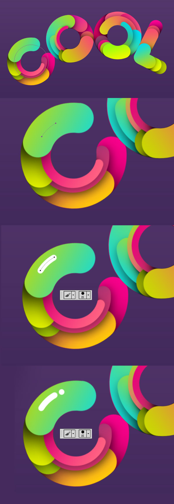
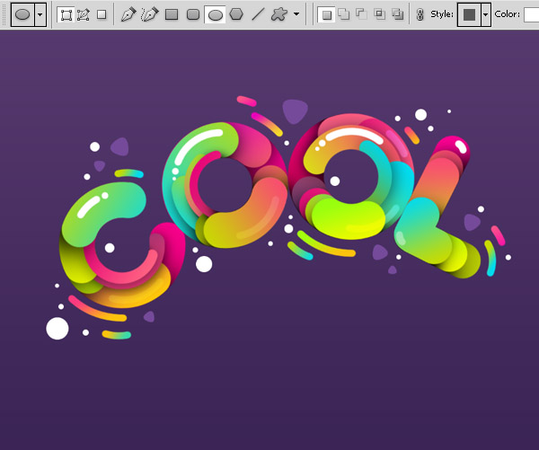
Create “Cool” Typography Using Paths in Photoshop
2011-09-12 17:00:15 (читать в оригинале)In this tutorial we will demonstrate how to create some "cool" custom typography. Let’s get started!
Tutorial Assets
The following images were used during the production of this tutorial.
- White flower
- Yellow flower
Working with Paths
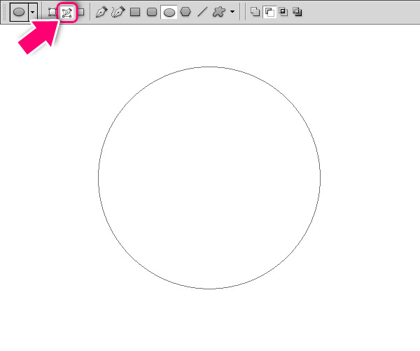
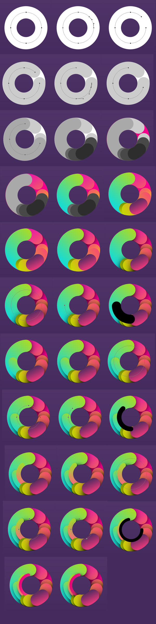
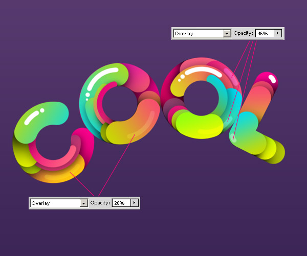
We will use the circle path and parts of it and stroke them with brush. Pick Ellipse Tool (U) and choose Path option on the properties panel. This way you will create circle path and not the shape. Hold Shift and create a perfect circle.
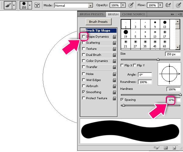
Pick the Brush tool (B). Use big, hard edges brush. Press F5 to get brush properties panel. Set Spacing to 10% and uncheck Shape Dynamics.
Create a new layer, and with Brush tool choosing press Alt + Enter. That will stroke the path with your brush properties.
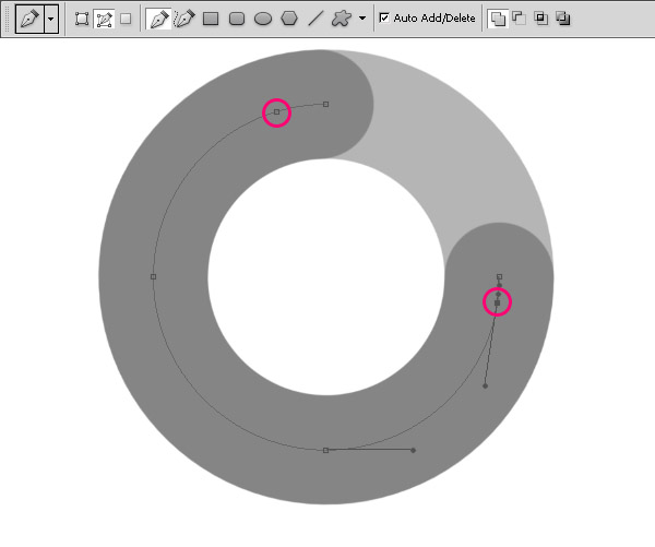
Pick the Direct Selection Tool (A). Note that no one of the anchor points are selected, click on the path between the two anchor points and click delete. Create a new layer, pick the Brush Tool (B), pick darker color and press Alt + Enter to stroke the path you just created.
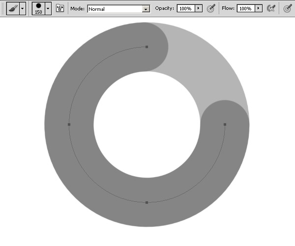
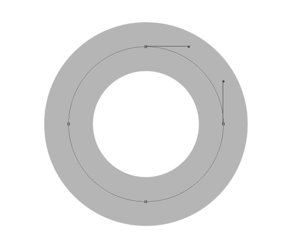
Pick the Pen Tool (P) and add anchor points on the path as shown below.
With Direct Selection Tool (A) select and delete the extreme anchor points of the path.
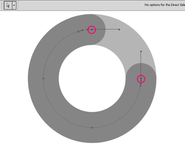
Pick the Brush Tool (B), pick darker color, create new layer and press Alt + Enter to stroke the path.
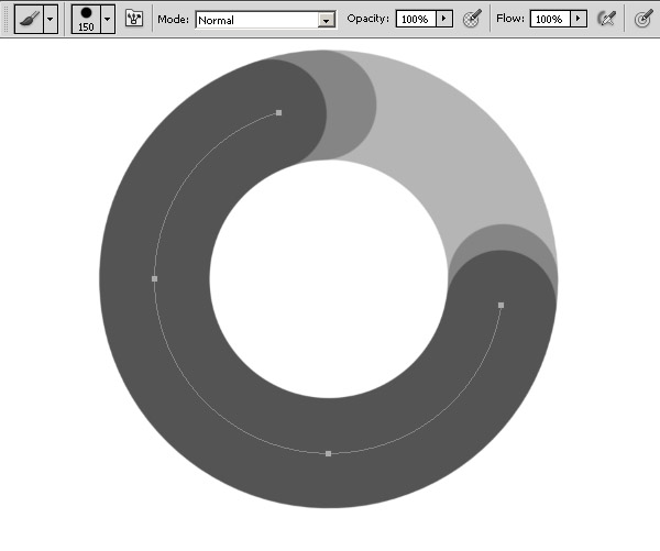
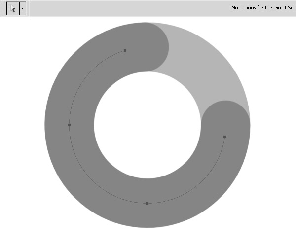
As you see we just cut parts of the original circle path by deleting anchor points. That lets us to make nice clean shapes and create interesting effect. This is the base technique of the tutorial. Make sure to always create a new shape on new layer. Another note: after you delete one anchor point, all other points will be automatically selected, so for choose another single anchor point you should click ones outside of path to unselect all points, and when select one point with Direct Selection Tool (A).
Step 1
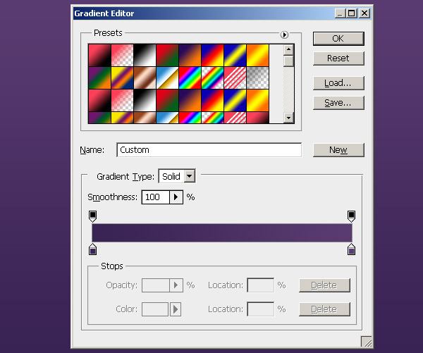
Create a new document 1600 pixels wide and 1200 pixels high at a resolution of 72 dpi. Fill the “Background” layer with black with dark violet gradient #392354 – #593b70.
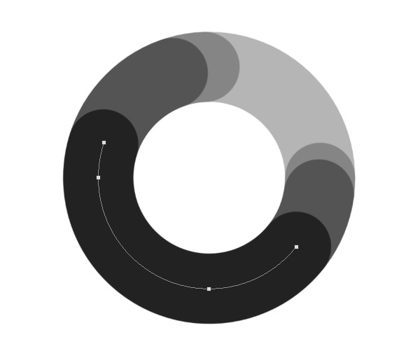
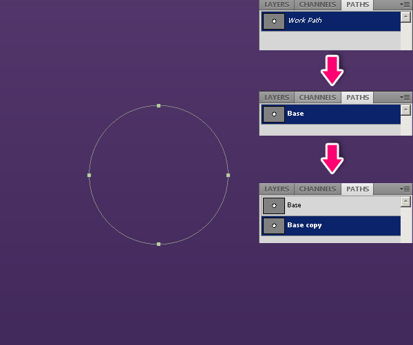
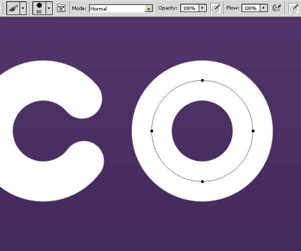
Pick the Ellipse Tool (U) and choose Path option on the properties panel. Hold Shift and create a circle. Go to the Paths panel, duplicate the Work Path, name it "Base" and then duplicate it again. Keep the "Base" shape and work with copy.
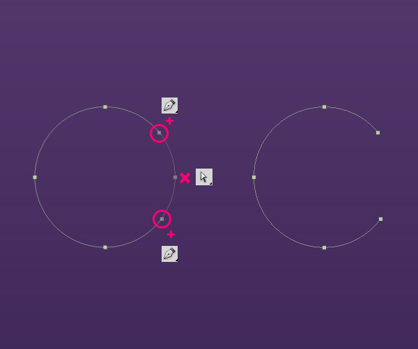
Now we will create letter “C”, using Pen Tool (P) add two anchor points, and then delete the anchor point between them.
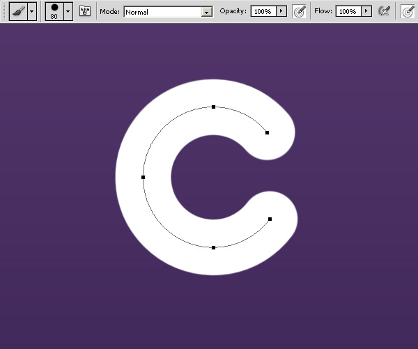
Pick the Brush Tool (B) size 80 px. Create new layer and press Alt + Enter to stroke the path. Make sure not to delete this path, we will need it later.
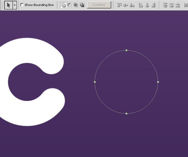
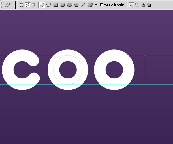
Go to Paths panel, select the “Base” path, duplicate it and move the copy path to the right, it will be letter “O”. To move path use Path Selection Tool (A).
Brush (B) > New Layer > Alt + Enter.
Duplicate the “O”.

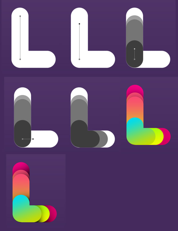
Now create the "L". Place rulers to mark the "Base" path height. Pick Pen Tool (P), holding Shift create a path.
Brush (B) > new layer > Alt + Enter.
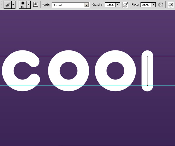
Do the same to create the second part of “L”.
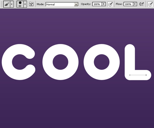
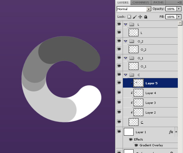
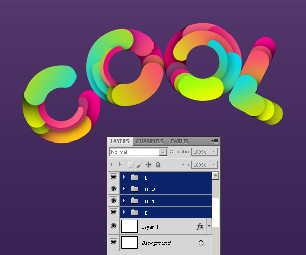
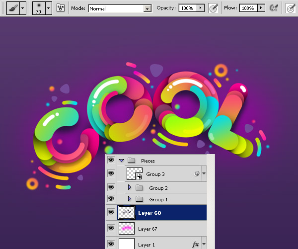
Now arrange the layers as shown below, each letter in separate folder.

Step 2
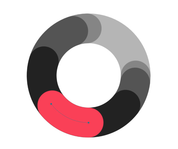
Now we have all the letters, we start to make layered shapes inside each letter. Use clipping mask for each new layer. Choose "C" path from Paths panel, duplicate it, and start cut and stroke it. Use shades of gray for now, we will add colors after.
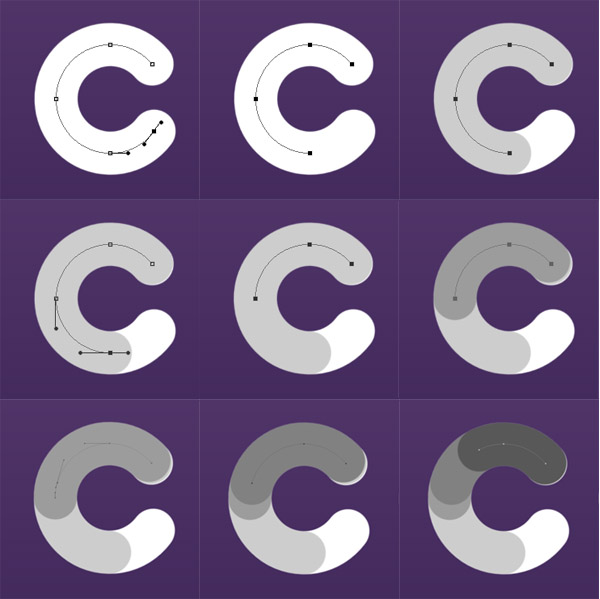
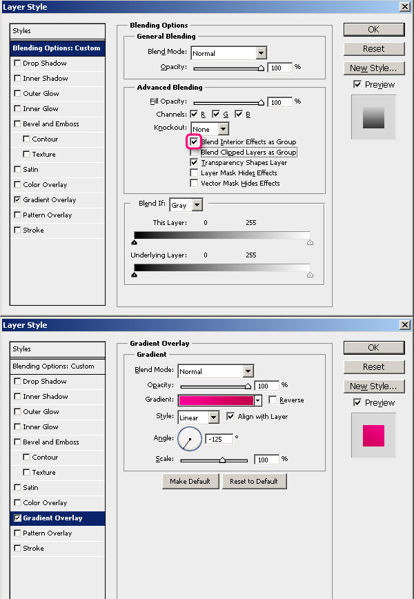
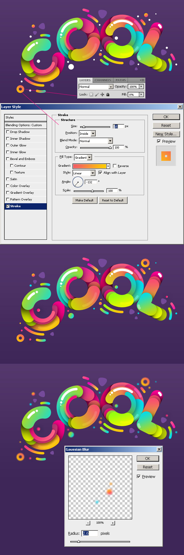
Let’s splash some colors! Choose the “C” layer and add Gradient Overlay Layer Style. In the blending options uncheck Blend Clipped Layers as Group and check Blend Interior Effects as Group. Gradient #ff0096 – #c20049.

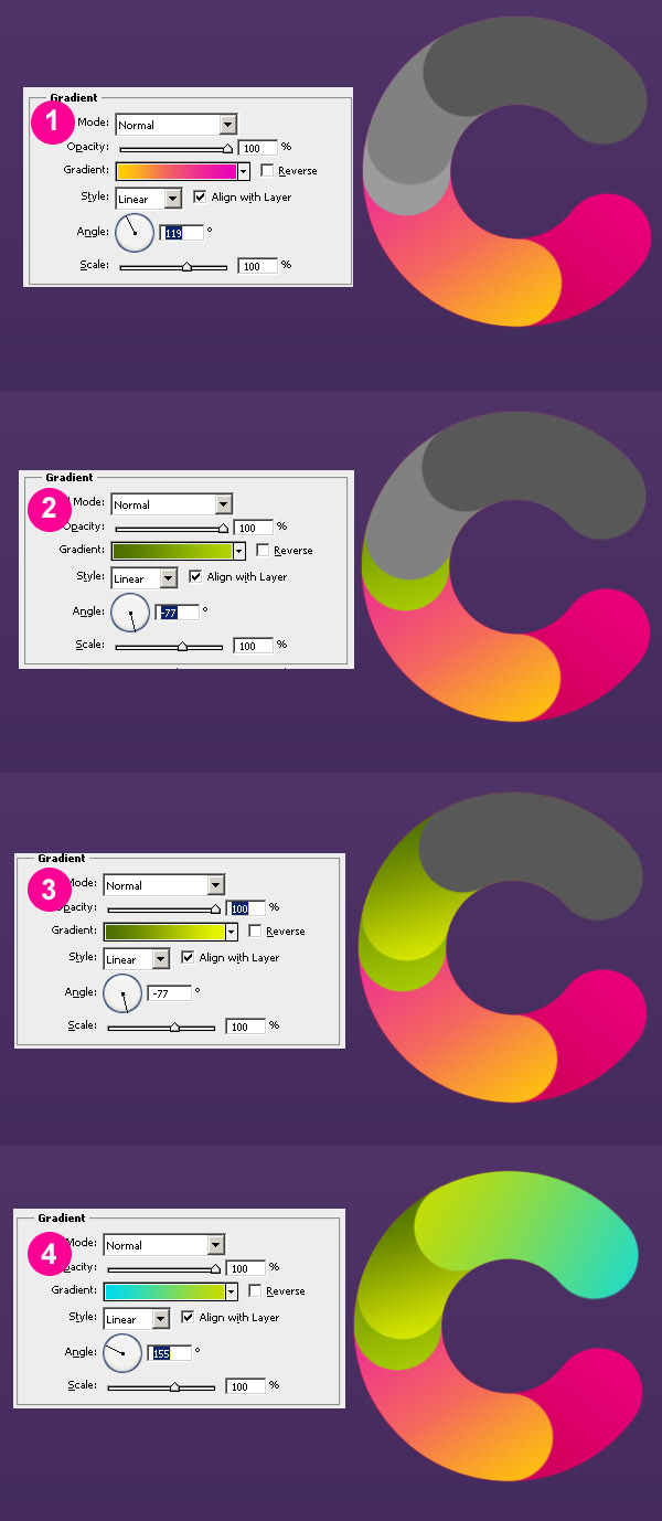
Apply Gradient Overlay for each shape as shown below. Pay attention for angles of the gradients.
1. #ffd200 – #e900ba
2. #4a6d00 – #b1d603
3. #4a6d00 – #eaf900
4. #00dbef – #c8db00
Grab a large soft-edge brush, set opacity to 50%. Create new layer under each shape and draw shadows with black color.
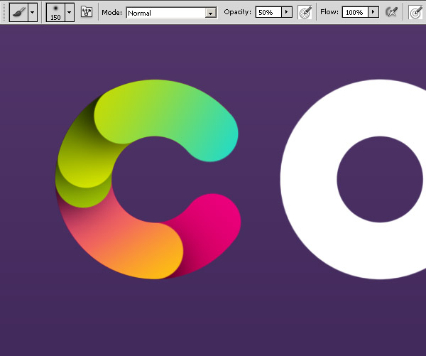
Select the "C" path again, and make it smaller (Path Selection tool (A) and then Command/Ctrl +T to transform). Use size 40 brush to stroke it on new layer. Add gradient (#fb3a7e – #442b5d) and place it under upper shape.
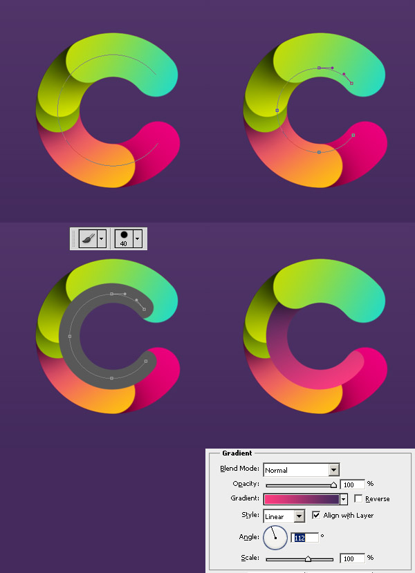
Do it again to create another small shape. Gradient #e80079 – #ff6481.
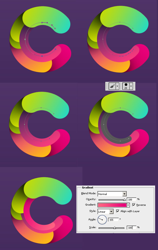
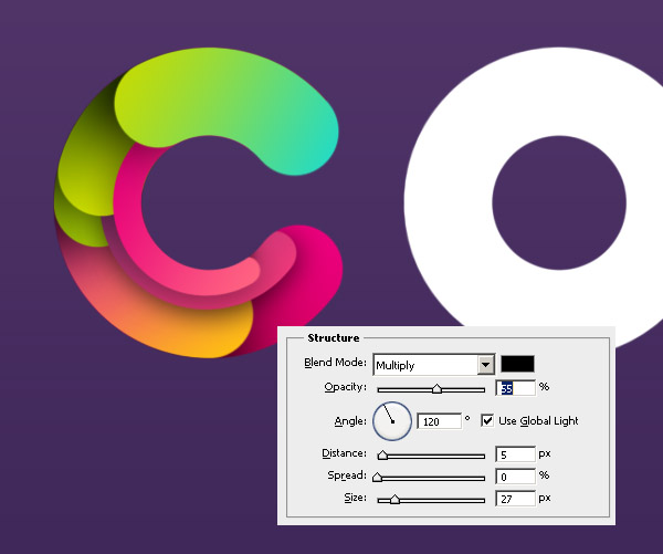
Also move the first small shape under second big shape, and add Drop Shadow layer style for both small shapes we just created.
We are done with "C" for now, just 3 more letters to go!
Step 3
Now repeat similar steps for all other letters, you can experiment with paths and create different shapes. Use same gradients we apply to "C" shapes to keep uniform colors composition. You also can follow my steps of course.
After I finished the "O" shapes, I realized I didn’t like the dark shape at the bottom and I deleted it.

Second "O." Repeat Process
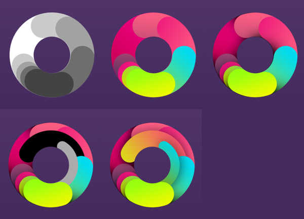
The “L”. Now it’s really easy.
Step 4
Now we have all 4 letters, lets place them in nice round composition. Use Free Transform Tool (Command/Ctrl + T) to rotate and place each letter.
Let’s add some shine to the letters. Create small path, stroke it with size 15 px hard brush, and paint a white dot by single clicking of brush.
Add white shine for all letters as shown below, set some of the shapes layer style to Overlay and different opacity.
Step 5
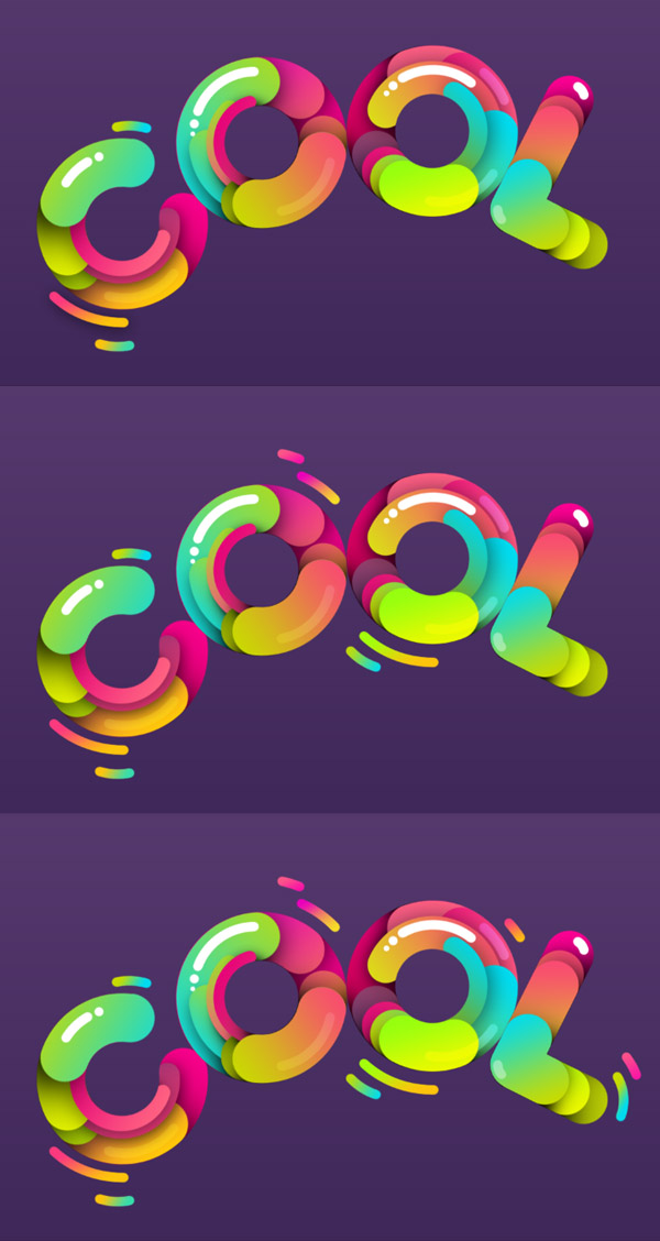
Create some pieces around the letters. Color them with various gradients we used for the letters. Easy way to do this: Right click on layer > Copy Layer Style, then select the new shape layer, right click > Paste Layer Style.
Step 6
Pick Polygon Tool (U), make sure it’s a shape, and not a path. Set Sides to 3, and in Polygon Options check Smooth Corners.
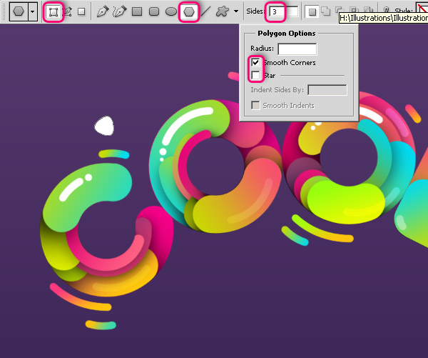
Set Foreground color to #754a9a, and create few triangles with different sizes around the letters.

Pick Ellipse Tool (U), set foreground color to white, and create various circles around the letters.
Color them with various gradients we used for the letters. Set some of the circles layer style as shown below: Gradient stroke and set layer fill to 0%, to see only the stroke of the circle. Select another few circles, go to Filter > Blur > Gaussian Blur, and set radius about 2.6 pixels.
Step 7
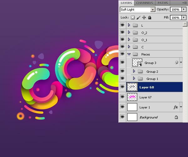
Let’s take care about background. Using a large soft brush draw on the new layer above background layer with color # ff02ea.
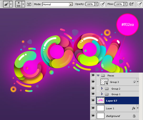
Set layer style to Soft Light.
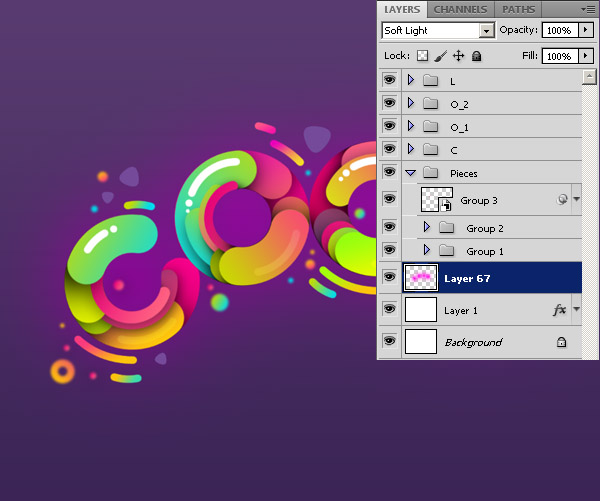
With smaller soft brush draw some shadows with black.
Set layer style to Soft Light.
Step 8
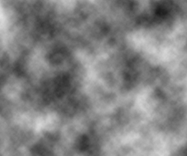
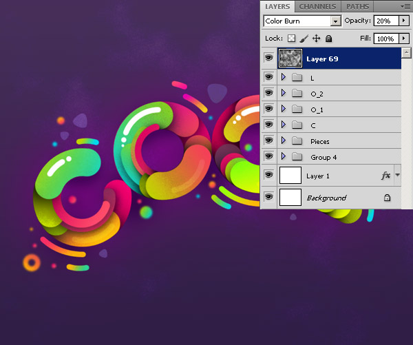
Create new layer above all other layers, press D to set foreground and background color to black and white. Go to Filter > Render > Clouds.
Go to Filter > Noise > Add Noise. Check Uniform and Monochromatic, and set Amount about 26%.
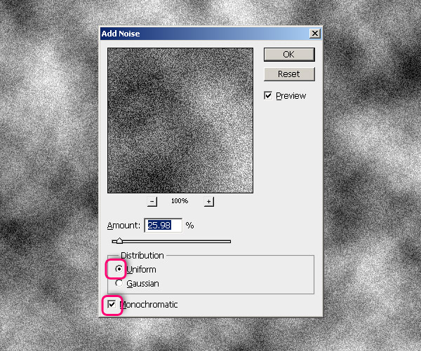
Go to Filter > Blur > Gaussian Blur. Set Radius to 0.5 pixels.
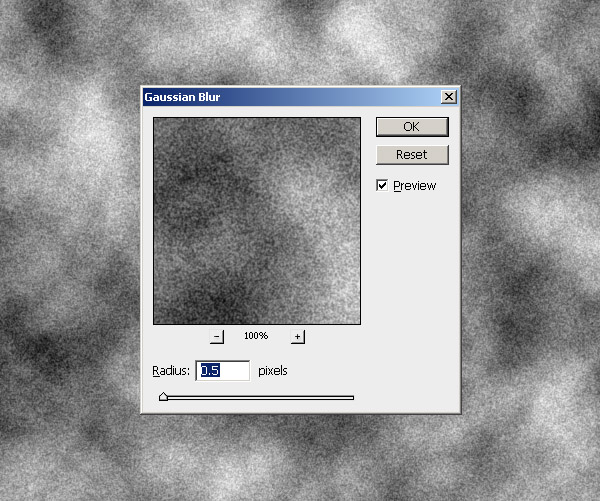
Set layer style to Color Burn and opacity to 20%.
Step 9
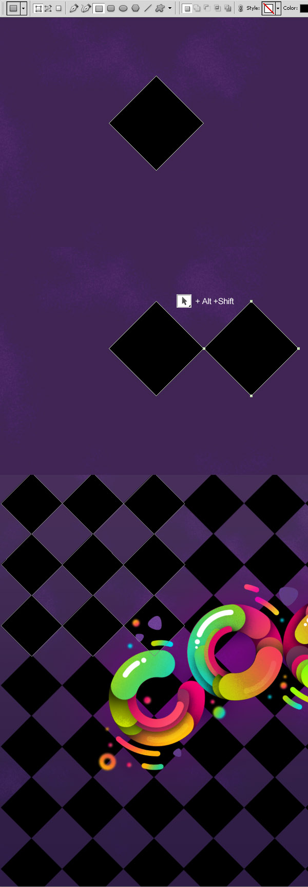
Pick Rectangle Tool (U) and holding Shift create a black square. Rotate it 45 degrees. Pick Path Selection Tool (A), hold Alt + Shift and move the square, you will create the copy of the shape. Duplicate the shape like this few more times, until you getting the pattern all over the canvas.
Step 10
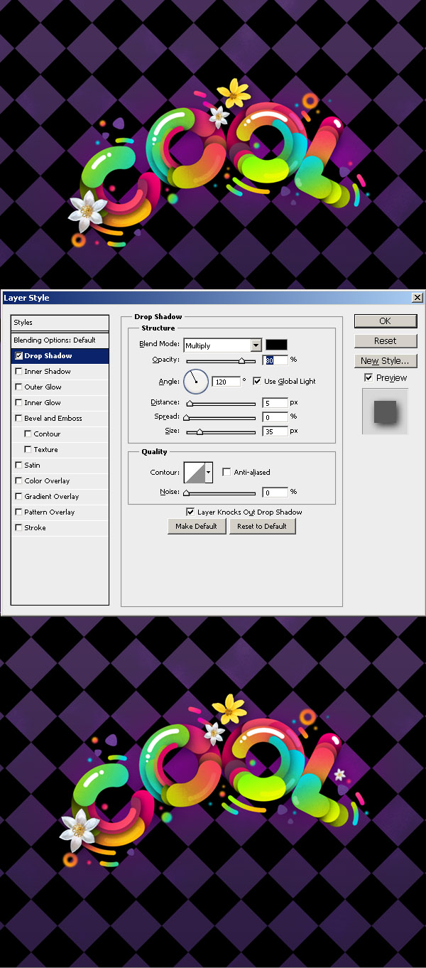
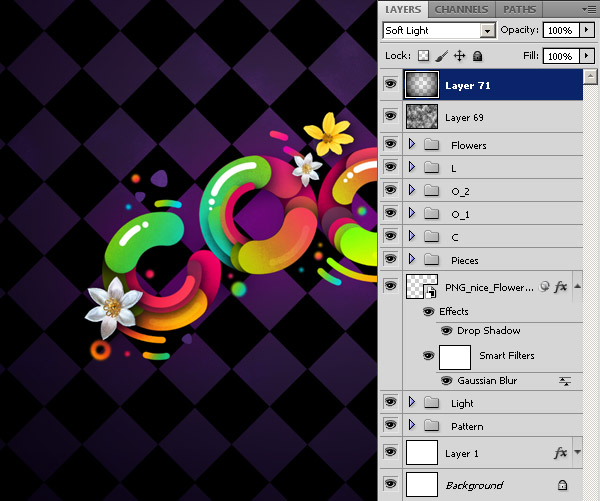
Now add some flowers. I found these on Deviantart, they are transparent pngs, so all you need to do, just drag and place them on the canvas. Add to each flower Drop Shadow layer style. I also blurred one of the flowers.
Step 11
The final touch. Create new layer above all the layers. Set foreground color to black. Pick Gradient Tool (G). Select the Foreground to Transparent gradient. On the gradient properties panel select Radial gradient and check Reverse. Draw the gradient from the middle of the canvas to the edge. Set layer style to Soft Light.
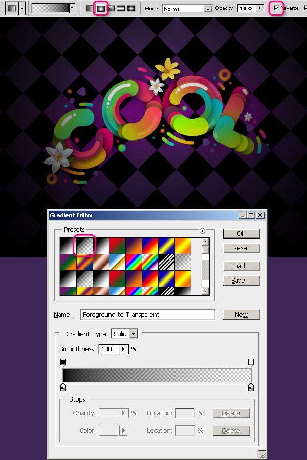
Set layer style to Soft Light.
Final Image

Photoshop World 2011, Las Vegas Recap
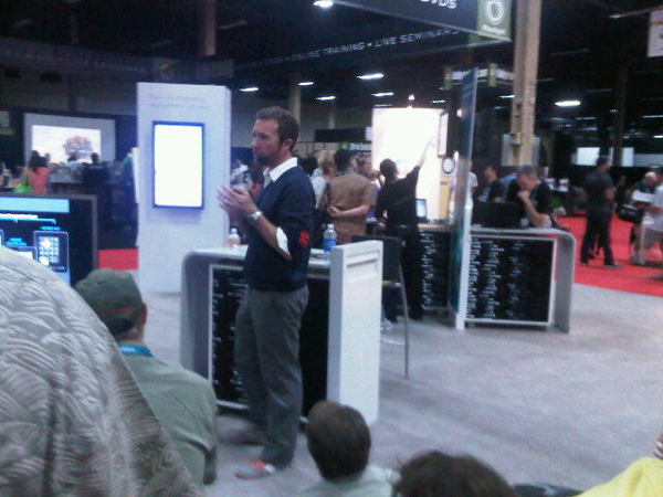
2011-09-11 22:38:11 (читать в оригинале)Last week I had the opportunity to attend Photoshop World in Las Vegas. Photoshop World is a conference of Photoshop professionals, held twice a year. It’s a great place to see what is happening in the world of Photoshop, photography, and design in general. The conference was sponsored by Adobe and much of the Photoshop team was there to promote the app and to make some announcements. This was my first-ever Photoshop World and today, I’d like to share my experience and thoughts about the conference with you.
Being my first Photoshop World, I wasn’t quite sure what to expect from the event. I wasn’t sure who would be attending or how many people. The biggest surprise for me was the age of the majority of the attendees. While the age of the typical Psdtuts reader tends to be on the younger end of the spectrum, the age of the typical Photoshop World attendee tends to be a bit older.
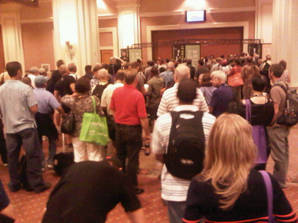
The line to get into Photoshop World before the keynote.
I also found that the conference tended to slant towards the photography community. As a designer, this was something that I found a bit disappointing. I was hoping to attend some interesting design workshops; and while there were certainly a few design-related workshops on the schedule, the majority of them were geared toward photographers. This meant that I spent a majority of my time walking the expo floor, learning about some of the products on display, and meeting new people instead of learning new tricks.
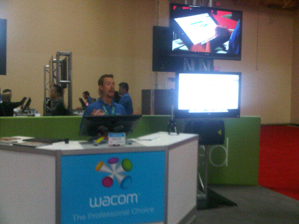
Representatives at the Wacom booth demonstrated their tablets.
Meeting new people was my primary reason for attending the conference. As some one who works from home, it’s important to attend these types of events to get to know some of the key players in the Photoshop community, and to build real-life relationships with the people I know online. While I was there I got to speak with quite a few members of the Photoshop team, as well as many others who work at Adobe. Everyone I spoke to from Adobe was extremely friendly and answered all the questions I had.
Photoshop Sr. Product Manager Bryan O’Neil Hughes shows some hidden gems in Photoshop at the Adobe booth.
Most of the people I spoke to at this year’s Photoshop World were curious about any announcements that might be made about future versions of Photoshop. In the past, Adobe has used Photoshop World as a vehicle for making new product announcements like CS5, for instance. While Adobe did announce Carousel, a cloud-based photo syncing service for iOs, Mac, Windows, and Android devices, no major announcements were made about future versions of Photoshop or any other Adobe application.
I had a fantastic time in Las Vegas for Photoshop World. I really enjoy Las Vegas and try to make the best of it whenever I am there. Aside from attending the conference, I managed to eat some great meals, lay out by the pool, and even enjoy some of the Vegas nightlife. I also really enjoyed meeting some people that I’ve never met offline. I got to speak with Sr. Photoshop Product Manager, Bryan O’Neil Hughes, and Photoshop Product Manager, Zorana Gee, Scott Valentine, Patrick LaMontagne, Dave Cross, Kevin Stohlmeyer, and many others.
The next Photoshop World event will take place in March 2012 in Washington, D.C. Hopefully, I will see you there!

|
| ||
|
+3386 |
3395 |
pllux |
|
+3357 |
3427 |
AlexsandR_MakhoV |
|
+3354 |
3417 |
Simple_Cat |
|
+3349 |
3432 |
Solnche605 |
|
+3344 |
3441 |
ДеВаЧкА-НеФоРмАлКа |
|
| ||
|
-1 |
661 |
Где отдохнуть?! Куда поехать?! Выбирай с нами! |
|
-1 |
565 |
ШНЯГА.ru - простые рецепты |
|
-1 |
36 |
doctor_livsy |
|
-2 |
605 |
aQir |
|
-2 |
6 |
SkaSkin |
Загрузка...
взяты из открытых общедоступных источников и являются собственностью их авторов.