| Сегодня 7 июля, вторник |
|
|
|
Какой рейтинг вас больше интересует?
|
Главная /
Каталог блоговCтраница блогера PSDTUTS/Записи в блоге |
|
PSDTUTS
Голосов: 2 Адрес блога: http://psdtuts.com Добавлен: 2008-10-26 20:48:58 блограйдером DrakAngel |
|
Amazing Fan Art from the Marvel Universe
2011-07-12 17:00:46 (читать в оригинале)Advertise here
The Marvel Universe is home to hundreds of unique heroes that possess a variety of interesting super powers. Characters in the Marvel Universe include Spiderman, the X-Men, the Avengers, and more classic heroes. So what better way to show our love for superheroes than create some cool fan art? This article will focus on delivering the best fan art from the Marvel Universe. Please take a moment to enjoy some of the stunning visuals below.
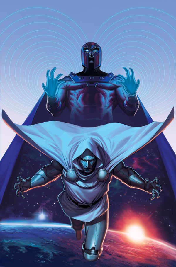
X-Men 16 By Jorge Molina Manzanero
Our first piece of fan art features an interesting combination of Marvel franchises, The Fantastic 4 and The X-Men. In this cover we don’t see any heroes, only two villains in an extraordinary environment with some great color combinations.
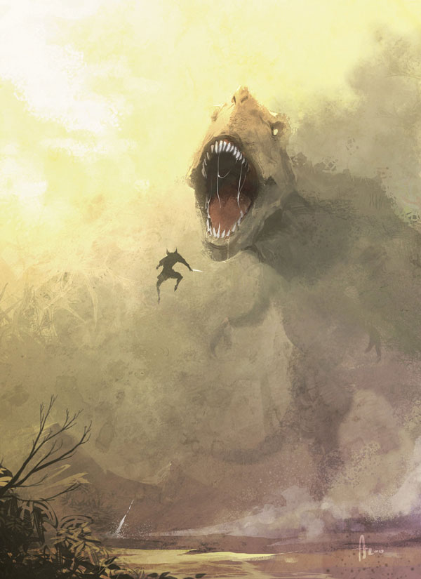
Wolverine vs T-Rex by Andrew Hou
Although we don’t get to see a whole lot of Wolverine in this illustration we still this is an awesome piece of fan art because of the scene. Who wouldn’t want to see Wolverine go back in time and fight a dinosaur?
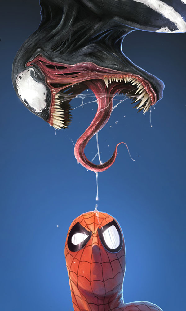
What The..? By Daniel LuVisi
Everything about this painting is amazing; from the superb detail in Venom to the perplexed expression on Spiderman this is a fantastic piece.
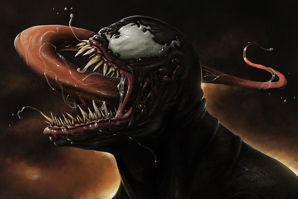
Venom By Kyle Bastian
This piece of fan art was inspired by the previous painting. The designer did a really good job capturing the details featured in the original painting, even making Venoms slime look incredibly realistic.
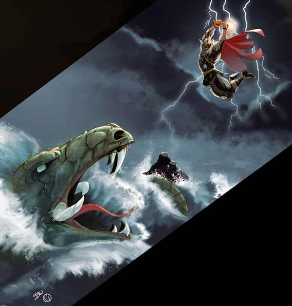
Thor By Craig
The God of Thunder is featured here in a fierce battle with a sea creature. The only complaint I have with this piece is the odd cutoff point; it would have been so much better if it were a bit wider.
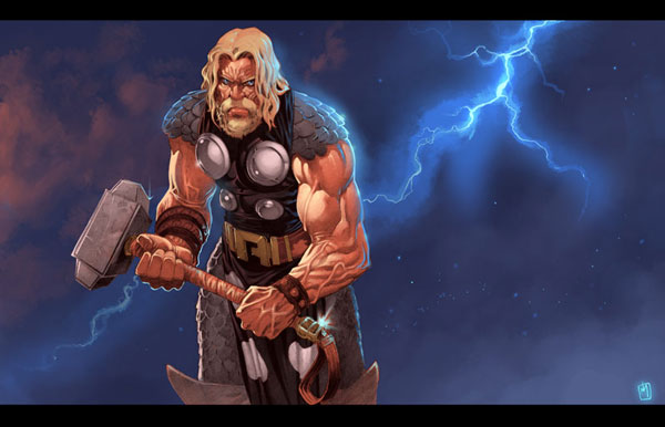
Thor By Armand Dimitri
More fan art of the thunder God here and this is just as good if not better than the last. The painting has a great combination of the simple background with the complex painting of the hero himself holding his signature hammer.
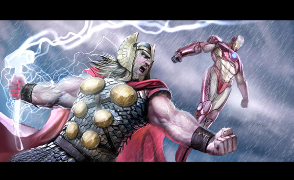
Thor and Ironman By Stjepan Sejic
Although it’s not official this is still a cool look at what the upcoming Avengers movie might look like. Two of the Avengers join forces here in a very realistic painting.
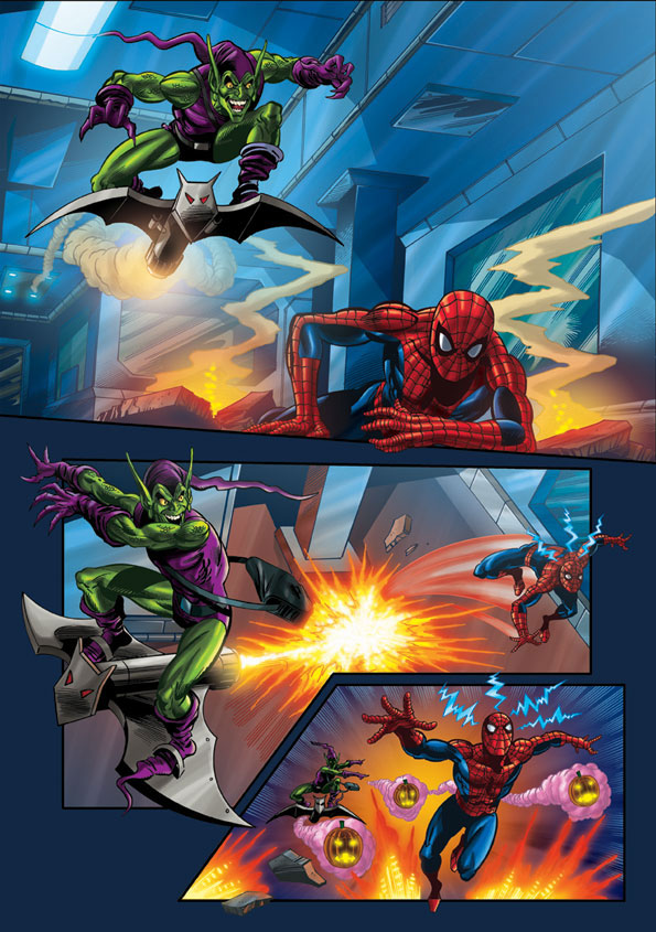
The Green Goblin Attacks By Simon Williams
This is a more animated and colorful piece of fan art that resembles what we would normally see in a comic book with different types of action panels.
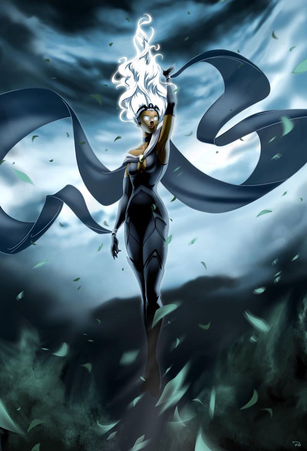
Storm By Ray Ocampo
Being able to control the weather at your demand is one of the cooler super powers in this bunch and designer Ray Ocampo takes advantage of this and paints a very interesting piece of the X-Men Storm.
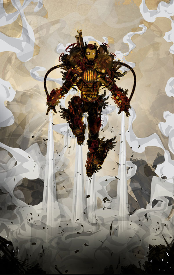
Steampunk Iron Man By Justin Currie
Giving Iron Man a steampunk look is pure genuis because it makes for a whole new breed of superhero on top of Iron Man. The distinct artistic style here also helps this piece of fanart to be really unique.
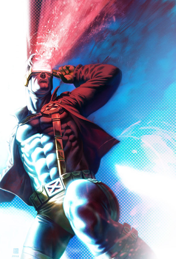
Cyclops By Enymy
This is another awesome piece of Marvel fan art, the seemingly realistic painting is coupled with vibrant colors and patterns to make the character stand out.
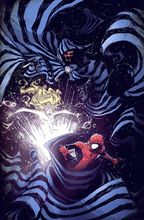
Spiderman Ft Cloak and Dagger By Skottie Young
This cover features many great elements, the main dark colors of the Villain and his evil powers play extremely well with the strong red and blue of Spiderman. The drawing looks like a classic comic book making this some more fantastic fan art.
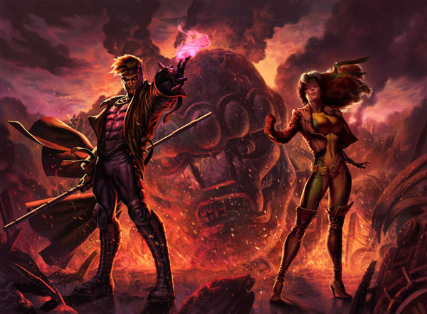
Gambit and Rogue By Fabian Schlaga
This scene has so much going on in it, which in part makes it an extraordinary painting. The characters are painted to detailed perfection and the environment they were put in is just as interesting as the heroes themselves.
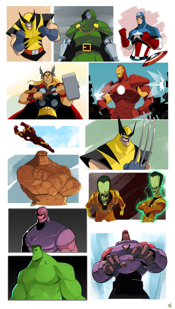
Marvel-ing By Endling
This is one of the funnier and more lighthearted pieces of fan art in the group. At the same time it is still very uniquely drawn since its almost like a caricature of these superheroes.
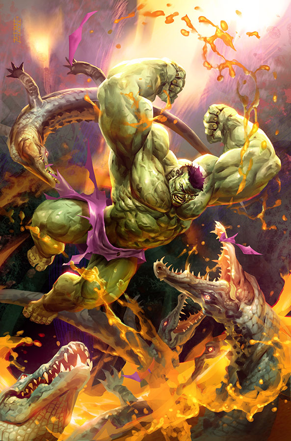
Jungle Hulk by Michal Ivan
This piece is features for practically the same reasons as the Wolverine vs T-Rex painting. Once again, who wouldn’t want to see The Hulk rampage through an exotic jungle? The bright colors just pop off the screen in this fantastic painting.
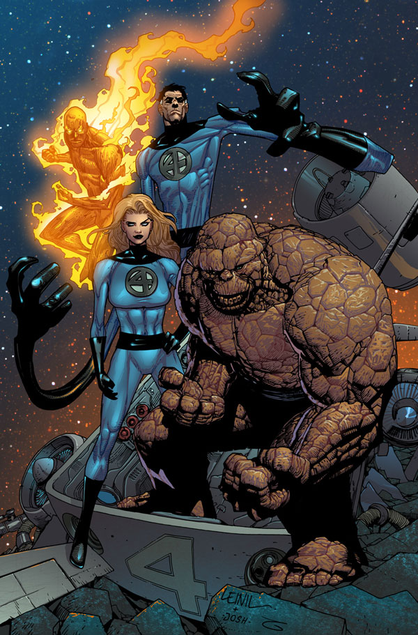
The Fantastic Four By Josh Templeton
This comic book style piece features Marvels quartet of heroes, the Fantastic 4. The illustration really captures emotion in each of the heroes as well as surrounds them in a beautifully painted environment.
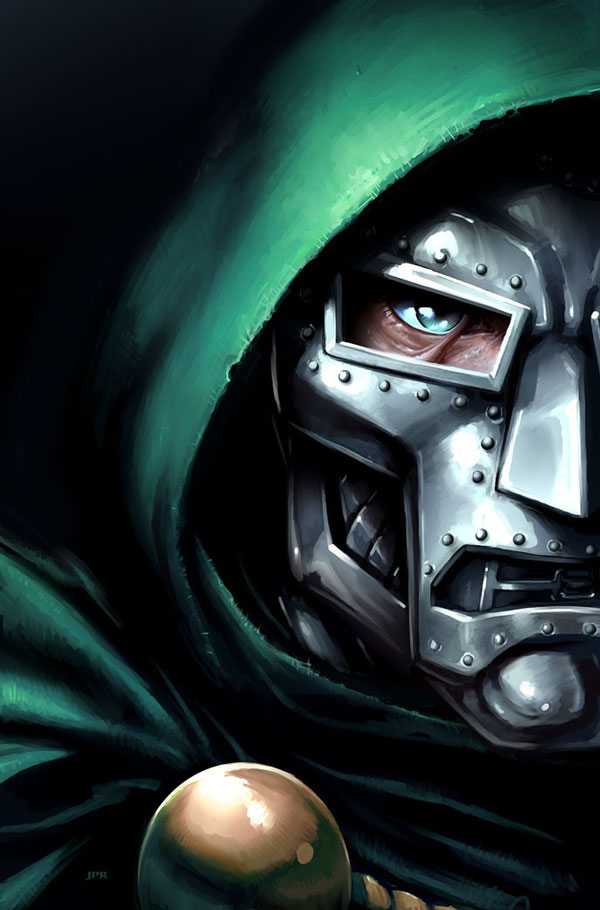
Doom By Jeremy Roberts
The main villain of the Fantastic Four world is featured here. The painter does an impeccable job of painting Dr. Doom, not only for the detail but also the expression that will definitely tell the viewer that this is a bad guy, in case you already weren’t aware.
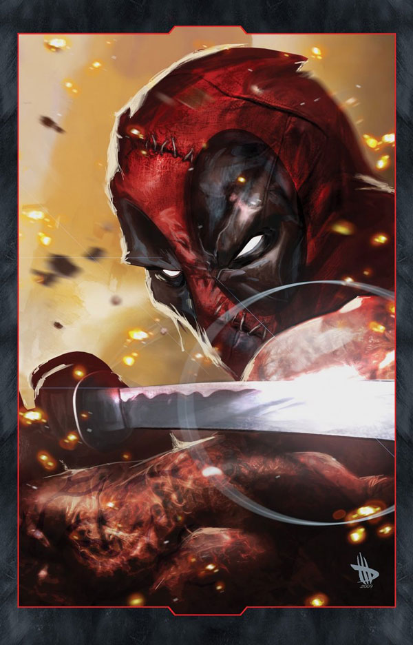
Deadpool By Dave Wilkins
Deadpool is one of the more unknown characters in the Marvel Universe but that doesn’t stop designers like Dave Wilkins from making this awesome close up shot of the hero.
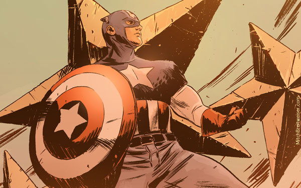
Capitan America By Mitch Breitweiser
This Capitan America illustration features a very cool almost pencil drawn design style, which looks fantastic when colored. The original piece is a wallpaper so go ahead and download that if you’re a fan of the piece.
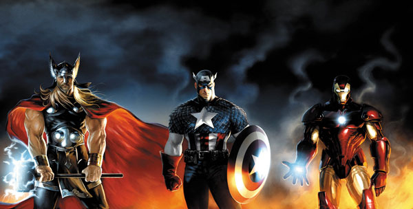
Avengers By Jeremy Roberts
Our last piece of Fanart is a pretty epic picture of 3 Avengers. Nothing much needs to be said here because the painting itself is so epic. Perfect detail and realism make for a phenomenal painting.
Create Custom Rims For Your Ride in Photoshop
2011-07-11 21:00:34 (читать в оригинале)Advertise here
Customizing your ride can be a lot of fun for those of you who are into that sort of thing. In today’s tutorial we will demonstrate how to create some custom rims for your ride and then show what they would look like if overlaid on top of an image of a car. Let’s get started!
This tutorial was prepared in collaboration with Radu Matei.
Step 1 – Introduction
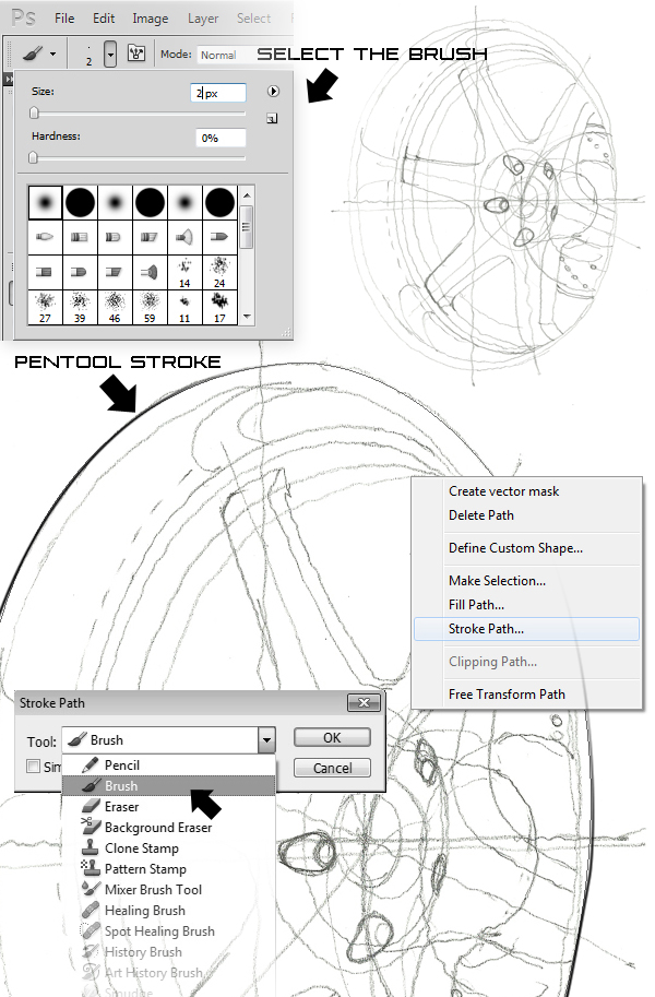
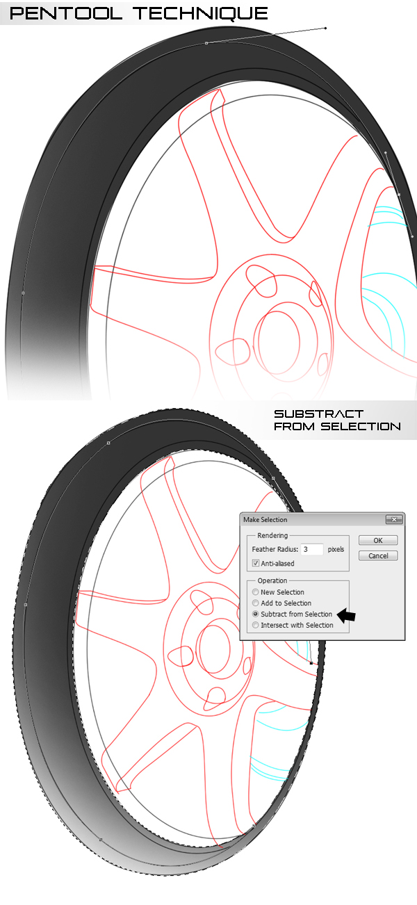
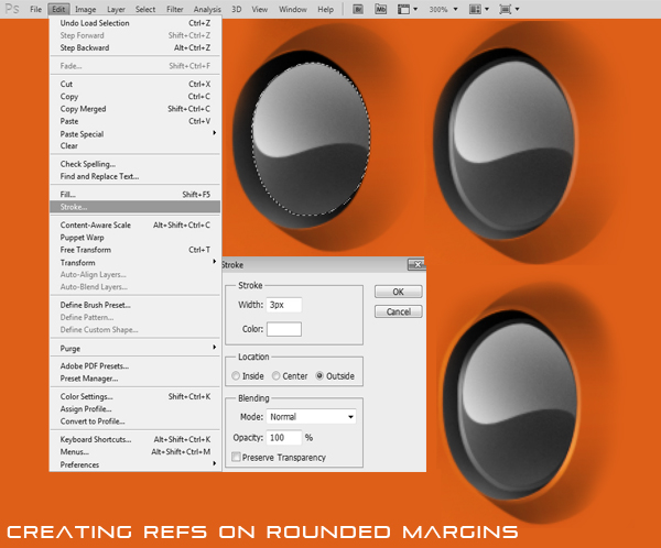
The main tool that we will use is Pen tool (P) to create selections, as it is a much more versatile tool than the lasso tool. It can be tricky to use the first couple of times, but with practice it turns into a very handy tool. I use 0.3 feather when creating selections, and have the anti-aliased button checked, so no jagged edges appear.
Step 2
Start by loading up a sketch, and create a new blank layer (Command/Ctrl + Shift + N). Start tracing it with the Pen tool (P). For this, set the Brush tool (B) to 2px and black color. Select the Pen tool (P) and start tracing the lines. Don’t try doing too complicated shapes, just take your time and do it in small steps. After every line, right-click and select Stroke Path. Select from the cascade window Brush tool (B).
Step 3
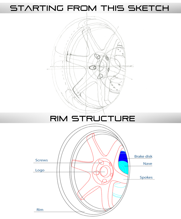
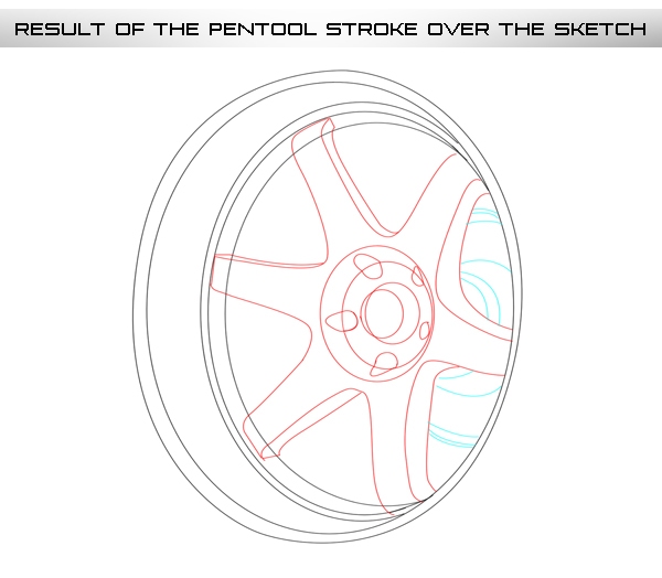
You should have something like this in the end (I’ve color-coded different parts of the wheel, so everything looks clearer).
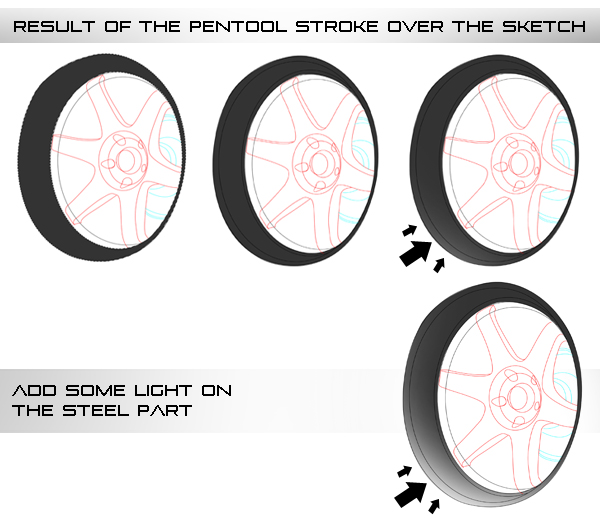
Step 4
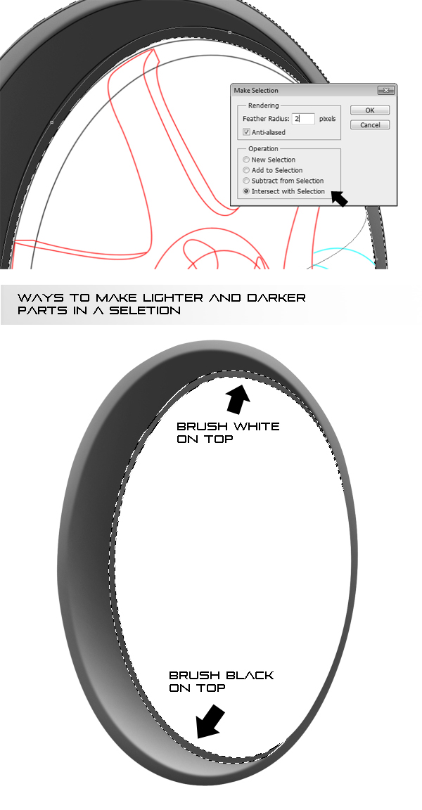
Start by selecting the rim. Create a new layer and fill the selection with a dark grey (I’m going to make it dark steel, but if you want a stainless steel color, use a lighter grey). Move the sketch layer on top of this layer, so you can see the lines. Select the Brush tool (B), and set it to about 1000px, white color, with a fuzzy brush preset. Select the rim layer contents (Command/Ctrl + click on it’s thumbnail). Brush alongside the lower edge of the selection, like this. Following the images you should reach the same result.
Step 5
Trace the outer part of the rim with the Pen tool (P). Select the rim layer contents again and then, using the pen tool, right click and select Make Selection. Set the feather to 3 and Subtract selection. Use the same technique as previously to brush alongside the selection, only this time use black in the lower part and white in the upper one. You should get something like this.
Step 6
Trace the inner part of the rim now, select the rim layer again, and Make Selection, using a 2px feather and Intersect with Selection option. Gently brush with white on the top, and black on the bottom, alongside the selection.
Step 7
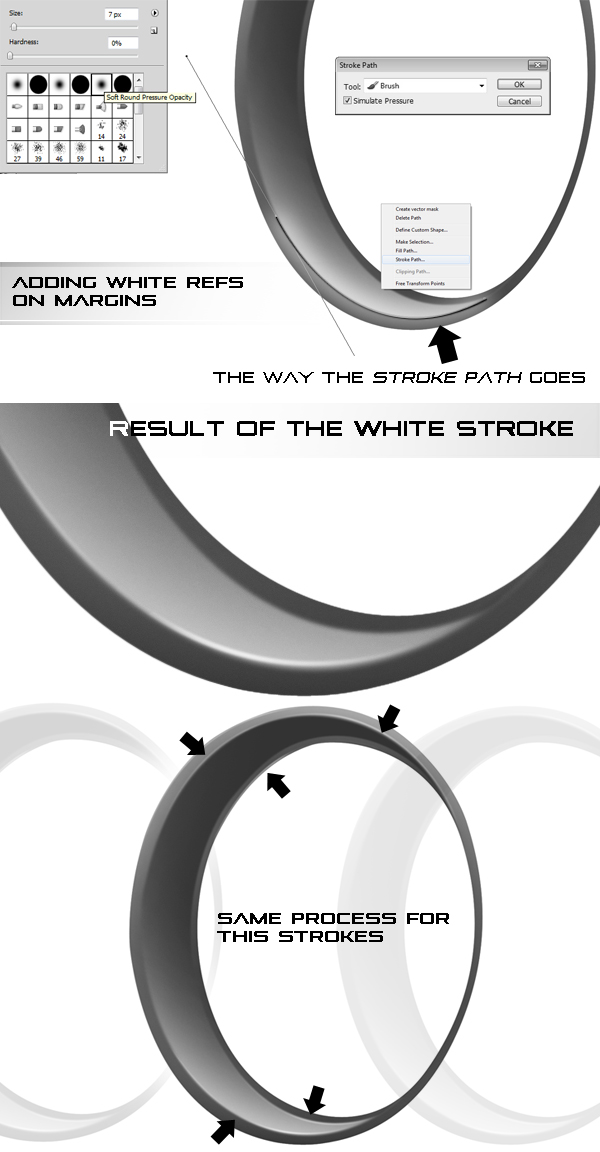
We’ll start adding some light reflections on the rim. Start by creating a New Layer, then select the Brush tool (B) and set it to white, 7px and select the fuzzy brush. Select the pen tool, and start tracing some curves. Right click, select Stroke Path, set it to Brush tool (B), only this time tick simulate pressure. Now there is a fading line instead of the path. Select the Eraser tool (E), Set it to 100px and about 25% opacity, with a fuzzy preset and start erasing some of the line, so that it fades even more slowly. You should end up with something like this.
Step 8
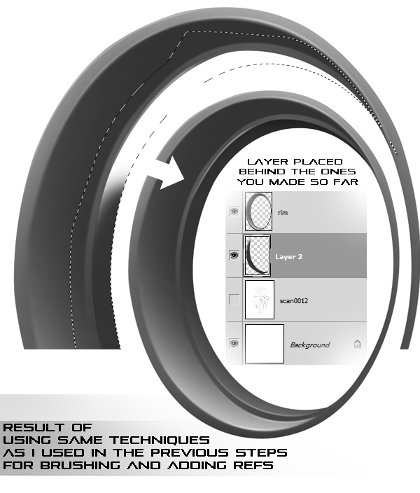
Start brushing the inner rim. Create a New Layer beneath the other rim layer, and repeat the shadow brushing technique – select the area, fill it up with dark grey, and brush with the big brush with black along the upper part, and with white along the lower one. Add light reflections on the lower part, in the reflections layer. After you’re done, you should have something like this.
Step 9
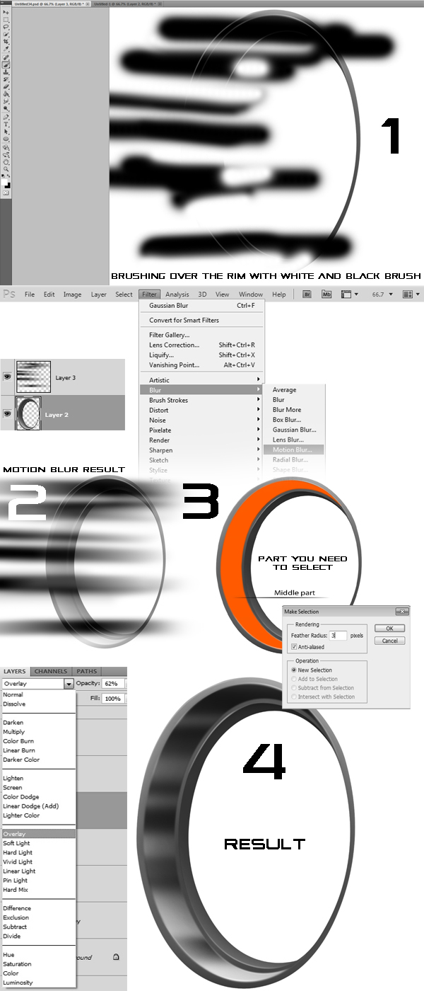
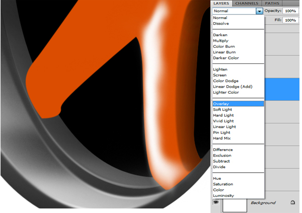
Merge the two rim layers together. Create a new layer on top of the rim layer. Select the brush tool (B), Set it to about 125 px, fith the fuzzy brush, and 100% opacity. Select black and white as primary and secondary colors in the palette, and start brushing some stripes over the entire rim. Use the X key to switch colors, and you should get something similar to the image below.
Go to Filter-Blur-Motion Blur, and set the parameters to 0 degrees and 999 px. Select the middle part of the rim making a selection with Pen Tool (P), using a 3px feather, and then invert the selection (Command/Ctrl + I). In the stripes layer, press delete, so that everything except the middle part is erased. Set the stripes layer to Overlay mode, and set the opacity to about 60%. Repeat this step for the inner part of the rim, only use about 25% opacity.
Step 10
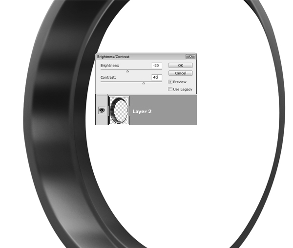
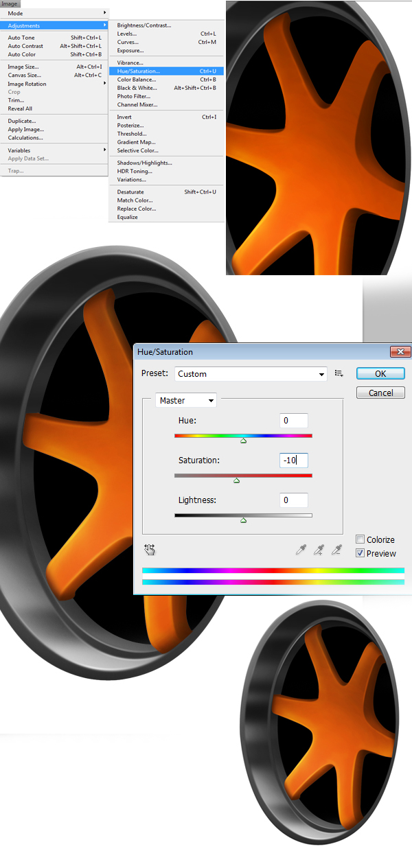
Merge the stripes layer with the rim one, and go to Image-Adjustments-Brightness and contrast (this step is optional). Lower the brightness with about 20 units, and raise the contrast by 40.
Step 11
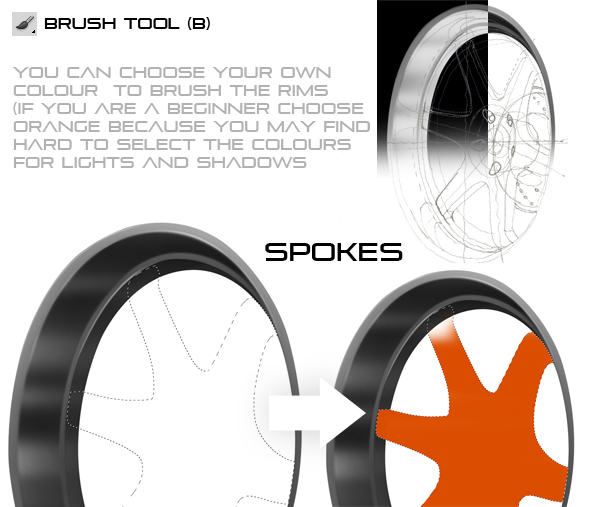
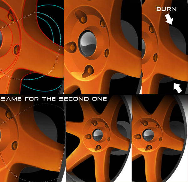
Create a new layer just below the sketch layer. Start tracing the spokes with the pen tool, and make selection, returning to the default value of 0.3 feather. For this tutorial I’ll be making some orange spokes, Japanese style tuning. The steps apply to any color, even white or black (with minor adjustments). Fill the selection with orange, in a new layer, on top of the rim and then you will have to add some light using white brush.
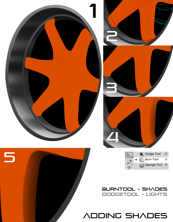
Select the inner part of the spoke, using 2px feather. Select the Burn tool, and use a big brush (about 225 px) and use it on the inside part.
Step 12
Create a new layer, on top to the spokes, and brush a small white dot or line, on top of the spoke. Use the Smudge Tool to smear it over the left half of the spoke. Set the layer’s style to Overlay
Step 13
Start erasing some of the white, with a big eraser (200px) and low opacity (20-25%). This will make it look like it’s light shining on the spoke. Repeat this step again, but with a narrower strip of white
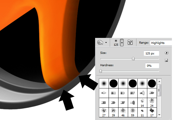
Step 14
Start burning the lower part of the spoke, where it curves. Set the Burn tool (B) to Highlights, 125px, and to 10 to 15 strokes in that part.
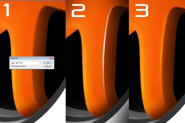
Step 15
As we’ve done with the reflections on the rim, we’ll do with the spokes. Set the brush to 7 px, white color and 100% opacity. Create a new layer on top of the spokes. Trace the line on the right with the Pen tool (B), right-click and select Stroke path. Erase some of the line with the Eraser tool (E). This time, set the layer’s style to Overlay, and repeat this step with a second setting for the brush, with 15px width.
Step 16
Repeat this step with each spoke, try getting something like this: Merge all the layers created for the spokes together. I’ve lowered the saturation a bit, to make the spokes less contrast. You can make adjustments at this step, using Image-Adjustments-Hue Saturation, to fine-tune the color or light.
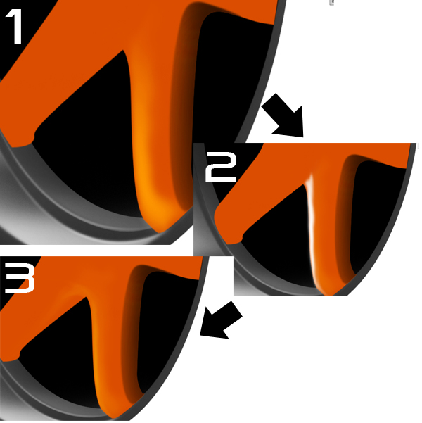
Step 17 – Lights (5)
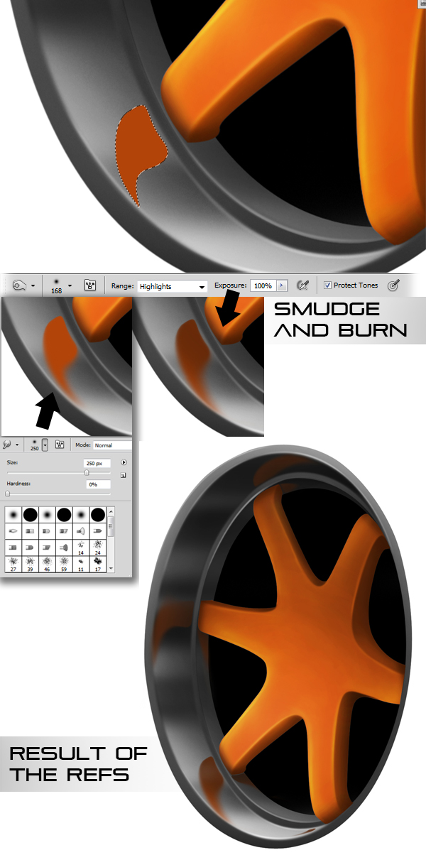
We’ll add some reflections of the spokes on the rim. To get a good picture of how they should look, try looking at some deep-dish rims, the reflections tend to follow the curvature of the rim.
Make a selection like this, and fill it up with a darker orange (not too dark). Set the Smudge tool to 250 px, with a fuzzy brush, and smudge the lower part of the reflection, to make it look like it is fading away. Use the Burn tool to darken the reflection, making it a bit lighter colored to the tip of the rim. Set the layer’s opacity to 90%, and repeat this step for the other spokes., and on in the inner part of the rim.
Step 18 – Lights (6)
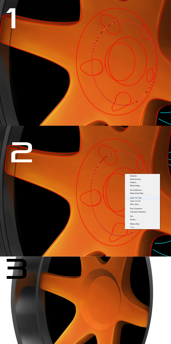
Select the middle part of the rim, as shown. Using the Elliptical Marquee Tool (L) to make the selection, right click and select Layer via Copy. We’ll save this part for later. Go back to the spokes layer, and select the center, but this time on the outer edge. Again, create a new layer via copy, now this layer should be under the previous center layer. Use Burn tool on the upper part, and the dodge tool in the lower part.
Step 19
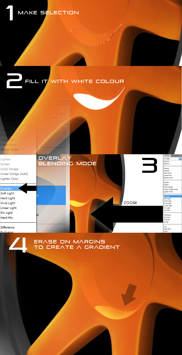
Create a new layer on top of this one, and create teardrop-shaped selection in the lower part of the layer, and fill it up with white. Set the layer’s style to Overlay, and start erasing some of it, using the Eraser tool (E), set at 20% opacity
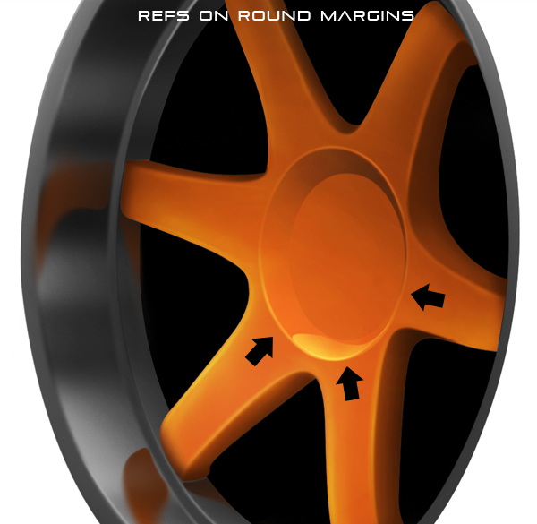
Step 20 – Refs
Use the technique we used to create reflections on the rim to create round reflections around the center (use the brush tool at 7px, white color, and use the "Stroke path" option to create them). Merge all the spokes layers.
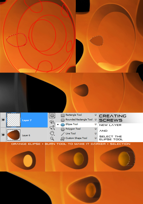
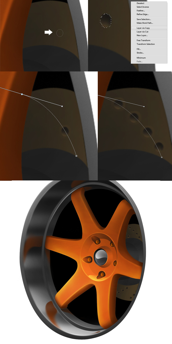
Step 21 – Creating the screws
Create a new layer, in which we’ll make the screw itself. Use the ellipse tool to make a round ellipse. Turn the path into a selection, and fill it up with orange. Use the burn tool to darken some of it. Merge this layer with the one underneath (the screw location layer). Select the remaining area of the screw, and use the burn tool to darken it. Make some reflection on the contour now. Repeat this step for all screws.
Step 22
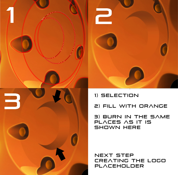
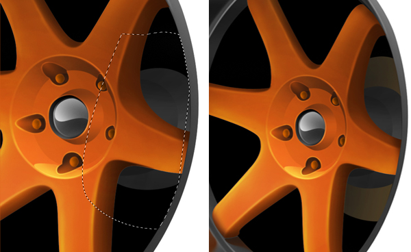
Select this part of the spokes, and create a new layer. Fill the selection up with orange, and start burning on the top and bottom part of the selection.
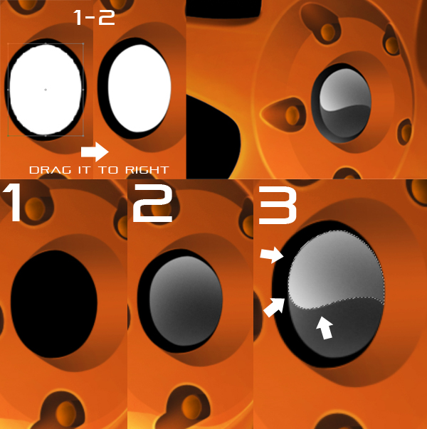
Step 23 – Logo Part
To make the logo, select it, create a new layer, and fill the selection up with black. Duplicate this layer, and press Command/Ctrl + I to invert the colors. Use the Free Transform option (Command/Ctrl + T), keeping the SHIFT key pressed to scale down this layer. Drag the white part to the right, till it looks like it’s sunken in the black part, and then press Command/Ctrl + I again to make it black. Select the layer now, by pressing Command/Ctrl and clicking on the layer’s thumbnail, and set the Brush tool (B) to 250px, white color and 100% opacity. Brush round the selection, so that the center remains darker. Make a wavy selection through the middle part, as shown, and brush more with white. Load up the other black layer, and brush with white a bit, on the lower half.
Step 24
Create a new layer on top of the black ones. Select the first black layer, and go to Edit-Stroke and set a 3px value, and Outside option. Erase most of the white circle, till it looks like this. Repeat this step with the other black layer, only set the white ring layer to Overlay.
Step 25
We’re done with the spokes, it’s time for the nave now. Merge all the spokes layers, and create a new layer underneath the merged spokes. Select the first section of the nave. Don’t worry about overlapping with the spokes, this layer is underneath and won’t overlap. Fill the selection up with a dark gray. Use the burn tool to darken the top and bottom parts.
Create a new layer underneath the first section of the nave. Select the second section, keeping an eye out not to overlap with the rim. Fill this up with a slightly lighter gray than previously used. Again, use the burn tool to darken the top and lower parts.
Step 26
We’ll start working now on the brake disk. Create a new layer underneath the nave, and select the brake disk shape. Fill the selection up with a slightly yellow-ish color (I’m using 483a23). Use the burn tool to darken some of the color, on the left side.
Step 27
Use the Ellipse tool to create the holes in the brake disk, make a selection from the path. Use the Dodge tool on the lower part, and the burn tool in the upper part, to give the impression of a dent. Using the Lasso Tool (L) , right click on the selection, and select Layer via Copy. We’ll use this layer to copy the holes in other places. Create a round path, so you can place the holes the right way. (They’re placed in spirals round the disk). Copy and place on the path 5-8 holes, depeding on their size, like this (To copy a layer, right click on it’s thumbnail and select Duplicate layer).
Step 28
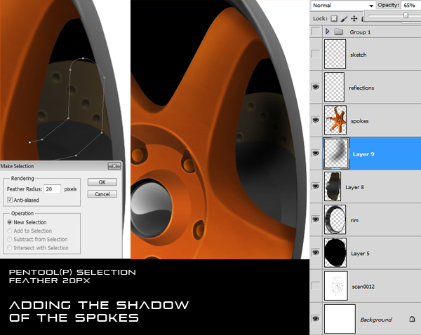
Merge the nave layers with the brake disk and the holes. Create a path of this shape, to mimic the shadow of the spokes. Create a selection, using 20px feather. Fill this selection up with black. Be careful to erase the part that overlaps with the rim, using the normal 0.3 px feather on the selection. Set the shadow layer’s opacity to 65%, and do this again in the lower part.
Step 29
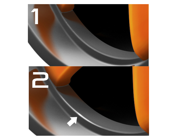
The rim is almost done now. We’ll just make some small light reflections now. To do so, we start by creating a long an narrow reflection, using a path. When creating the path, make the middle part a bit thicker. Use a 1px feather when making the selection. Take the Brush Tool, set it to 100% opacity, and choose about 50px width, and brush the selection. Brush a bit more in the middle part, you should get something like this. Make more of these reflections on any edges that are in light.
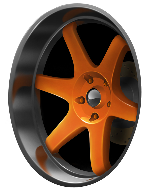
Final Image
Step 30 (Optional)
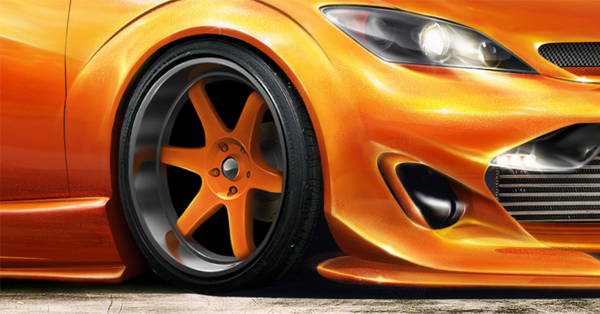
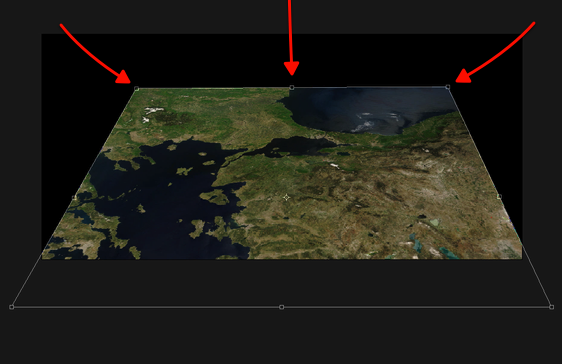
Place the new wheel on top of an image of a car.
Video Interview With Jennifer Cirpici
2011-07-09 18:00:13 (читать в оригинале)Advertise here
Recently, I had the chance to chat with Jennifer Cirpici, a freelance illustrator and graphic designer from the Netherlands. Jennifer is a relatively young but talented designer who has managed to accomplish quite a bit in a short amount of time. In our interview we discuss how Jennifer has utilized social media to her success, some of her favorite websites, how to build real-life relationships with other designers, and whether or not there is any harm in teaching your skills to other designers. Please take a moment to view this roughly 30-minute video interview, and enjoy!
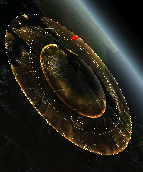
Matte Painting 101: Meteor Impacts
2011-07-08 17:00:13 (читать в оригинале)Advertise here
Matte painting is a technique that filmmakers use to create backgrounds for scenes that can’t or don’t exist in real life. In the early days, matte paintings were actually painted onto glass. Today, modern filmmakers use digital applications such as Photoshop to produce the backdrops that they need. We have published many matte painting tutorials on this site meant for intermediate and advanced users. This tutorial is part of a series of tutorials that we will be publishing on this meant for those of you who may be relatively new to Photoshop or matte painting in general.
Today’s tutorial, Matte Painting 101: Meteor Impacts will teach you how to destroy a city with meteors. In this tutorial you will learn how to paint streams of smoke, and break up buildings. Let’s get started!
Tutorial Assets
The following assets were used during the production of this tutorial.
- Base Image
- Brushes and Gradients
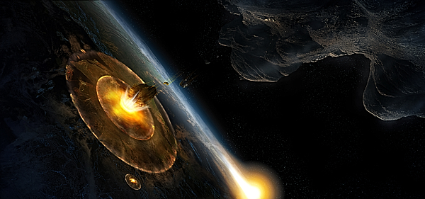
Create a Planetary Asteroid Impact – Psd Premium Tutorial
2011-07-07 17:00:27 (читать в оригинале)Advertise here
While asteroids don’t slam into the Earth all that often, movie producers sure act like they do. We can all think up a few movies with similar plots. An asteroid is about to hit the planet and a group of heroes comes to save the day. In this Psd Premium tutorial, author Ed Lopez will demonstrate how to create an asteroid impact, just like in the movies. If you would like to take your Photoshop skills to the next level, Log in or Join Now to get started!
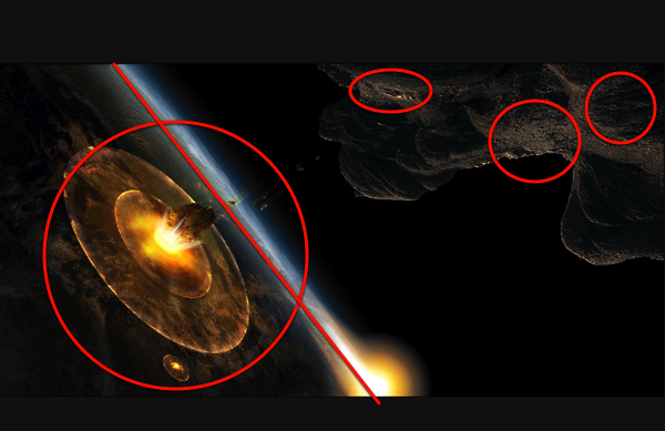
Detailed Video Instruction
This tutorial includes 10 videos that demonstrate the process of creating this project in detail so that you can better understand the techniques that were used in each step. Below is a clip from one of those videos. To view more clips you can Log in or Join Now!
Professional and Detailed Instructions Inside
This tutorial also includes full text and screenshots of each step. Premium members can Log in and Download! Otherwise, Join Now! Below are some sample images from this tutorial.
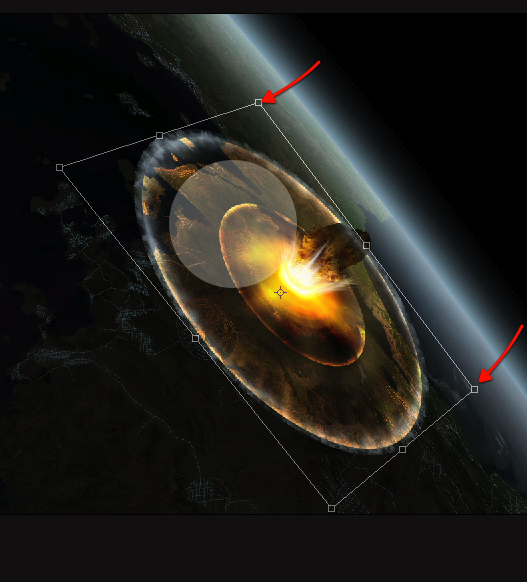
Final Image
Psd Premium Membership
You can join Psd Premium for as little as $9/month. Premium membership gives you access to the source files for all our tutorials as well as access to premium tutorials like this one. This also includes the rest of the sites in our network including Vectortuts+, Webdesigntuts+, Phototuts+, Nettuts, and more! Premium Members can Log In and download this tutorial. Otherwise you can Join Today!
|
| ||
|
+3386 |
3395 |
pllux |
|
+3357 |
3427 |
AlexsandR_MakhoV |
|
+3354 |
3417 |
Simple_Cat |
|
+3349 |
3432 |
Solnche605 |
|
+3344 |
3441 |
ДеВаЧкА-НеФоРмАлКа |
|
| ||
|
-1 |
661 |
Где отдохнуть?! Куда поехать?! Выбирай с нами! |
|
-1 |
565 |
ШНЯГА.ru - простые рецепты |
|
-1 |
36 |
doctor_livsy |
|
-2 |
605 |
aQir |
|
-2 |
6 |
SkaSkin |
Загрузка...
взяты из открытых общедоступных источников и являются собственностью их авторов.