| Сегодня 8 июля, среда |
|
|
|
Какой рейтинг вас больше интересует?
|
Главная /
Каталог блоговCтраница блогера PSDTUTS/Записи в блоге |
|
PSDTUTS
Голосов: 2 Адрес блога: http://psdtuts.com Добавлен: 2008-10-26 20:48:58 блограйдером DrakAngel |
|
The Advantages of Camera RAW Editing
2011-07-06 17:00:27 (читать в оригинале)Advertise here
While much larger in terms of file size, Camera RAW images have many advantages over that of typical JPG files. In this tutorial, Adobe Certified Expert and Instructor, Martin Perhiniak will explain the advantages of camera RAW editing, the difference between a JPG and Camera RAW file, and how to effectively manipulate a RAW file to get the most out of your photographs. Let’s get started!
Part 1
Part 2
Part 3
Part 4
Part 5
Part 6
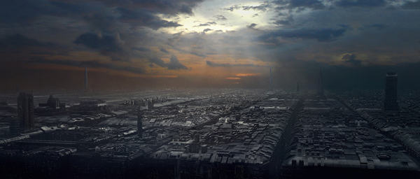
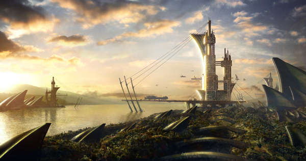
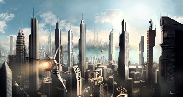
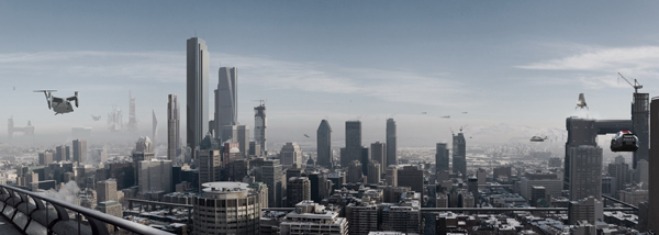
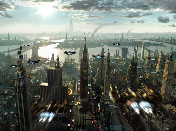
20 Stunning Matte Paintings of Cities
2011-07-05 17:00:42 (читать в оригинале)Advertise here
You may not realize it but you see matte paintings almost every time you watch a feature film or television show. Matte paintings are used in film whenever the filmmakers need a background that can’t or doesn’t exist in real life. In this showcase we will feature stunning matte paintings that include cities. Let’s take a look!
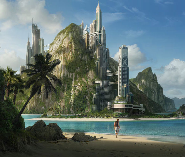
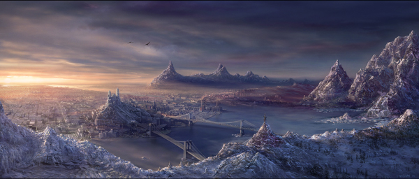
Tropical City by Dylan Cole
Master matte painter Dylan Cole brings us the first city matte painting, this one features a very cool futuristic city perched on the side of a mountain in a very tropical climate.
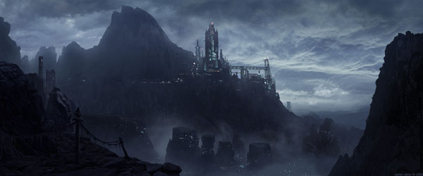
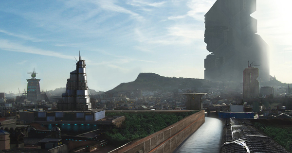
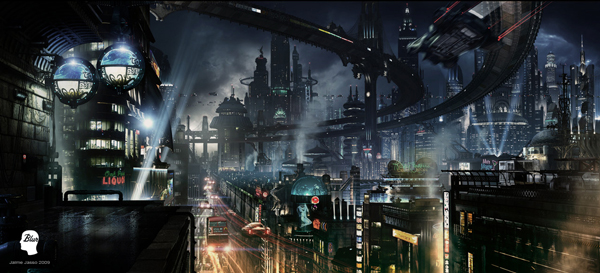
The Tower Above Stone City by Jaime Jasso
The dark environment set in this matte painting looks amazing, and once again we see a futuristic cityscape that perfectly blends in with the rugged mountain region.
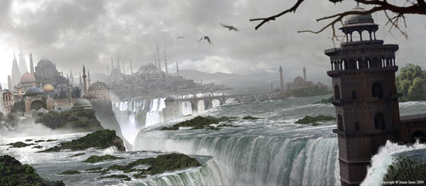
Spirutal City by Jaime Jasso
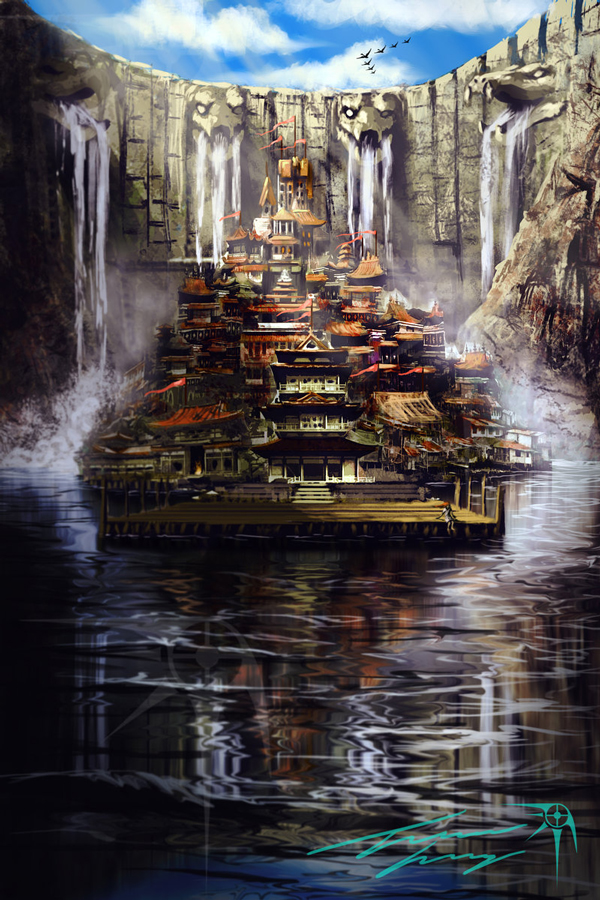
Here we have another matte painting by Jaime Jasso but this time we see an elevated city surrounded by massive waterfalls. This is a perfect example of how matte painting can bring environments together into harmony for an illustration.
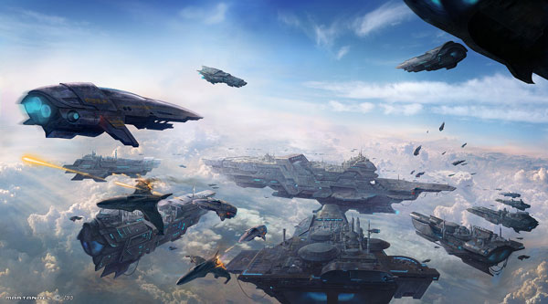
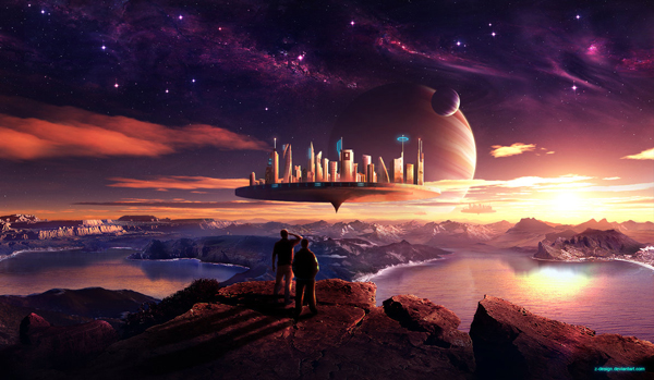
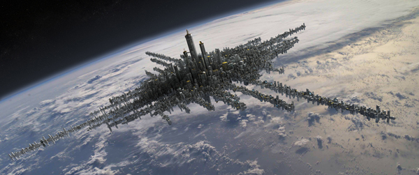
Spaceships Sky City by Marta Andres
This is one of the more original and unique matte paintings featured in this collection, the whole city here is on a space ship floating thousands of miles above the ground. What makes it even better is that Marta decorates this scene even more with intricate spaceships and beautifully compositioned clouds.
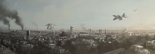
Duel by Vlado
This matte painting features a destroyed city in the midst of an epic battle between what looks to be a robot and a few fighter jets. This designer created a very complete environment that definitely blends with the events unfolding in this piece.
Lava City by Dylan Cole
Here is another Dylan Cole matte painting but this one isn’t as calm and scenic as the last one. Here he paints a whole futuristic city that is surrounded by lava rivers which zig-zag throughout the whole city. Another incredible full shot by the talented matte painter.
Homeworld by Zane Bien
The city in this painting might be small compared to the others in this list, but this is definitely an original matte painting that is put together perfectly. The environment was fulfilled perfectly and the atmosphere is breathtaking.
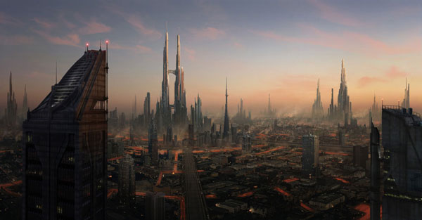
Futuristic City by Kenneth Dingens
The futuristic city is definitely a favorite among matte painters, and this one is no different. An incredible composition that features towering buildings in a very unique environment that features everything from rivers to mountains.
Futuristic City by Jaime Jassi
This intricate futuristic city created by Jaime Jasso is definitely the most creative one out of the bunch. Jaime spared no detail in creating this city as every billboard is there along with its neon lights and unique ad. This is truly a top class matte painting with perfect composition and atmosphere.
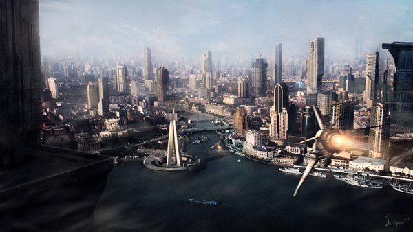
Future City by Huiyen
This matte painting takes a very cool shot of another proposed city in the distant future. The designer decorates this high angle shot with a cool looking spacecraft zooming through this city.
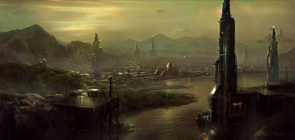
Enviroment FJORD by Daniel Kvasznicza
This stunning matte painting features a somewhat unusual place to build a city, but it doesn’t really matter when its put together this well. Every element in this painting looks perfect and works extremely well with the overall painting.
Colony Revision by Roman Honz
This matte features an array of interesting elements mixed together for a superb piece. The blending of various elements such as mountains, lakes, buildings and spacecrafts looks seamless making this another stunning painting.
City Matte by Mortalitas
This huge painting is a stunning look at amount of detail an artist can put into his work. Every building in this matte looks original and blends in with the atmosphere perfectly.
City Below The Dam by Travis
This painting might not be as detailed or realistic as the others featured but it definitely has an original and unique scene that is very cool to look at. The whole orientation of this city surrounded by a mountain and waterfall is very originative and the execution is still top notch.
City Above The Clouds by Chris Korn
Here we have another stunning and unique matte painting that features a civilization in an extremely unfamiliar place. This huge city floating above the clouds looks too perfect making for another great matte painting.
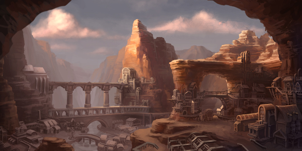
Canyon City by Zack Fowler
The city featured here isn’t as high tech or architecturally sound as the others in this list but the idea and execution of this matte painting is definitely still unique and the environment’s colors are uniform throughout the whole piece.
Another World by Radoslav Zilinsky
The beautiful sunset in this matte painting is only one of the many things that is perfect about this piece. The whole environment looks very realistic and gives the viewer a stunning scene that we could just stare at for days.
2210 by Huiyen
Hopefully our cities will look something like this matte painting 200 years in the future, this depiction of a futuristic city by the matte painter is another stunning example of perfect composition in the midst of many different elements.
2063 by Vlado
Not as far into the future as the last painting featured but this one definitely still ramps up the technology in this matte set in 2063. Even with all these new elements inserted into the frame the element of realism is still kept making for a great matte painting.
Babel Myth by Frederic St. Arnaud
Our last matte painting features an array of incredible elements that work perfectly with each other to give us a whole beautiful futuristic city. The spaceships zooming through the city give it a nice touch, as well as the many towering buildings that are seen in the backdrop of this piece.
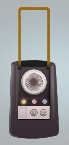
Create a Star Trek Style Communicator in Photoshop
2011-07-04 19:00:37 (читать в оригинале)Advertise here
In this tutorial, we will draw a retro Star Trek style communicator, a voice communication device used in the original Star Trek series. We will combine layer styles and lots of manual drawing. So, prepare your Wacom to boldly go where no Photoshop tutorial has gone before.
Tutorial Assets
The following assets were used during the production of this tutorial.
- 26 Repeatable Pixel Patterns from PSDfreemium
- Final Frontier Old Style font from Allen R. Walden
Step 1: Preparing Background
Create new file, with size 600×660 px. Fill Background with color: #ababab.

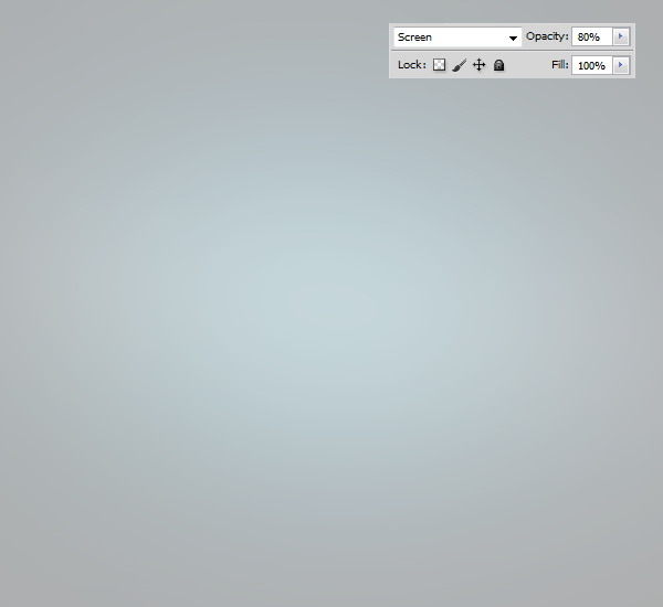
Step 2
Create new layer and add gradient from blue to black.

Step 3
Set blend mode to Screen and reduce its Opacity.
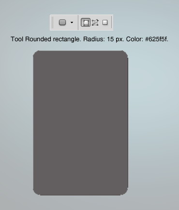
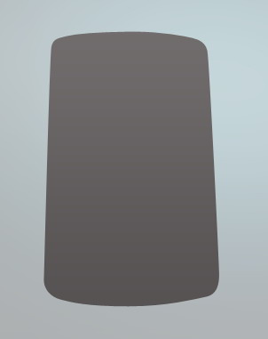
Step 4: Communicator Basic Shape
Draw a rounded rectangle with radius 15 px and color #625f5f.
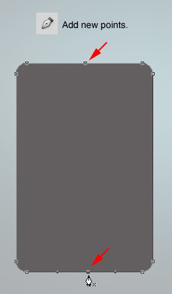
Step 5
Activate pen tool and click middle top and middle bottom to add new points.
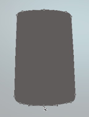
Step 6
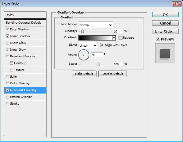
Use Direct Selection Tool to modify each point until we have this following shape. Add subtle Gradient Overlay.

Step 7
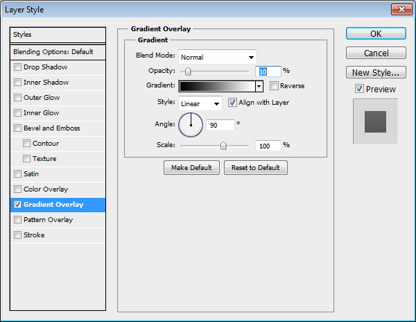
Duplicate basic shape we have just created by pressing Command/Ctrl + J. Change its color to #2f2229. Resize it to 98%. Add Gradient Overlay.
Step 8
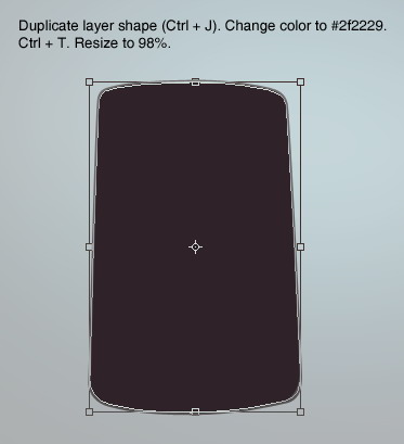
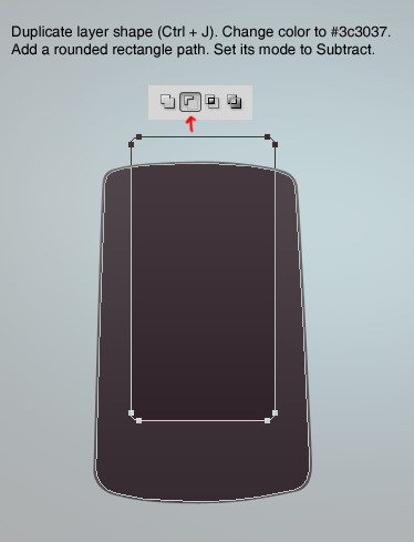
Duplicate layer shape by pressing Command/Ctrl + J. Change its color to #3c3037. Add a rounded rectangle path and set its mode to Subtract.
Step 9
Command/Ctrl-click layer to create a selection based on its shape.
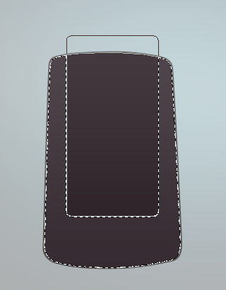
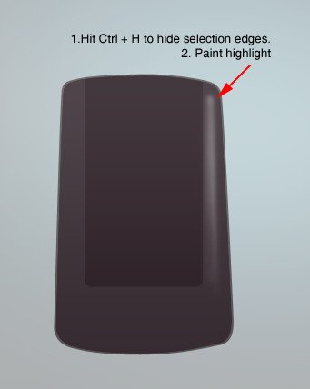
Step 10
Create new layer. Hit Command/Ctrl + H to hide the selection edges. Activate soft brush tool. Paint highlight on left side of the shape.
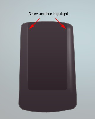
Step 11
Draw another highlights on indicated areas. It will be easier if you do all strokes on different layers. This way, you can reduce the layers Opacity to reduce its effect. Or, you can simply delete the layer if you don’t like the result.

Step 12
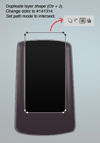
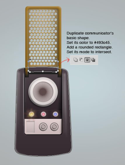
Duplicate shape we have created earlier. This time set rounded rectangle mode to Intersect. Change its color to #141314.
Step 13
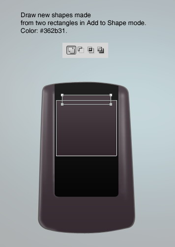
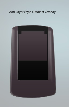
Draw new shape made from two stacking rectangle. Set both paths mode to Add to Shape. Set its color to #362b31. Add Layer Style Gradient Overlay.

Step 14
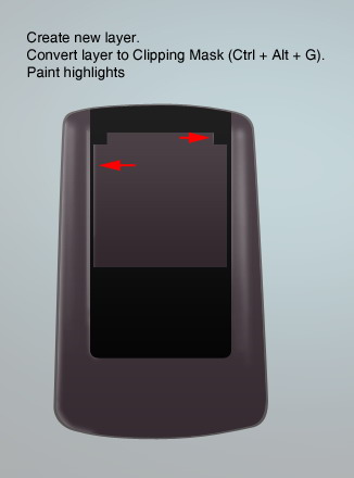
Create new layer and convert it to Clipping Mask by pressing Command/Ctrl + Alt + G. Paint highlight on some parts of the shape.
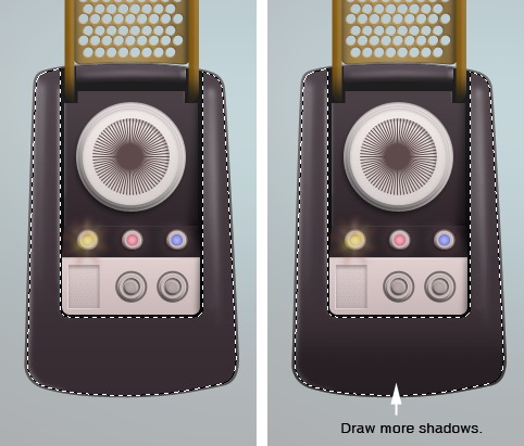
Step 15
Of course, don’t forget the shadows.
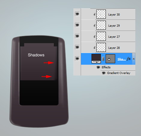
Step 16
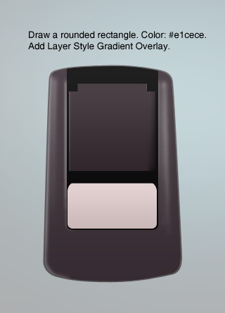
Draw a rounded rectangle with color #e1cece. Add Layer Style Gradient Overlay.

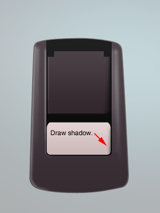
Step 17
Create new layer and convert it to Clipping Mask. Draw shadow on lower corner to add depth onto the shape.
Step 18
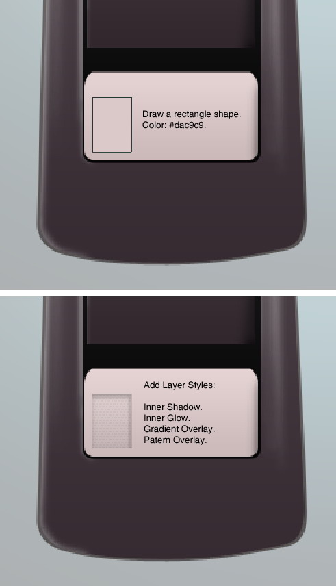
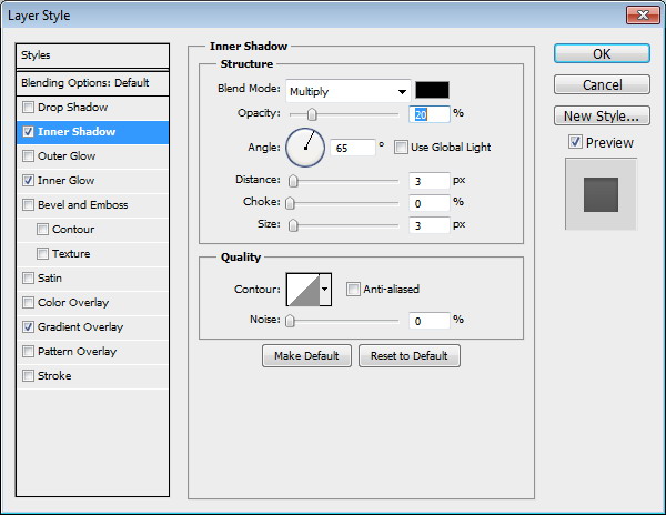
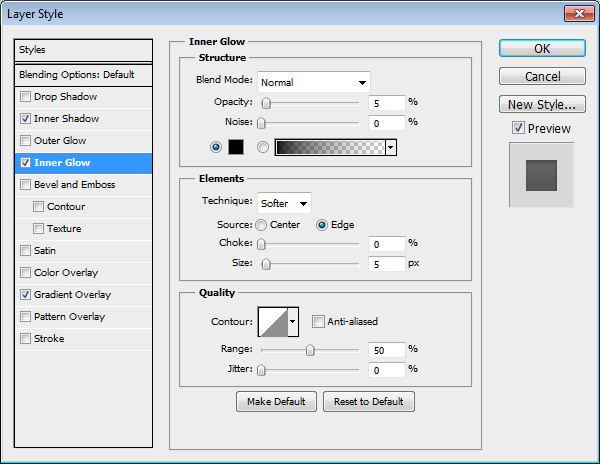
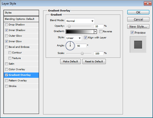
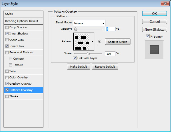
Draw a rectangle shape with color #dac9c9. Add following Layer Styles. In Pattern Overlay setting, use Pixel Patterns from PSDfreemium
Step 19
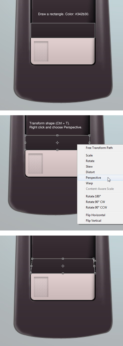
Draw a rectangle covering top part of previous shape. Set its color to #342b30. Hit Command/Ctrl + T to perform transformation, right click and choose Perspective. Pull top corner until we have a trapezium shape.
Step 20
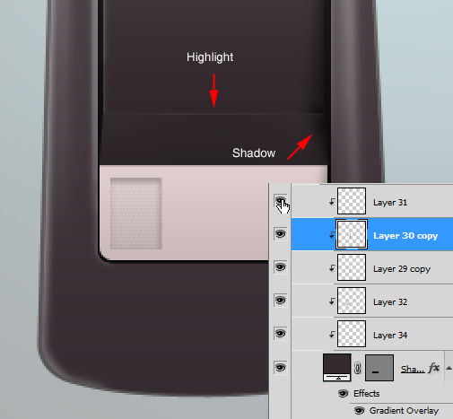
Create new layer and convert it to Clipping Mask (Command/Ctrl + Alt + G). Paint some subtle highlights and shadows.
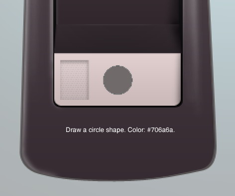
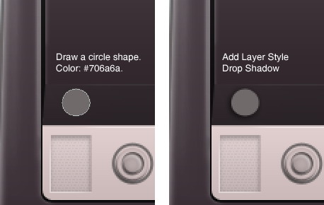
Step 21: Button
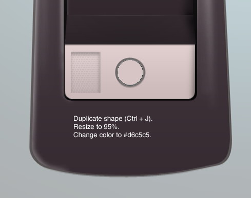
Draw a circle shape with color #706a6a.
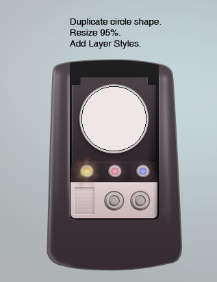
Step 22
Duplicate shape we have just created and set its color to #d6c5c5. Resize it to 95%.
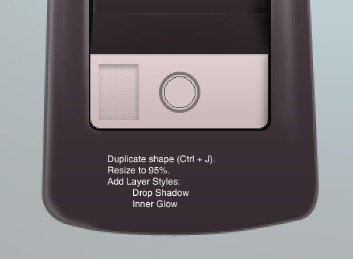
Step 23
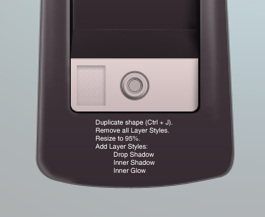
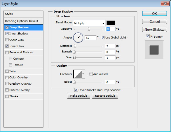
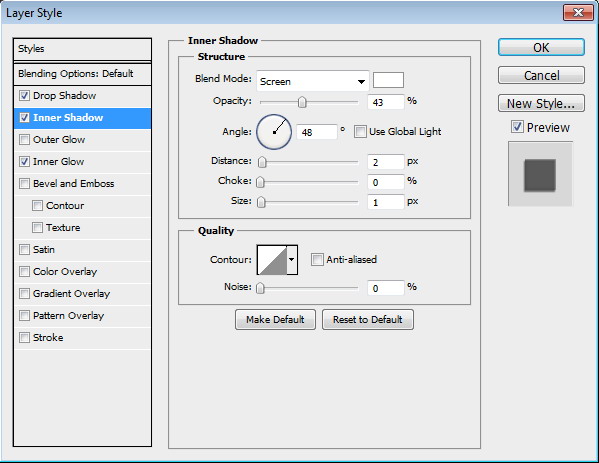
Again, duplicate the circle shape. Resize it to 95%. Add following Layer Styles.


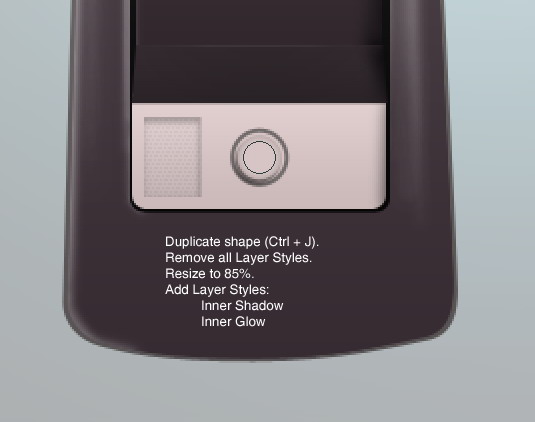
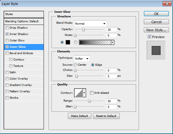
Step 24
Duplicate shape. Resize it to 85%. Remove all previous Layer Style. Replace them with these Layer Styles.

Step 25
Duplicate previous shape and then resize it to 95%. Add following Layer Styles.

Step 26
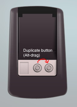
Put all button layers into a group. Alt-drag group to duplicate the button.
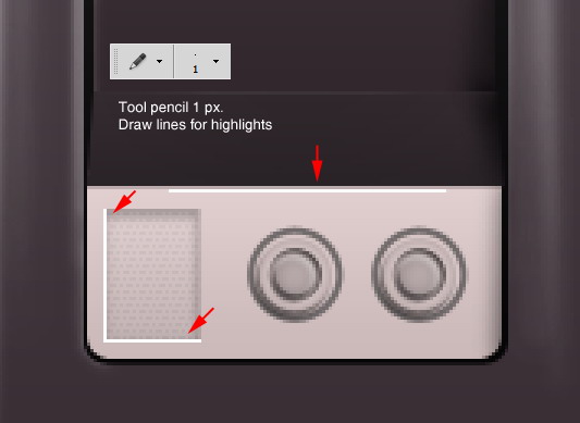
Step 27: Highlights
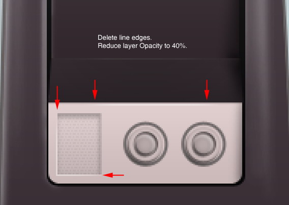
Activate pencil tool and set its size to 1 px. Draw 1 px white line on some areas. Delete both its ends using big soft brush eraser and reduce layer’s Opacity to 40%.
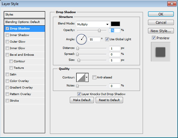
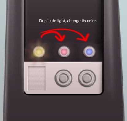
Step 28: Indicator Lamp
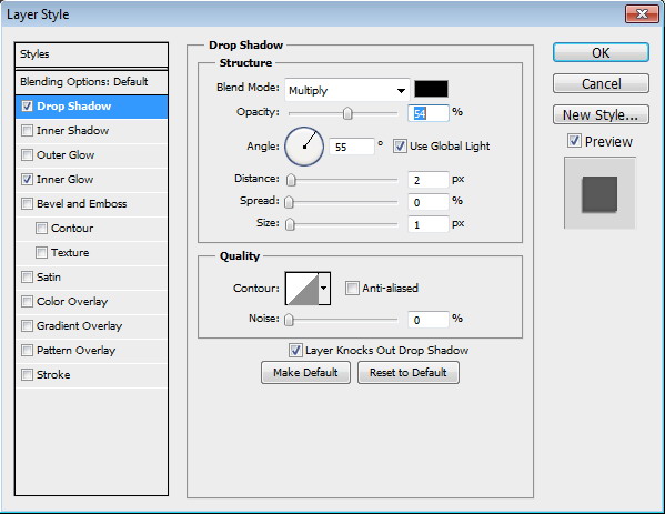
Draw a circle with color #706a6a and add Layer Style Drop Shadow.
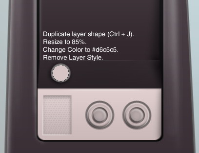
Step 29
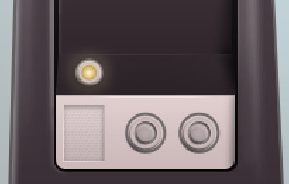
Duplicate circle shape we have just created and remove its Layer Style. Resize it to 85%. Change its color to #d6c5c5. .
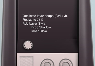
Step 30
Duplicate layer shape (Command/Ctrl + J). Resize it to 75%. Add following Layer Styles.
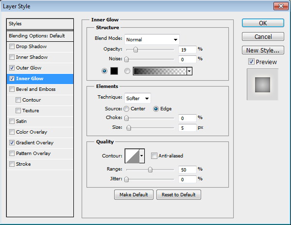
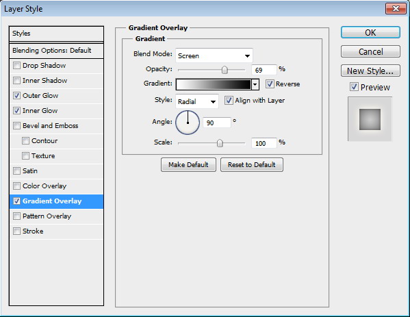
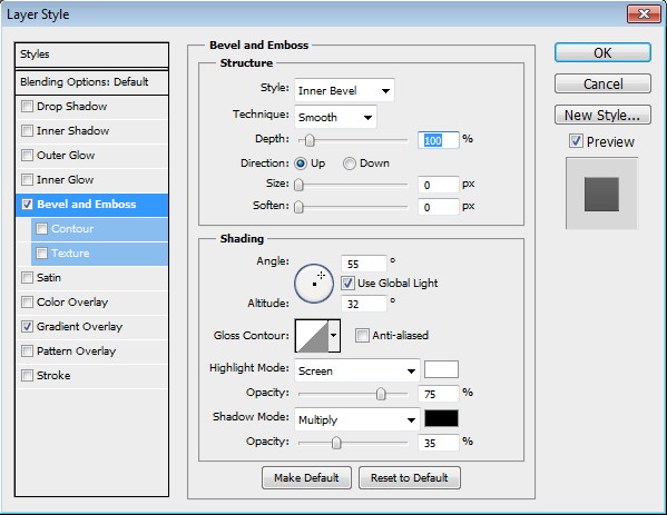
Step 31
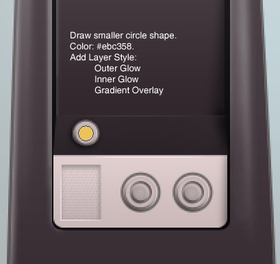
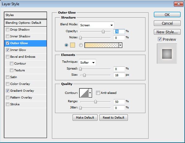
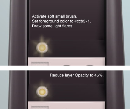
Draw smaller circle shape with color #ebc358. Add following Layer Styles.
Step 32
Set foreground color to #ccb371 then use soft brush to paint lens flare on top of the lamp. Reduce layer Opacity to keep the effect natural.
Step 33
Place all layers that compose the lamp inside a group by selecting them and hit Command/Ctrl + G. Alt-drag the group to duplicate it. Do this process twice until we have two lamps and make sure to change their color.
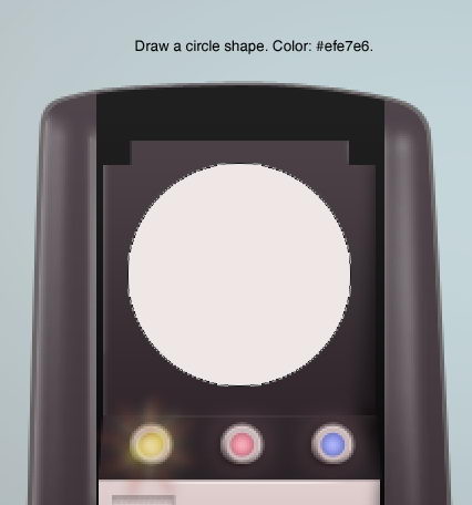
Step 34: Oscilloscope
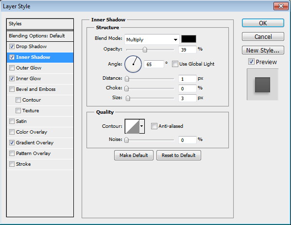
Draw a circle shape with color #efe7e6. Add following Layer Style.


Step 35
Duplicate circle shape and resize it to 95%. Add following Layer Styles.


Step 36
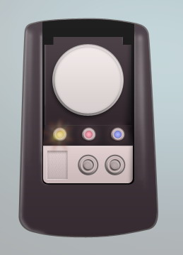
Duplicate previous circle shape and resize it to 92%.
Step 37
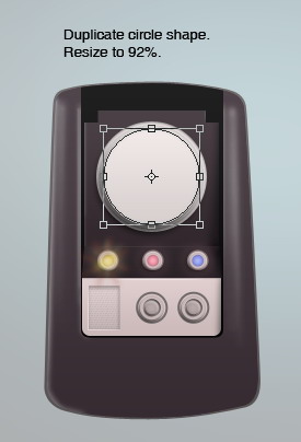
Duplicate circle shape and resize it to 75%. Change Layer Styles used with following settings.


Step 38
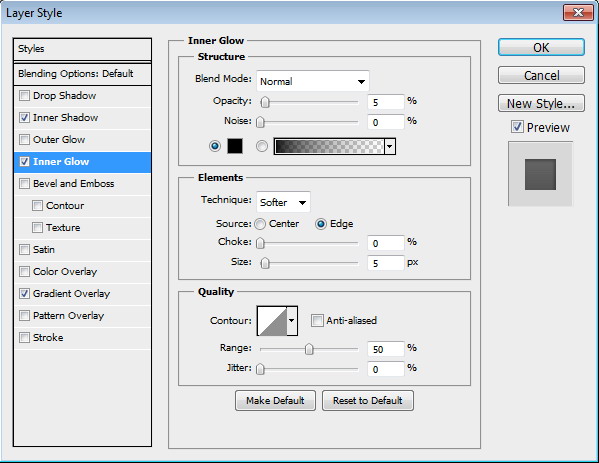
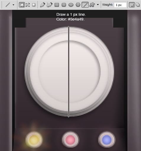
Draw 1 px line with color #5e4a49. Place it on the middle of the circle.
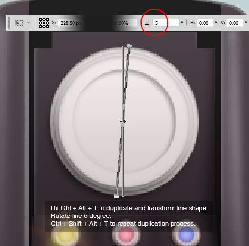
Step 39
Activate Path Selection Tool and select the line. Hit Command/Ctrl + Alt + T to duplicate and transform the line path. In the Option Bar insert 5 degree. Repeatedly, hit Command/Ctrl + Shift + Alt + T to repeat the duplication process.
Step 40
Repeat this process until the lines form a full circle, 360 degree.
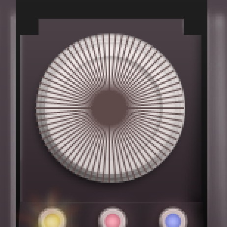
Step 41
Command/Ctrl-click last circle that we created in Step 37. Click Add Layer Mask icon. The lines now goes inside the circle.
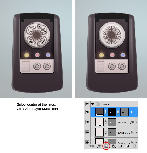
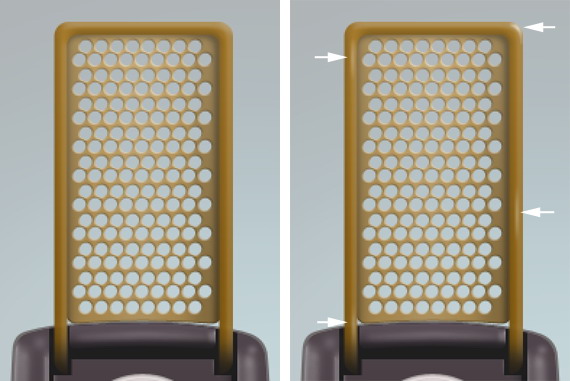
Step 42: Cover
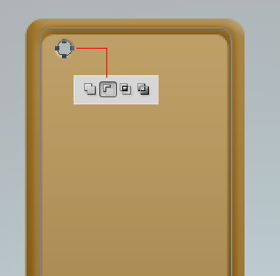
Draw a rounded rectangle with color #956a0b. Draw another rounded rectangle inside it and set its mode to Subtract.
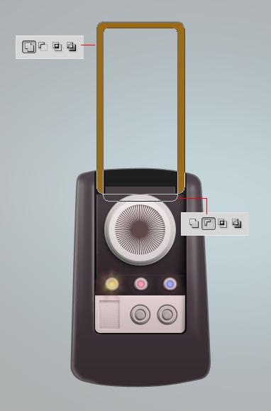
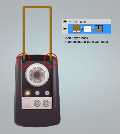
Step 43
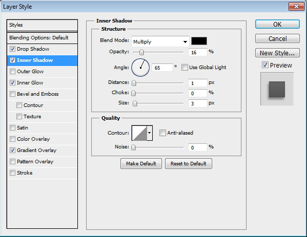
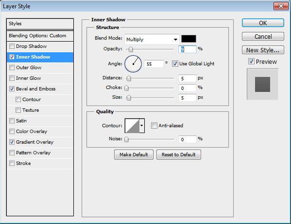
Add layer mask and paint its lower part with black to fade it into the communicator base. Add following Layer Styles.

Step 44
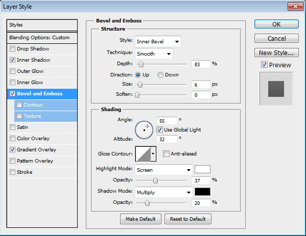
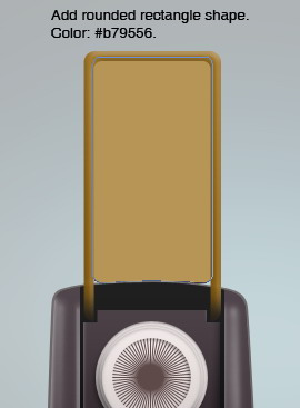
Draw a rounded rectangle behind previous shape. Set its color to #b79556. Add following Layer Styles.

Step 45
Add circle shape onto the path. Set its mode to Subtract to create a hole inside the shape.
Step 46
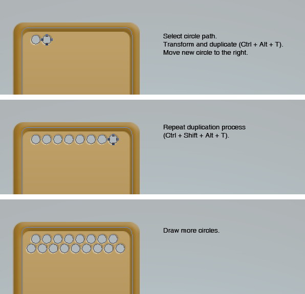
Select the circle. Transform and duplicate the path by pressing Command/Ctrl + Alt + T. Move the duplicated circle to the right. Repeatedly press Command/Ctrl + Shift + Alt + T to repeat the duplication process until we have a row full of holes. Draw more circles on the second row.
Step 47
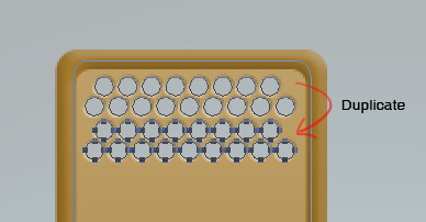
Select all the circles. Hit Command/Ctrl + Alt + T to transform and duplicate them. Press down arrow a few times.
Step 48
Hit Command/Ctrl + Shift + Alt + D repeatedly until the shape is fully covered with holes.
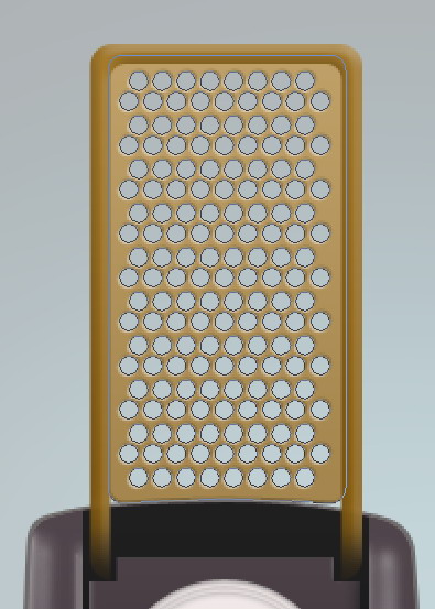
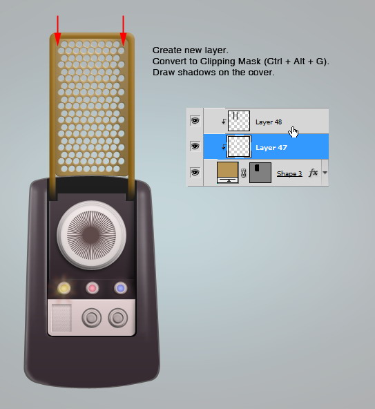
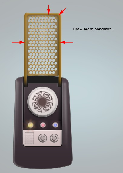
Step 49
Create new layer and set it as Clipping Mask by pressing Command/Ctrl + Alt + G. Draw some shadows on the cover to keep it realistic.
Step 50
Duplicate communicator’s basic shape and change its color to #493c45. Add a rounded rectangle on top and set its mode to Intersect. Add Layer Style Gradient Overlay.

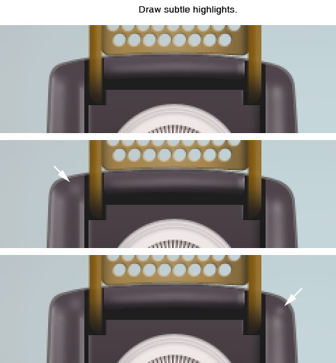
Step 51
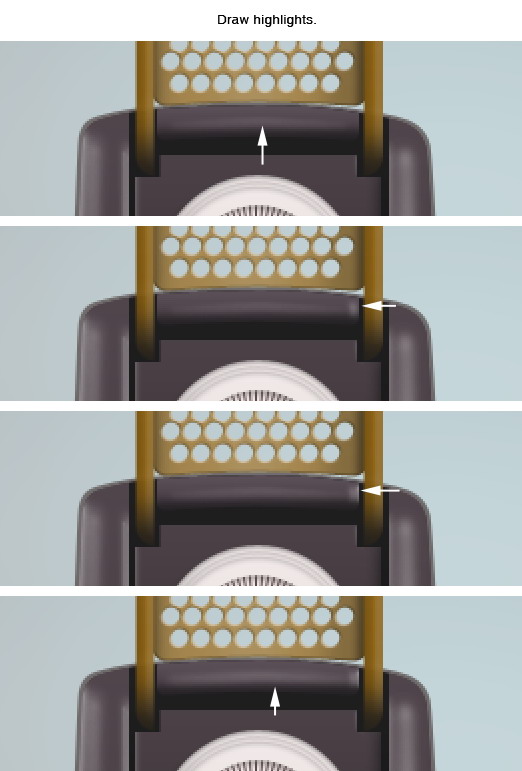
Zoom closer onto the shape to see the details closer. Activate brush tool and select small soft brush with hardness 0%. Create new layer. Draw subtle highlights on top of the shape.
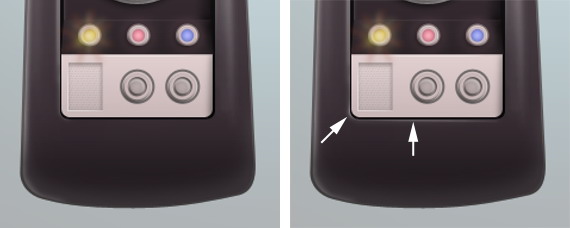
Step 52: Tweak Highlights and Shadows
Command/Ctrl-click communicator basic shape to make a selection based on its shape. Select big soft brush and then paint black on lower part of the communicator. This way, the communicator appearance is not so flat.
Step 53
Zoom closer to see details. Select soft small brush. Paint white on some parts for its highlights.
Step 54
Once again, Command/Ctrl-click basic shape of the communicator. Paint more shadows on some parts below to make it darker and glossy.
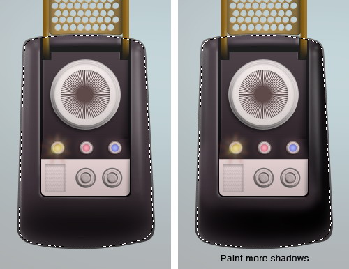
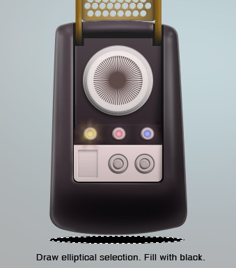
Step 55: Shadow
Draw elliptical selection under the communicator and fill it with black.
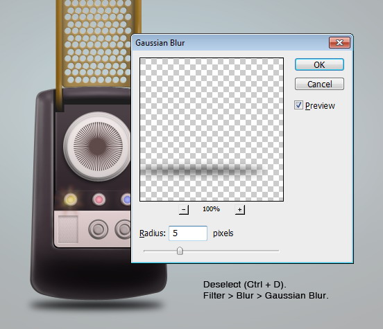
Step 56
Remove selection by pressing Command/Ctrl + D. Click Filter > Blur > Gaussian Blur to soften the shadow.
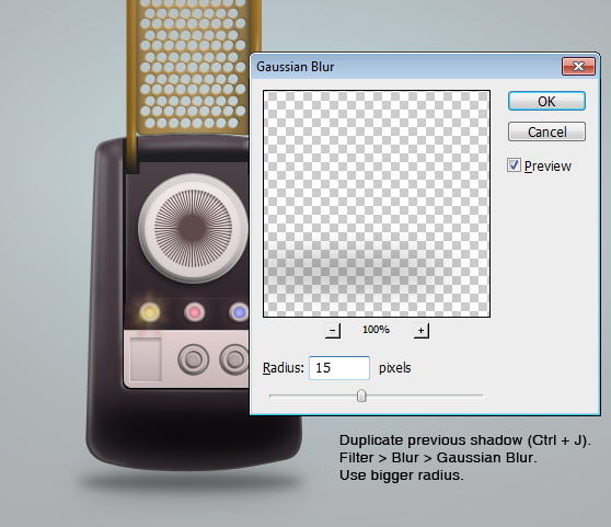
Step 57
Duplicate shadow layer we have just created. Apply another Gaussian Blur by pressing Command/Ctrl + Alt + F but this time use bigger radius.
Step 58
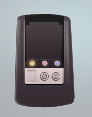
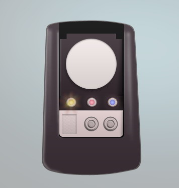
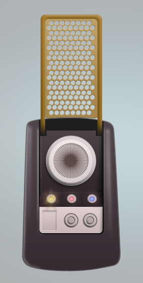
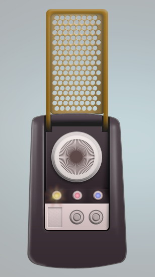
Here’s the result.
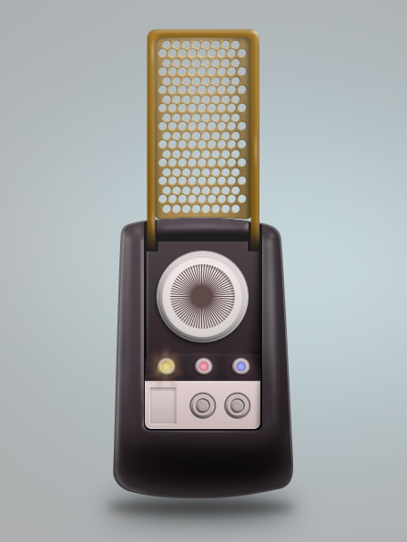
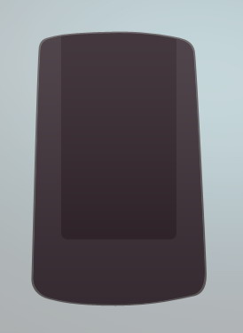
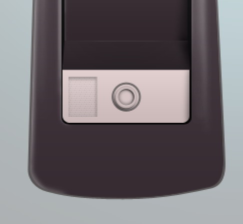
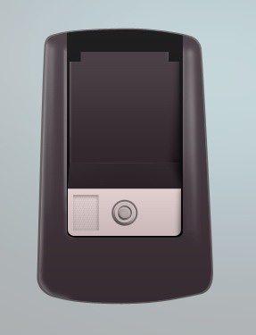
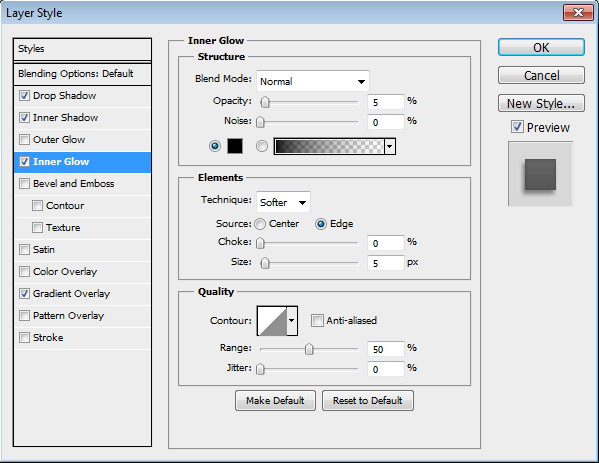
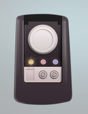
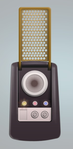
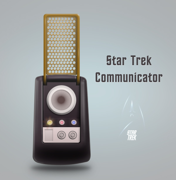
Final Image
Finally, we have finished drawing this cool communicator. I also added some text using the font Final Frontier. I hope you enjoy this tutorial as much as I do. Live long and prosper.
Interview With Edmar Cisneros
2011-07-02 17:00:05 (читать в оригинале)Advertise here
Designer Edmar Cisneros has an interesting and unique philosophy regarding design that can be seen through his work. Edmar’s relationship with Photoshop has flourished over the years and it has lead to him to discover his own style. In our inteview, Edmar discusses his struggles and triumphs with art and Photoshop. Please take a moment to review this excellent interview.
Q Welcome to Psdtuts+, please introduce yourself. Could you tell us where you’re from and how you got started in the field?
Hi everyone! My name is Edmar Cisneros, I’m 22 years old and currently live in Mexico City. I work as a freelance graphic designer and Illustrator and I’m currently perusing a degree in Digital Animation. I started out with an old copy of Paint Shop pro; I used to retouch pictures back in 2007 and at that time I stumbled across a little site called Deviantart where I was introduced to the world of digital art. Eventually I discovered some art communities such as Evokeone, Depthcore and Slashthree where I was really impressed with the quality of images that could be produced using Photoshop and so I guess I got hooked since then.
I used to spend a lot of time messing around with Photoshop, looking for tutorials and inspiration sites as well as submitting everything I did to Deviantart for comments and feedback. I got obsessed with it and with that I became better little by little.
Revenant
QHave you always been an artistic person? Or did you develop this love for art later in life? If so then when?
When I was younger I got into the habit of spending entire nights drawing and painting random stuff. After a few years of keeping this up I lost interest from one day to another until I got into digital art. I switched my pencils and brushes in for my computer and I rediscovered my interest in the field.
UV-9
QWhat was you’re first Photoshop experience like, and how do you think you have evolved as a designer since then?
I remember the first time I used Photoshop I downloaded some grunge and floral brushes and started making a mess with them. I found the program kind of difficult to use but as I got more interested with it I started searching the web for tutorials on how to use it. PSDTUTS+ and Abduzeedo being two of those places and I think I recreated every single tutorial both sites had until that point. Then I started using what I learned on my work and experimenting spending countless hours on my own. From there it took me a couple of years to start developing my own style without the need of much outer inspiration and just using my own ideas and concepts.
On The Coldest Winter Day
QWhen looking at your older art we can notice a very drastic change in appearance of your illustrations. What would you say is an important key in transforming ones style and advancing techniques?
When I was still learning my way through Photoshop I liked following trends and basically do what everyone else was doing at the time. That changed when I started joining art communities (Most recently Slashthree). Within these communities I learned how important it was to create my own style and have my own voice and that way my works changed like I changed my way of thinking about art. It’s something that you learn to do day by day and with each artwork you create.
Longing
QHow would you characterize your specific style of art?
I wouldn’t say I have an specific style set in all my artworks. I like going from Photo manipulation to 3D to Digital Painting and also from Surreal to fantasy and Sci-fi stuff. It all depends on what I’m working on and how it flows, nothing is ever set on stone.
Adonis Complex
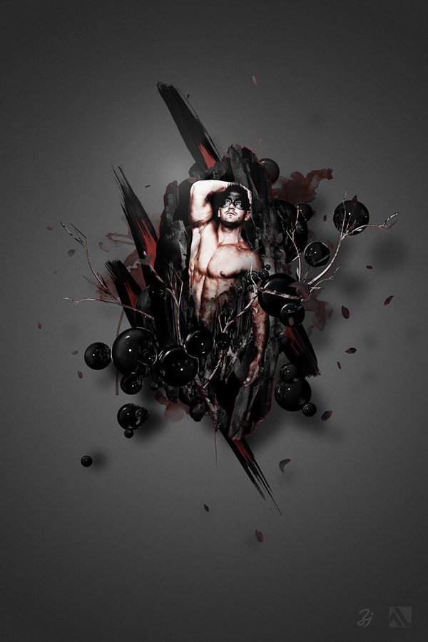
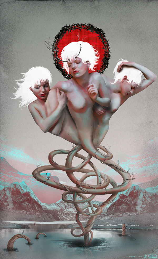
Q“Savant” is an extraordinary illustration that features several original and unique elements, could you tell us what this piece is about and a little on how you made it?
A savant is a person that has some sort of ability that exceeds the normal standard and I wanted to illustrate that with someone breaking or “blooming” out of the normal into creating something beautiful or brilliant. I used Cinema4D and some rock textures to create the ‘meteor’ (as I like to call it) on the background and also used C4D to render all the branches. Then I selected a stock image of a model I saw fit for the concept and retouched and over painted in Photoshop. One thing I like to do with my works is using neutral color palettes and add some color details, in this case I decided to keep the main colors to blacks, grays and the contrasting white on the branches and leaves with only the soft pink tones from the body of the guy.
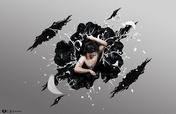
Savant
QWhat would you say is your biggest flaw when designing? How do you try and correct it?
My biggest flaw would probably be not developing my concepts thoroughly. This can make me get lost in the artwork. Technically, It can be difficult selecting a color palette or a stock image that would fit the idea and it could lead to an unfinished or unsatisfactory result as well as lots of wasted time figuring out what else I can add or do to it. I found out that by sketching my ideas beforehand or just simply writing down all the elements that I want to incorporate to the design and making a plan of action helps a lot.
In Search For Apotheosis
Q Thanks again for providing Psdtuts+ with this opportunity to interview you. Any final thoughts for our readers?
Thanks to you Emil and everyone at PSDTUTS+ for making this interview possible. And I just want to tell everyone out there to experiment and develop you craft and try to bring to the world all the ideas you have no matter how crazy they are. Just keep screaming until you are heard.
Goilya
Where to find Edmar on the Web
- Edmar’s DeviantArt
- Edmar’s Behance
Void
Matte Painting 101: Lighting Fires
2011-07-01 17:00:51 (читать в оригинале)Advertise here
Matte painting is a technique that filmmakers use to create backgrounds for scenes that can’t or don’t exist in real life. In the early days, matte paintings were actually painted onto glass. Today, modern filmmakers use digital applications such as Photoshop to produce the backdrops that they need. We have published many matte painting tutorials on this site meant for intermediate and advanced users. This tutorial is part of a series of tutorials that we will be publishing on this meant for those of you who may be relatively new to Photoshop or matte painting in general.
Today’s tutorial, Matte Painting 101: Lighting Fires will teach you how to extract and combine two images, use adjustment layers to make a nighttime scene, how to paint with masks, create highlights, and how to paint fires and torches. Let’s get started!
Tutorial Assets
The following assets were used during the production of this tutorial.
- Image1
- Image 2
- Brushes, Shadow & Highlights Settings, and Gradients
|
| ||
|
+3386 |
3395 |
pllux |
|
+3357 |
3427 |
AlexsandR_MakhoV |
|
+3354 |
3417 |
Simple_Cat |
|
+3349 |
3432 |
Solnche605 |
|
+3344 |
3441 |
ДеВаЧкА-НеФоРмАлКа |
|
| ||
|
-1 |
661 |
Где отдохнуть?! Куда поехать?! Выбирай с нами! |
|
-1 |
565 |
ШНЯГА.ru - простые рецепты |
|
-1 |
36 |
doctor_livsy |
|
-2 |
605 |
aQir |
|
-2 |
6 |
SkaSkin |
Загрузка...
взяты из открытых общедоступных источников и являются собственностью их авторов.