| Сегодня 8 июля, среда |
|
|
|
Какой рейтинг вас больше интересует?
|
Главная /
Каталог блоговCтраница блогера PSDTUTS/Записи в блоге |
|
PSDTUTS
Голосов: 2 Адрес блога: http://psdtuts.com Добавлен: 2008-10-26 20:48:58 блограйдером DrakAngel |
|
Best of Tuts+ in July
2011-08-03 15:00:10 (читать в оригинале)Each month, we bring together a selection of the best tutorials and articles from across the whole Tuts+ network. Whether you’d like to read the top posts from your favourite site, or would like to start learning something completely new, this is the best place to start!
Psdtuts+ — Photoshop Tutorials
-

Introduction to Digital Art
Photoshop is an excellent tool for manipulating photographs but it can also be used as a means to create stunning digital art. This tutorial is part of a 25-part video tutorial series demonstrating everything you will need to know to start producing digital art in Photoshop. Digital Art for Beginners, by Adobe Certified Expert and Instructor, Martin Perhiniak will begin by teaching you how to draw in Photoshop. At the conclusion of this series you will know all you need to produce your own concept art and matte paintings in Photoshop.
Visit Article
-

The Making of the Nutty Boat Trip
Most of you probably know how hard it can be to find the perfect stock images for your designs. That means you will often have to get creative and find new ways to create the perfect composition. In this tutorial, we will demonstrate how to place a couple of squirrels in a coffee mug that is floating in a body of water.
Visit Article
-

Create a Devastating Tidal Wave in Photoshop
Matte painting is a technique that filmmakers use to create backgrounds for scenes that can’t or don’t exist in real life. In the early days, matte paintings were actually painted onto glass. Today, modern filmmakers use digital applications such as Photoshop to produce the backdrops that they need. We have published many matte painting tutorials on this site meant for intermediate and advanced users. This tutorial is part of a series of tutorials that we will be publishing on this meant for those of you who may be relatively new to Photoshop or matte painting in general.
Visit Article
-

Recently in Web Development (July Edition)
Web development is an industry that’s in a state of constant flux with technologies and jargon changing and mutating in an endless cycle. Not to mention the sheer deluge of information one has to process everyday.
Visit Article
-

Build your First Game with HTML5
HTML5 is growing up faster than anyone could have imagined. Powerful and professional solutions are already being developed…even in the gaming world! Today, you’ll make your first game using Box2D and HTML5′s
canvastag.Visit Article
-

Should You Start Using CSSLint?
Getting our code reviewed by a pro is a great way of improving code quality but what happens if you don’t have access to a rockstar programmer? You do the next best thing and grab a ‘lint’ for that language.
Visit Article
-

Community Project: Vectortuts+ Custom Character Jam
Vectortuts+ loves Illustration and discovering new talent, so today we are proud to be launching a new community project that combines both, the Vectortuts+ Custom Character Jam. The best thing is, you can be a part of it! Find out how to get involved, at the jump.
Visit Article
-

Brandable, Free, Vector People Graphics: Mascots and Character Designs
Need a character or awesome vector mascot for your next design project, grab a set for free today. We’ve rounded up a collection of highly brandable vector people character packs and one off graphics. We have on display a customizable Tuts+ Guy website mascot set, creative mascot graphic pack made by Pasquale D’Silva, a top of the evolutionary ladder geek, a male and female character broken into outfits and parts – ready for animation, and more. Now’s the time to download these vector freebies, so get to it.
Visit Article
-

Create a Marker Text Effect in Illustrator
In the following tutorial I will show you how to create a marker illustration. This tutorial involves intermediate vector shape building skills in Illustrator to create the markers, along with some layering and script usage to create the text effects. Let’s get started.
Visit Article
-

Extreme Makeover: jPaginator CSS3 Edition
jPaginator is a nifty jQuery plugin by Remy Elazare which combines pagination and scrolling in a simple user interface. Remy recently asked me if I would like to use it for something on Webdesigntuts+ and I figured it would be a great candidate for a style make-over.
Visit Article
-

Improving Your Productivity: Quick Tips for Photoshop
In this exclusive web series, Adi Purdila is going to walk you through how to use a handful of web design applications to improve your productivity. Work fast, smarter, and more efficiently! Today’s session: Quick Tips for Photoshop!
Visit Article
-

Super Simple Lightbox with CSS and jQuery
Rather than using a bloated plugin that has features you’ll never use, this tutorial shows you how to create a super simple lightbox for handling images. It’s perfect for image galleries, portfolios, and more!
Visit Article
-

Everything You Need to Know About Lenses: Part 1
So you’ve purchased your first SLR system, welcome to a new world of photography. You’ve opened Pandora’s Box to a huge range of versatility. One of the major factors that sets SLR cameras apart is their ability to change lenses. In this two-part Basix tutorial, we’re going walk your through everything you’d ever want to know about lenses.
Visit Article
-

Tips on Creative Car Photography
If you’ve ever tried photographing a car, you’ll know that it’s often not as easy as first presumed. Although it can be simple enough to capture a clear and simple shot of the vehicle, it’s far more challenging to capture the design, detail and essence of the car in a photograph. To help, here are ten simple steps which will hopefully lead you through the basics of car photography.
Visit Article
-

Understanding the Fundamentals of Camera Sensors
Light travels through a lens, the shutter opens, and a moment is preserved by capturing it on the camera’s sensor. This chip is an absolute essential in creating digital images. However, you may not have a good idea of how it all works. If you’re wanting to demystify the magic of how your digital SLR works, look no further than today’s Basix article all about camera sensors.
Visit Article
-

Cgtuts+ Quiz: Know Your CG
Today we’re kicking off something a little different and giving you a chance to test your knowledge of all things computer graphics. This being the first ever Cgtuts+ quiz, we’re starting off fairly easy with 20 questions related to Cg in general. Will you succeed? Will you be victorious? We don’t know, but find out after the jump!
Visit Article
-

Product Rendering With Fryrender
In this tutorial by author Shaun Keenan, well look at setting up and rendering a product shot inside of RandomControls Fryrender. Shaun will start out by covering the process of setting up and preparing the scene in Maya, before exporting to Fry. Well look at creating light emitting geometry through shaders, as well as creating the jellybean and glass materials, finally well set up and tweak the render settings inside of Fry.
Visit Article
-

Animation Reference Pack: Facial Expressions – CG Premium Content
Animating characters can be an extremely difficult task, especially without the aid of good reference materials. Today we have the second, in a series of high quality reference footage packs aimed specifically at animators. These videos are available exclusively to our premium members and are available in both 720p and 1080p high definition. Reference pack 2 contains 29 different facial expressions and a total of 116 video files!, created by regular Cgtuts+ contributors Stefan Surmabojov and Georgi Zahariev.
Visit Article
-

Ink-redible!” Aetuts+ Premium Ink Reveal Bundle + Tutorial
Today’s Premium tutorial will walk you through how use mattes to spice up your next motion graphics piece. We have an amazing download of 12 Ink Mattes and 5 Particle Mattes that were create exclusively for Tuts+ Premium members.
Visit Article
-

Top Ten After Effects Keyboard Shortcuts – with FREE AE Starter Templates!
These are my Top Ten Favorite After Effects Keyboard Shortcuts that I use most often to help speed up workflow…. speeding up RAM previews, purging those previews, adding keyframes to any property, previewing and scrubbing audio only… check out the video below to see them all!
Visit Article
-

Aetuts+ Hollywood Movie Title Series -” Transformers – Day 1
Todays tutorial will explain how to make the ’TRANSFORMERS 3″ flying logo style. We will start with the modeling and animation technique of the letters in Cinema 4d. Then proceed with camera movement and the construction of the interior of the “O” letter, with a hi-tech coating. We will complete with the compositing in After Effects.
See your space! TRANSFORMERS.
Visit Article
-
Quick Tip: How To Get A Clean John Frusciante Tone
In this tutorial I’m going to show how to get that classic and iconic clean-Stratish tone using just modeling technology. I’m using Guitar Rig 4 to get it, but you could use whatever software or real amp, as long as it gives you a Marshall-like tone.
Visit Article
-

How to Create the ‘Like a G6′ Bassline Sound
If you listen to the radio, go into upscale bars, or dance at the clubs you probably have heard Far East Movement’s ‘Like a G6′. Aside from the icy vocals from the artist Dev, G6 has a very memorable bass line. If you wanted to know how to recreate that sound for a remix or to have it as a sound option in your own track then read on like a G6!
Visit Article
-

An Introduction to ADSR
As audio engineers we deal with ADSR everyday, even without knowing it. I certainly didn’t know what ADSR was when I first heard it, but it’s the acronym for what happens with every waveform.
Visit Article
-

Carve Up a Video in Real Time With AS3
Hello, code freaks! This tutorial will show you how to split a running video into blocks as if it has exploded. And all this using just ActionScript. For this tutorial we’ll use the camera as the video source, so you can see the changes live.
Visit Article
-

Get Control of Your AS3 Event Flow With Signals
In this screencast we’ll go over all you need to know about AS3 Signals – a light-weight strongly-typed alternative to the native Flash event system. Prepare to see events in a whole new way!
Visit Article
-

Fixing Bugs in AS3: Introduction
In this tutorial, I’ll describe some of the basic information you need to debug your Flash applications. Finding and resolving errors in your ActionScript is no small task, so this is actually just the first article of a series. In this installment, we’ll take a look at some of the general things you can do to help track down your bugs.
Visit Article
-

Tips for Creating WordPress Themes That Sell
The growing market for premium WordPress themes has made competition tougher than ever. Customers are demanding higher quality and greater functionality leaving theme developers searching for new ways to make their work stand out. Knowing what makes one theme sell better than another can be difficult, but remembering a few basic rules can make a big difference in your total sales.
Visit Article
-

Code Snippets WP Theme Developers Should Have on Speed Dial
One of the ways we endeavor to improve productivity when building WordPress templates is to have snippets of code available to us very quickly, through the use of tab-triggered shortcuts. In this article I will share with you 10 of my most-used snippets that I feel every developer should have at their fingertips.
Visit Article
-

The Definitive Check List for Publishing Your WordPress Plugin
When you are getting close to completing your WordPress plugin, it’s time to start thinking about releasing it to the broader public. Getting ready for publishing a plugin requires a lot of polishing, testing and fine tuning, and it’s easy to forget some steps in the process. This tutorial will guide you through publishing the plugin in the WordPress plugin directory and work as a check list to help you make sure your plugin will be ready for the prime time by the time you hit publish.
Visit Article
-

Android SDK: Enabling Google Analytics to Gather App Statistics
Google Analytics is a service provided by Google that makes it easy to track what users do. Recently, the Google Analytics team released an Analytics SDK for mobile platforms including Android, iOS (Apple), and mobile websites. In this tutorial, learn how to include and enable this technology within your Android projects to gather important information about how users are using your applications.
Visit Article
-

Corona SDK: Creating a Scrolling Background
The Corona SDK makes game development for the iPhone, iPad, and Android easy. Corona uses the Lua programming language to create cross-platform apps. In this tutorial we will explore how to create a scrolling background with the Corona SDK.
Visit Article
-

Better Apps By Design
Most mobile apps are missing that extra bit of design detail that could help them stand out from the App Store crowd. While there is no replacement for having a talented designer polish your app’s pixels for hours on end, the purpose of this series is to teach those with limited Photoshop experience and a low-to-no budget how to make apps that shine!
Visit Article
Nettuts+ — Web Development Tutorials
Vectortuts+ — Illustrator Tutorials
Webdesigntuts+ — Web Design Tutorials
Phototuts+ — Photography Tutorials
Cgtuts+ — Computer Graphics Tutorials
Aetuts+ — After Effects Tutorials
Audiotuts+ — Audio & Production Tutorials

Activetuts+ — Flash, Flex & ActionScript Tutorials
Wptuts+ —WordPress Tutorials
Mobiletuts+ — Mobile Development Tutorials
Thanks for Reading!
We love bringing you the latest and greatest tutorials each month, and would like to take this opportunity to say thanks for reading, subscribing, and offering your feedback. If you have any suggestions for tutorials, or Tuts+ in general, feel free to leave them below in the comments!
As ever, the best way to support the sites (and get your hands on superb, industry-leading tutorials) is to join our Premium program. It costs just $9 per month, and will be the best few dollars you ever spend! There’s also no risk, thanks to our 100% money-back guarantee.
Enter to Win a Free iPad 2 From MightyDeals!
2011-08-02 17:00:16 (читать в оригинале)Are you a web professional looking for the best deal on web design-related products and services? If so, you might be excited to hear about MightyDeals. MightyDeals teams up with great companies to offer you special deals through the power of bulk purchasing, and today, in an effort to help spread the word, they are offering one lucky Psdtuts reader a free iPad 2. To enter, all you have to do submit your entry using the form below.
Some of you may be wondering what type of products and deals can be found on MightyDeals. Deals include: software, graphics, WordPress themes, icons, and much more! To make it even more appealing, discounts can sometimes be as much as 90% off.
For more information about MightyDeals, check out their website. You might also want to check out their current deal for 9 eBooks from Smashing Magazine, a value of $44.99 available for this week only for just $27. To enter this giveaway, click on the link below and fill out the form. Good luck!
Enter to Win an iPad 2
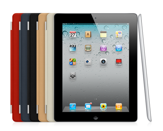
This giveaway is sponsored by MightyDeals.
Rules
- To enter, fill out this form and tell us what type of products you would like to see on MightyDeals.
- You may only enter once. Duplicate entries will be disqualified.
- Make sure to enter a valid email address so that we can contact you.
- Entries will be accepted until Thursday, August 11, 2011 at 11:59 PM, EST.
- Giveaway is open to all jurisdictions.
- You must be of legal age in the jurisdiction that you reside to enter.
- Giveaway is void where prohibited.
- iPad shipping is free. Customs fees may apply.
- Cash option also available if shipping is not available in the jurisdiction in which you reside.
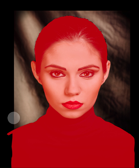
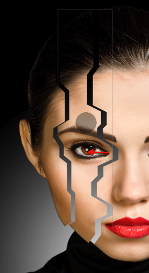
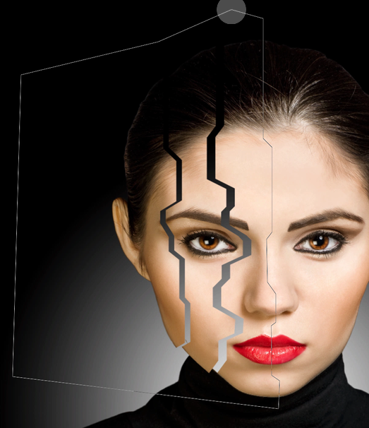
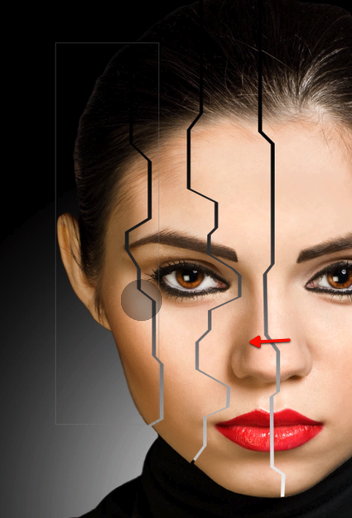
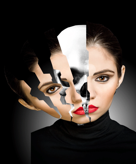
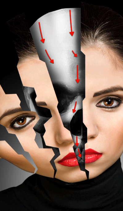
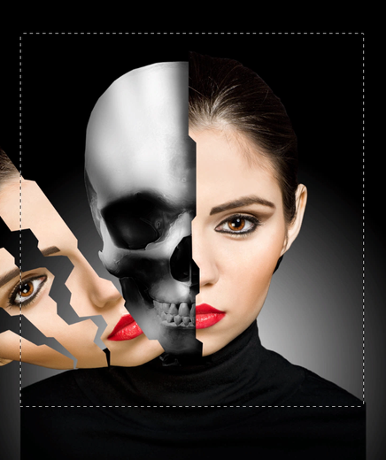
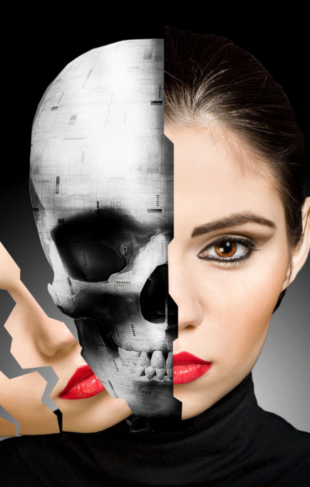
Create a Cybernetic Woman in Photoshop
2011-08-01 17:00:47 (читать в оригинале)Photoshop can let us do some amazing things. In this long and detailed tutorial we will demonstrate how to create a cybernetic woman using a photo of a model and a few stock images. This content includes written and video content. Let’s get started!
Tutorial Assets
The following assets were used during the production of this tutorial.
- Image 1
- Image 2
- Image 3
- Image 4
- Image 5
- Model
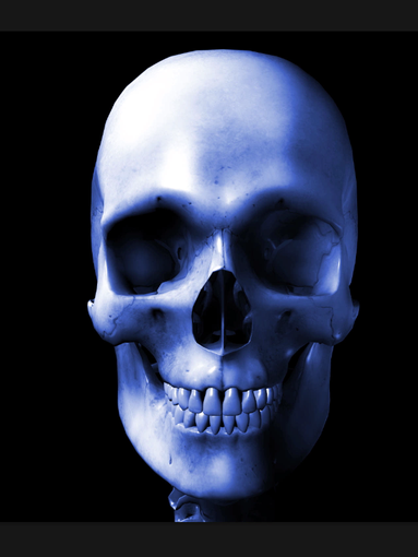
- Skull
- Gradient File
Before We Begin
Special thanks to the model Ana Ilinca and Her husband Daniel Ilinca the photographer for providing the brilliant sharp image which we will use for this tutorial, pay them a visit, both are very talented and available for work.
Step 1- Setup the skull
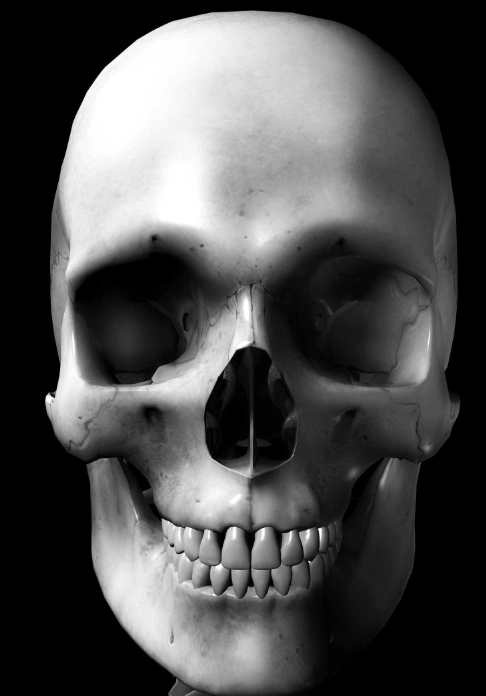
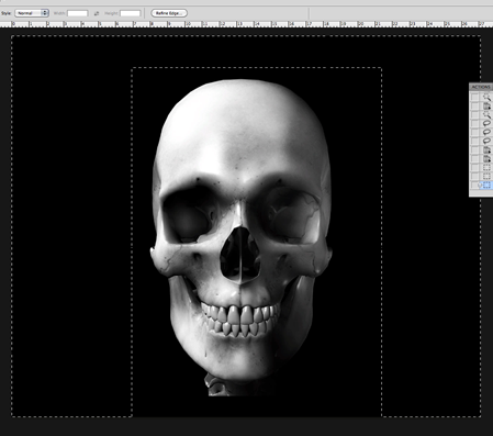
OK let’s get started, we will begin with this stock image from a skull that we will setup to fit the cybernetic mechanism we are trying to represent.
First off let’s create our document with these settings and size here.
Fill in the background with a plain black.
Then copy and paste the image of the skull into a new layer.
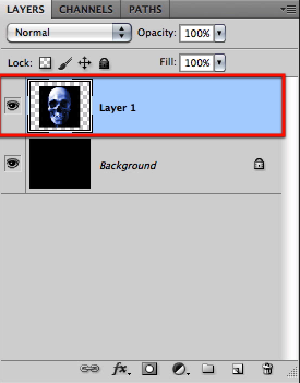
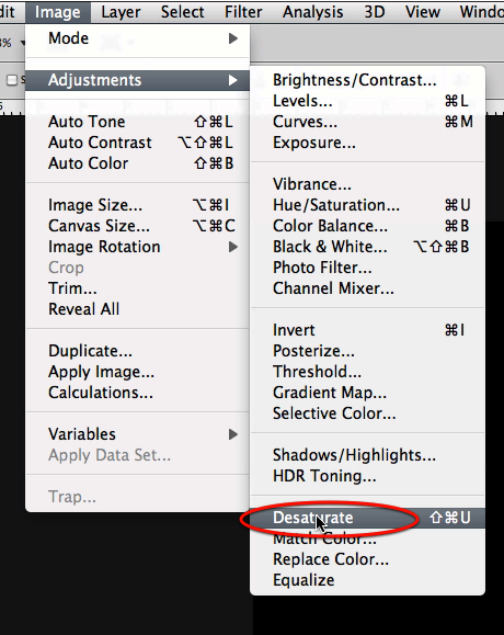
OK now that we have our skull let’s desaturate it to get rid of all the original color.
OK looking much better already, now we need to remove the black background from it.
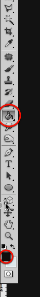
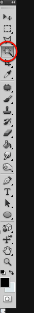
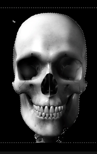
Since we have a great deal of contrast between the back and the skull we can use the magic wand tool to make a quick selection.
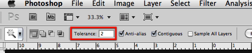
Set the tolerance to 2 and make a selection of the black around the skull; be sure that all around the skull is selected.
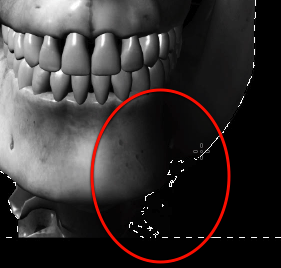
Now there will probably be some spill of the selection in the lower section of the skull so we will quickly use the lasso tool to fix this.
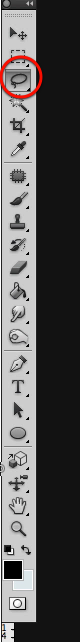
So just the lasso tool to remove this section from inside the skull area from the selection.
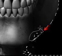
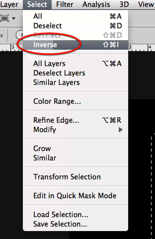
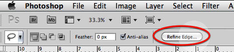
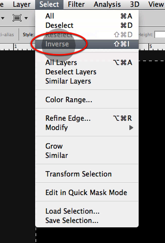
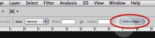
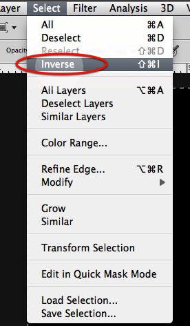
Once this is ready, inverse the selection and on the top bar click on refine edge.
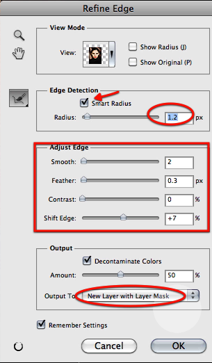
On the dialog box let’s make all these adjustments to refine the selection a bit.
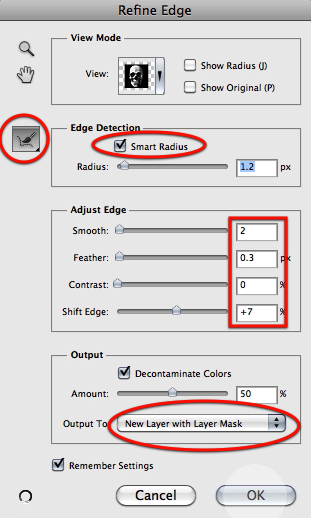
Once you click OK on the dialog box and the modifications are applied, just create a new layer mask.
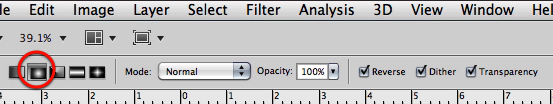
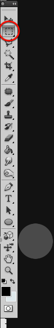
Now let’s use the rectangular selection tool, so go ahead and select it.
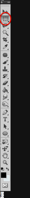
Let’s make selections of what is left so we can complete the mask for our skull.
Now just fill in with black the rest of the mask.
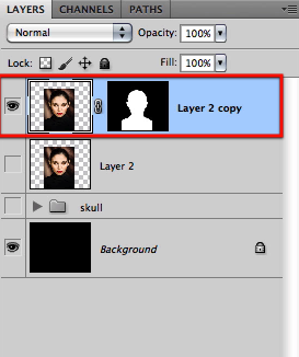
You should end up with the skull shape clearly defined with white in the layer mask.
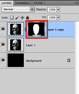
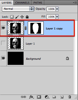
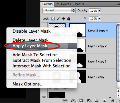
Then let’s apply the layer mask.
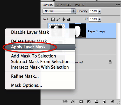
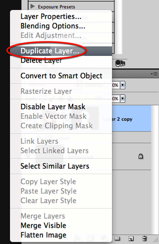
And let’s make a duplicate of it.
Now let’s hide these other two layers so we can work on the first copy.
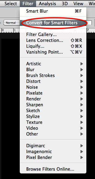
Now go to the filter menu and select "convert for smart filters"
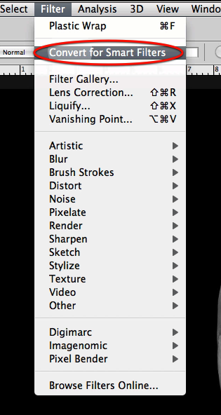
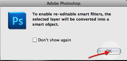
You will get this warning box from Photoshop, so just hit OK.
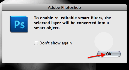
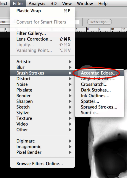
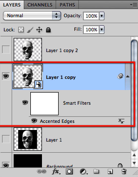
Now we can apply all the filters we want in a non destructive manner to this layer, and also disable them or adjust them at any time, just like adjustment layers. So let’s select the accented edges filter.
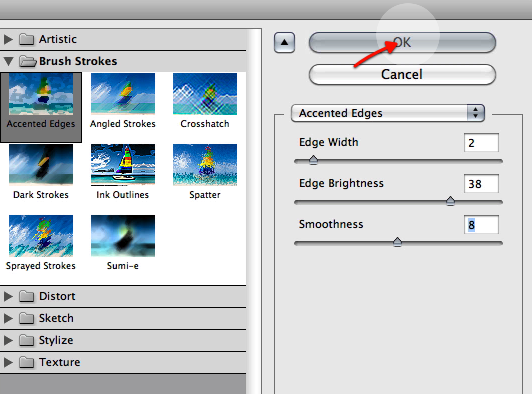
Adjust the settings for the filter as shown here.
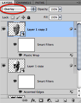
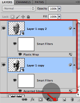
Once applied this is the stack you get that shows the edit able filter at the bottom and a mask you can use between the layer and the filter.
Let’s now go to the top layer so enable its viewing icon.
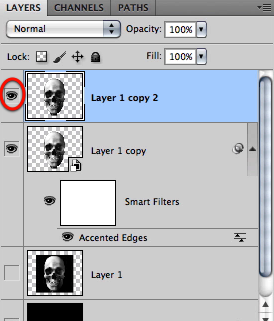
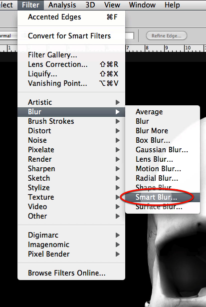
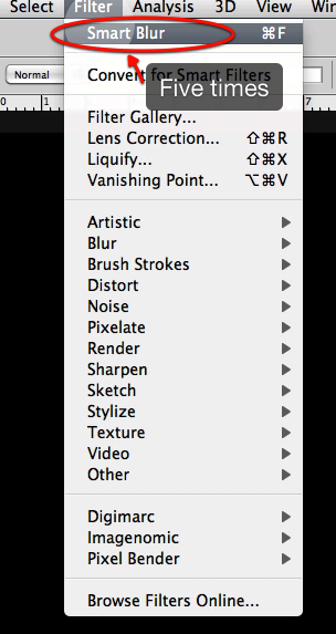
We will first apply a smart blur filter directly.
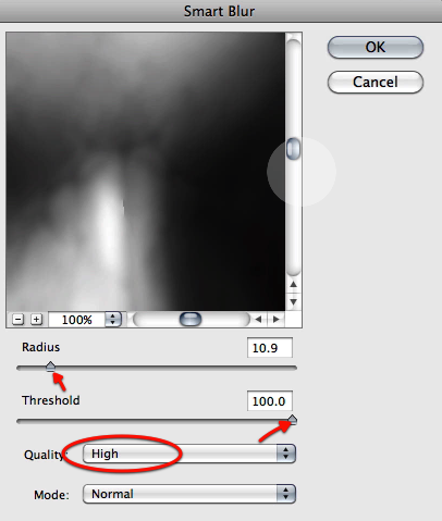
Adjust the settings as shown and re-apply the filter five times.
Now we can do the same as the other and convert the layer for smart filters
Hit OK on the dialog box and select plastic wrap from the filters.
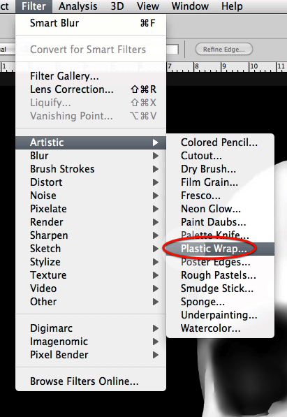
Adjust the settings as seen here.
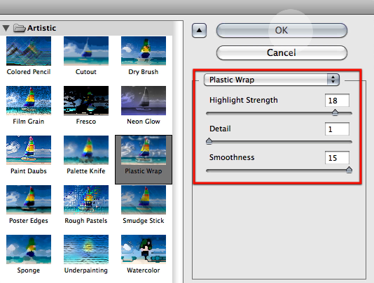
Then set the layer mode to overlay.
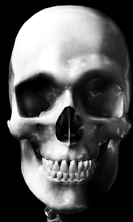
And this is what we have so far, a smoother skull with a metal appearance to it.
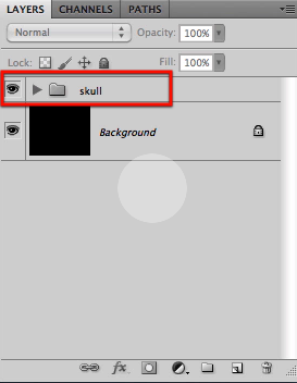
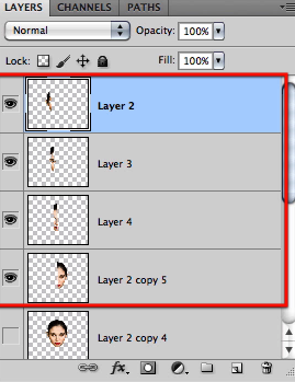
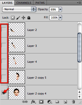
Now let’s grab all of our skull layers and group them together.
Then just to finalize this step name the group skull.
Step 2 – Mask the model
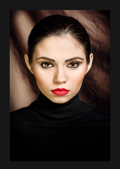
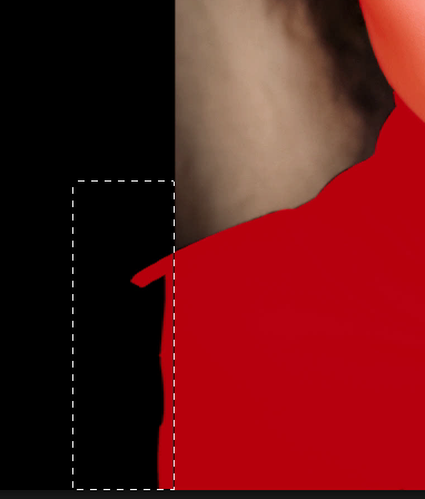
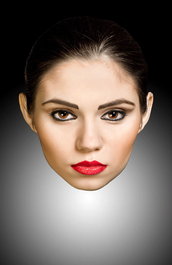
On this step we will be working with the main character image of the model and we will extract her from the backdrop, plus we will be separating her into just the face and the torso, so go ahead and open the image shown here.
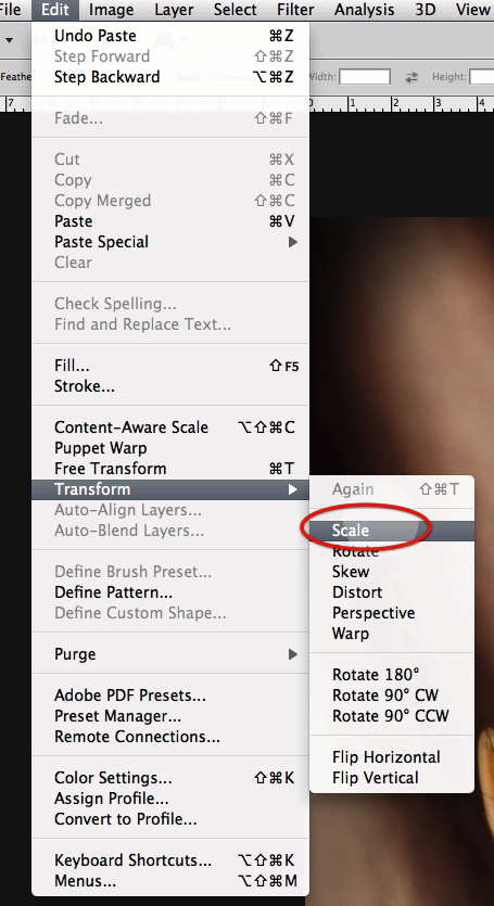
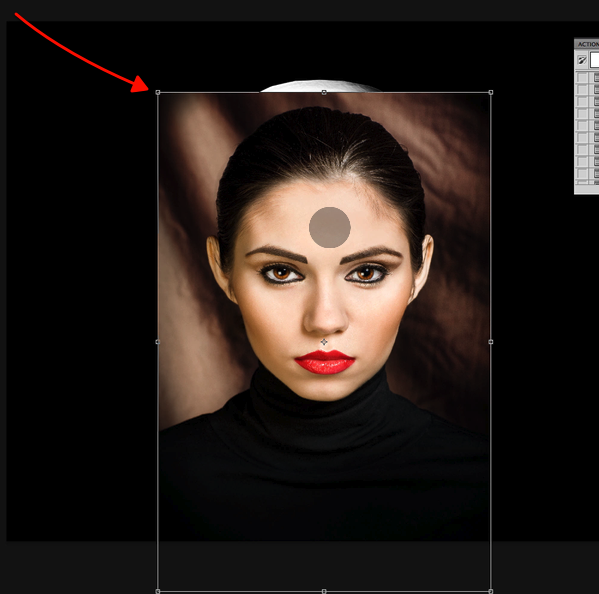
Copy and paste it on to a new layer and select the scale command so we can re size it.
Scale down the image as seen here.
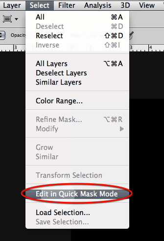
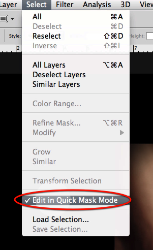
Then in the select menu access the quick mask mode.
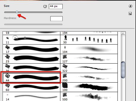
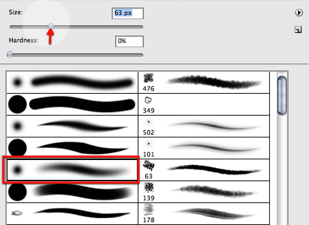
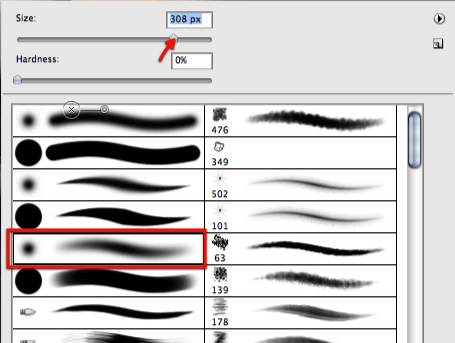
Then select the paintbrush tool and choose this tip here.
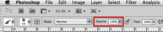
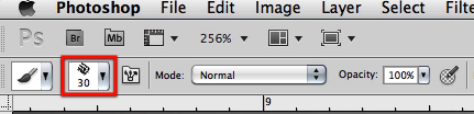
Be sure that the brush is set to 100% opacity.
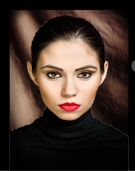
Now while you are in quick mask mode, everything you paint will appear in red if you haven’t altered the standard quick mask color preference. So start defining the border of the model.
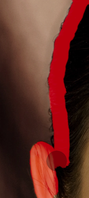
Just work around the edge detail until you have all of her covered in red, and of course change the brush size as needed.
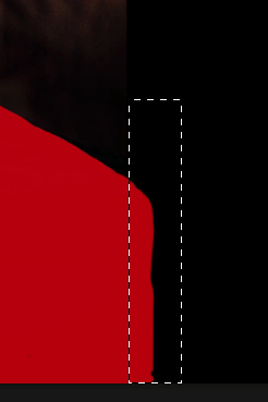
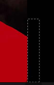
Now for the edges of the missing shoulders we will make those sharp using the rectangular selection tool.

Just drag a selection as shown here right at the border of the image.
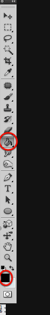
Then select the eraser tool
And erase the mask as shown here.
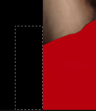
Now do the same for the other side of the image.
Then go again to the select menu and disable the quick mask mode.
As soon as you disable it, you will get a selection in place of the mask.
On the select menu inverse the selection
Once you have inverted the selection access the refine edge tool.
On the dialog box adjust the settings for it as shown here.
You will get a new layer with a layer mask already in place.
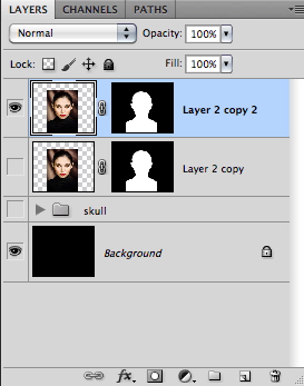
Right away let’s make a duplicate of the layer.
Now we have two layers, one for the face and one for the torso.
Before we continue working with the image let’s make a gradient for the back so its not all solid black.
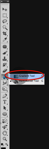
Select this simple black to white gradient.
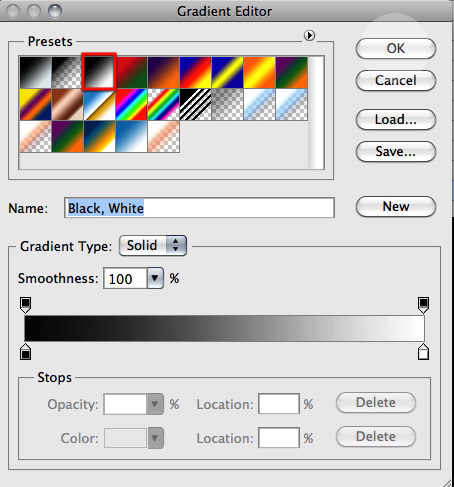
Make sure you have the circular gradient icon selected.
And while you have the background layer selected drag the big gradient as shown here.
This is the result you should get where we can see a bit of the missing shoulder sections.
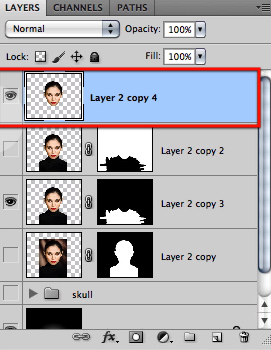
Then for the top layer go ahead and apply the layer mask.
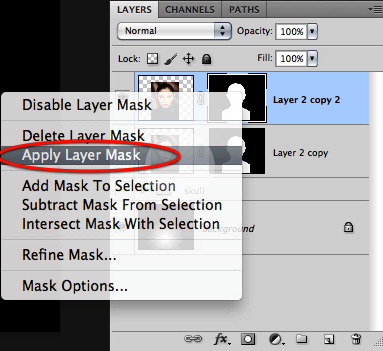
This gets rid of the mask and makes the cutout permanent, so be sure you have the mask perfect before applying this change.
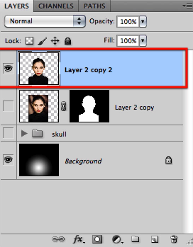
Now to continue working we will create a new layer mask.
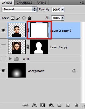
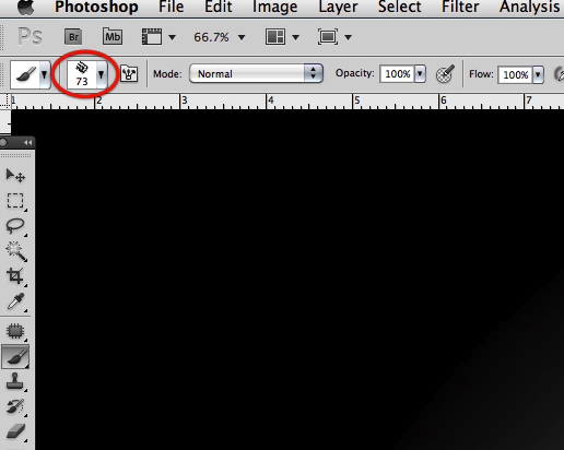
Then make the same black brush we have been using about 73 in size
And start masking off all the black blouse as shown here.
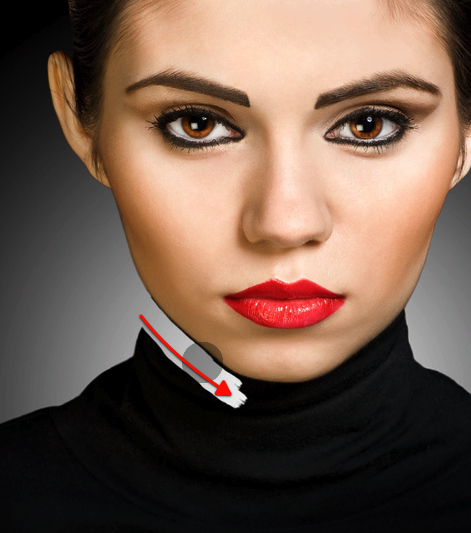
Then re size the brush to about 30 px
And detail the edge where the face starts.
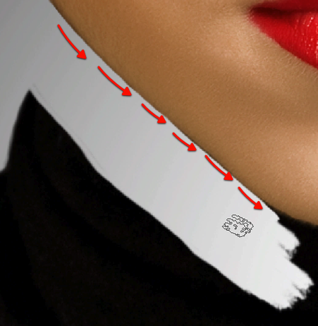
Continue with this process until you have masked all of the neck.
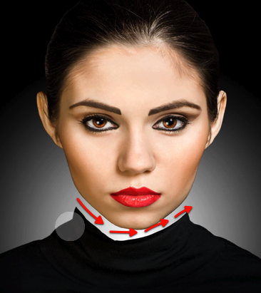
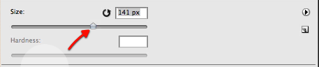
Then increase the size of the brush to 141 px
And mask off the rest of the black clothing.
You should end up with just the head as shown here.
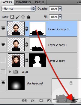
Then let’s duplicate this layer
Let’s now make a quick selection of the mask.
And then inverse the selection.
Without deselecting, go ahead and delete the layer mask as shown here.
You will get this dialog box; just hit delete.
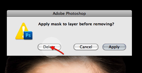
And now click on the new layer mask icon so we get a new mask but with the opposite effect as the previous layer.
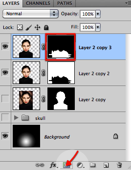
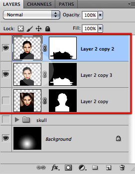
Now we have detailed sections for the torso and for the head in separate layers.
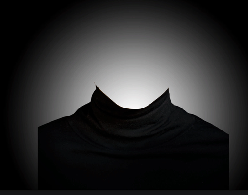
And we have finalized this step resulting in three layers that we will use for the rest of our work.
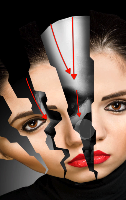
Step 3 – Section the face and adjust the skull
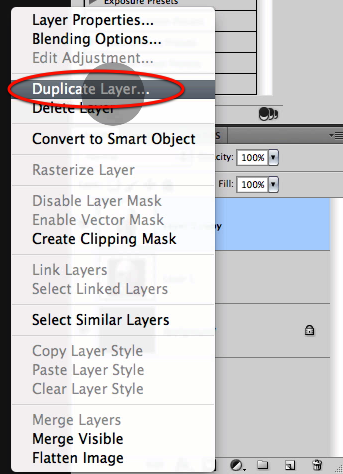
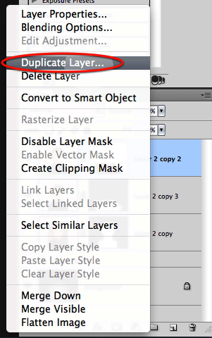
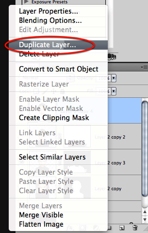
To start off let’s duplicate the face layer first.
Then apply the layer mask for this new duplicate.
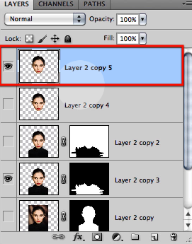
OK these leaves us with a layer of the head that we can work with to create the sections.
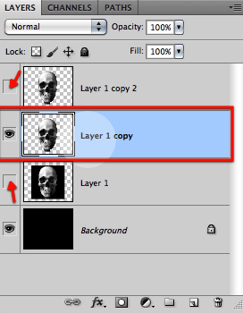
Let’s just now duplicate this last layer to keep safe in case we mess up.
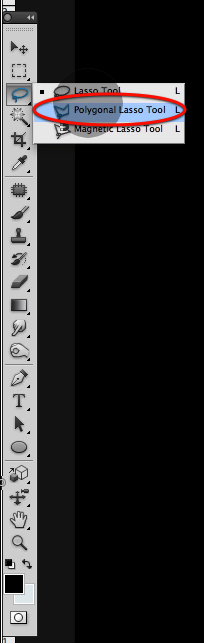
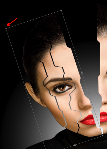
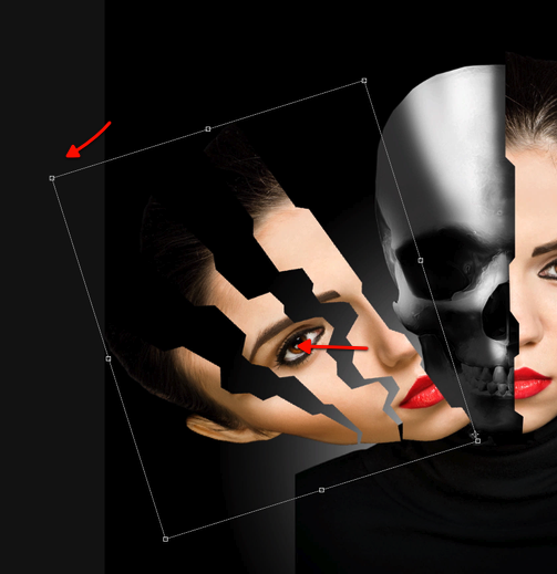
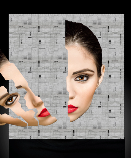
Now go ahead and select the polygonal lasso tool.
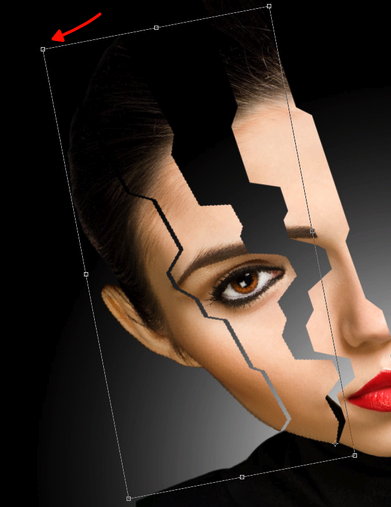
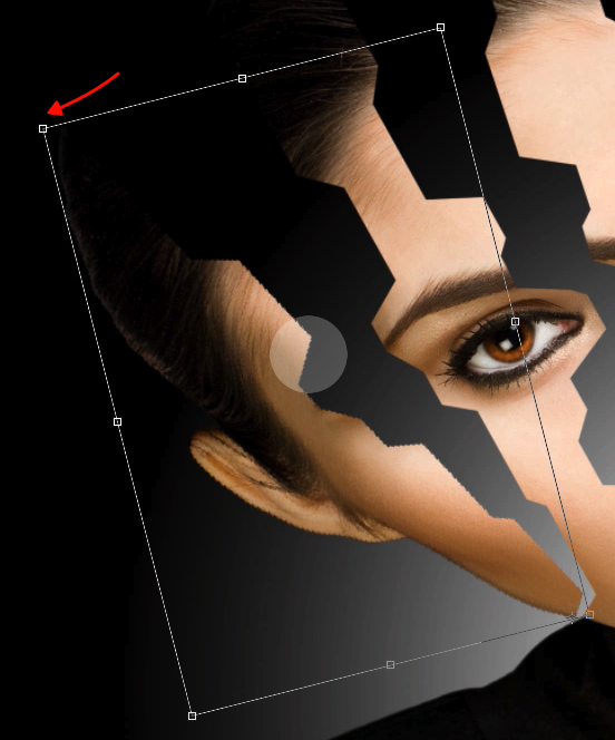
Then simple enough we start on the left side of the head and define a cut as you can clearly see here; and then just cut and paste the section on to a new layer.
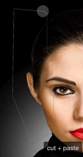
Once you have the section in a separate layer just reposition it a bit further out as seen here.
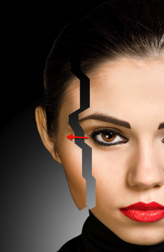
Now go back to the main face layer and define another cut section as shown here.
And repeat the same steps, cut and paste the section to a new layer and move it a bit to the left.
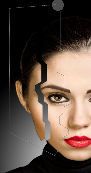
Let’s repeat this once more for one last final cut in the face section as shown here, right about the middle of the face.
Then move this third piece a bit to the left so you have all pieces with just a small gap between them.
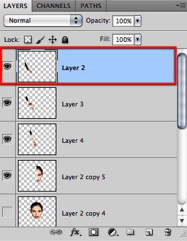
OK now you should have these four layers each containing a section of the face.
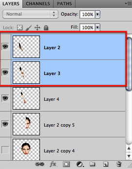
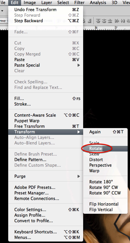
Let’s now select the three smaller sections only, leave out the big piece.
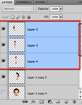
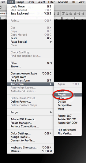
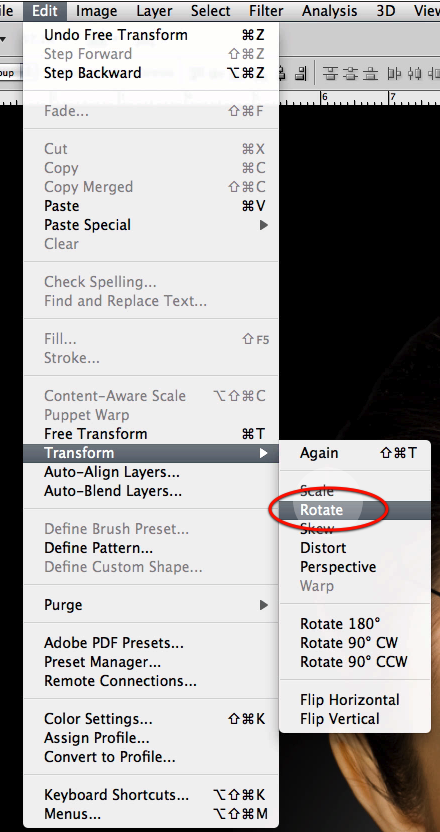
Select the rotate command.
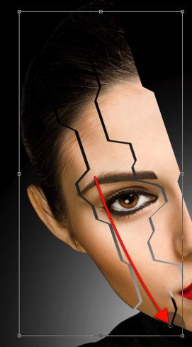
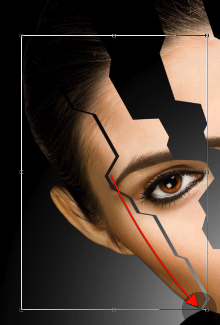
Now before we rotate, find the central anchor point of this selection.
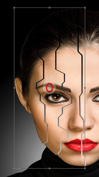
And drag the anchor point all the way down to the lower right corner at the tip of the section.
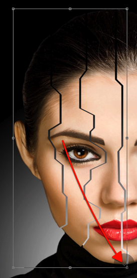
Now you can rotate, and you will see how the lower right corner stays put while the rest rotates.
Now let’s just select these two pieces, drop the one closer to the rest of the face.
And again access the rotate command
Move the anchor way down right at the tip of the middle cut section as shown.
And now rotate these two pieces as shown here.
Now let’s just select the last piece further left (the one with the ear)
And once again access the rotate command.
Move the anchor point.
And rotate the last piece as shown here.
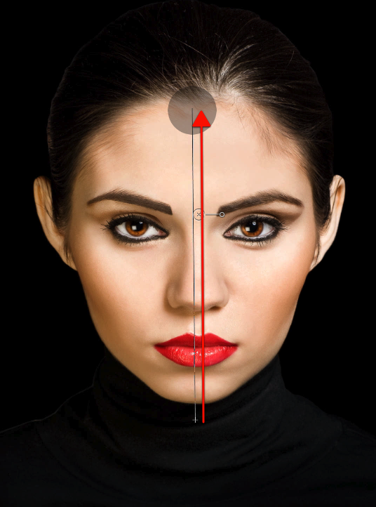
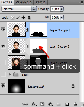
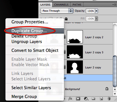
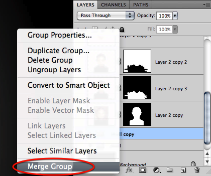
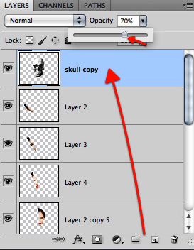
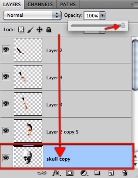
OK now we have our pieces spread nicely; let’s go back to the skull group, duplicate it and merge the duplicate.
Now go to the scale command
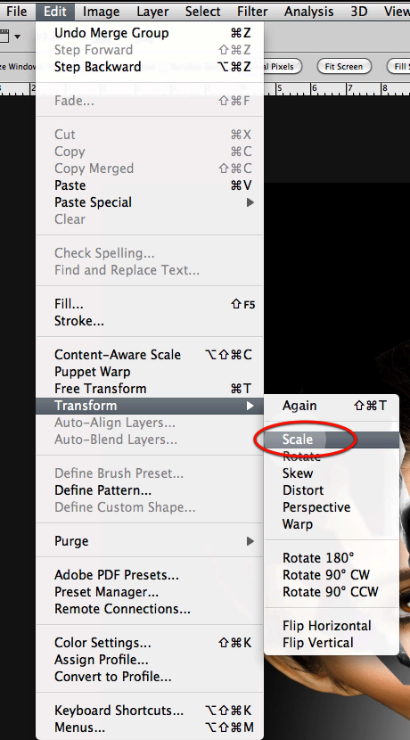
And scale the skull as needed so it fits evenly for the head proportions.
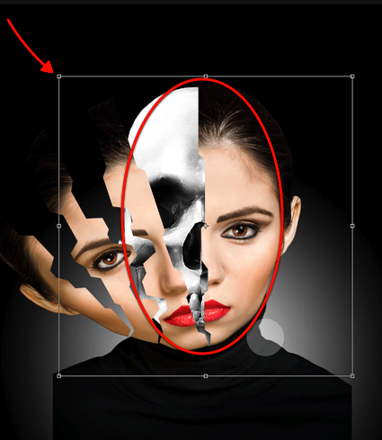
Now drag the skull merged group layer all the way to the top for now and reduce its opacity just a bit.
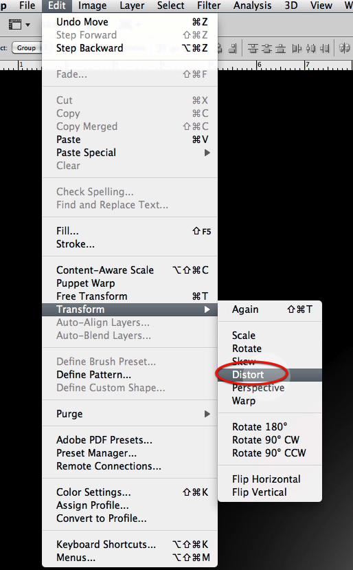
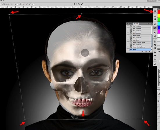
Go to the edit menu and select the distort command.
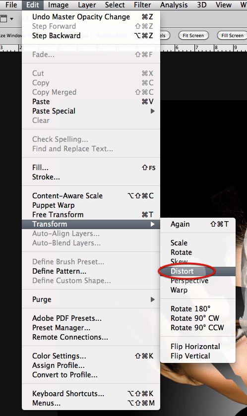
We need to make the skull fit our model so go ahead and distort evenly as shown here.
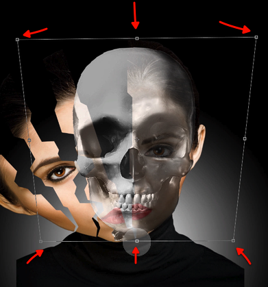
OK for now let’s hide all the pieces layers and enable the full face layer so we can clearly see the boundaries of it.
Let’s first center the skull in the face as indicated here.
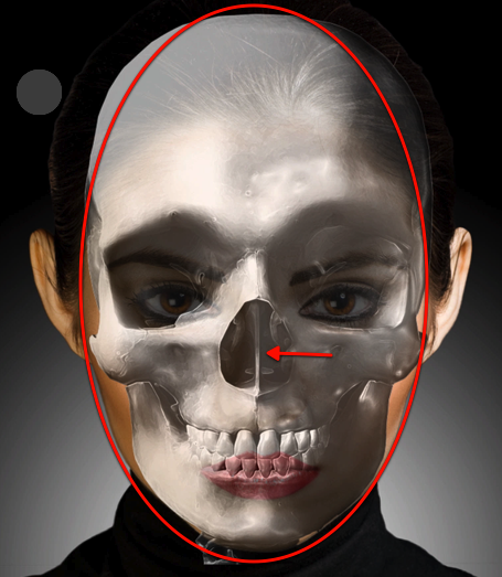
And once again access the distort command
Fine tune the skull shape to fit the face as needed.
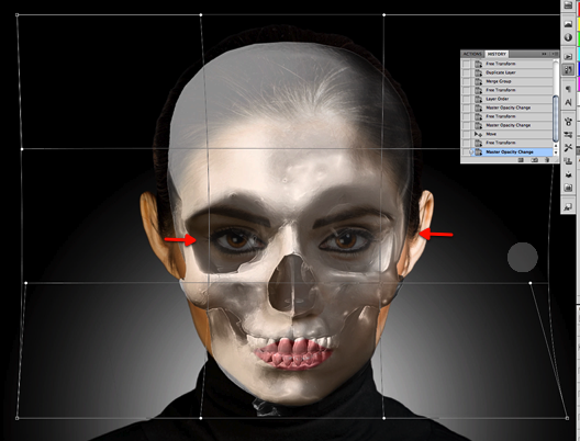
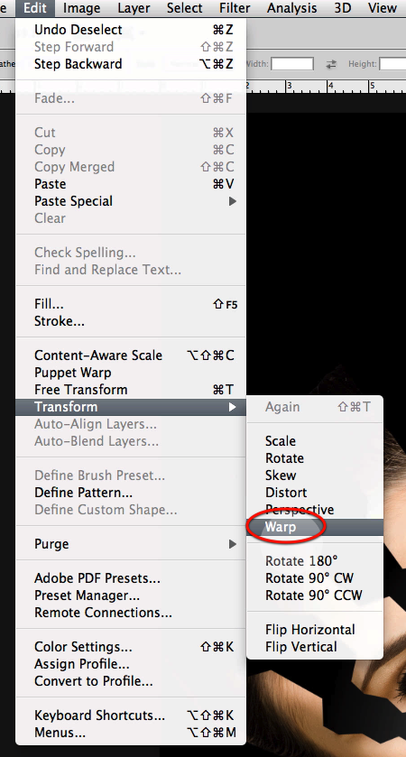
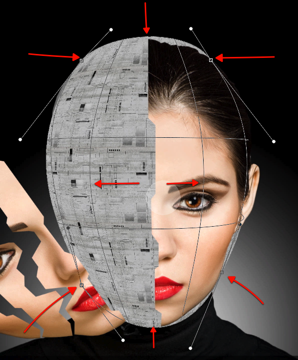
Now let’s use the warp command from the edit menu.
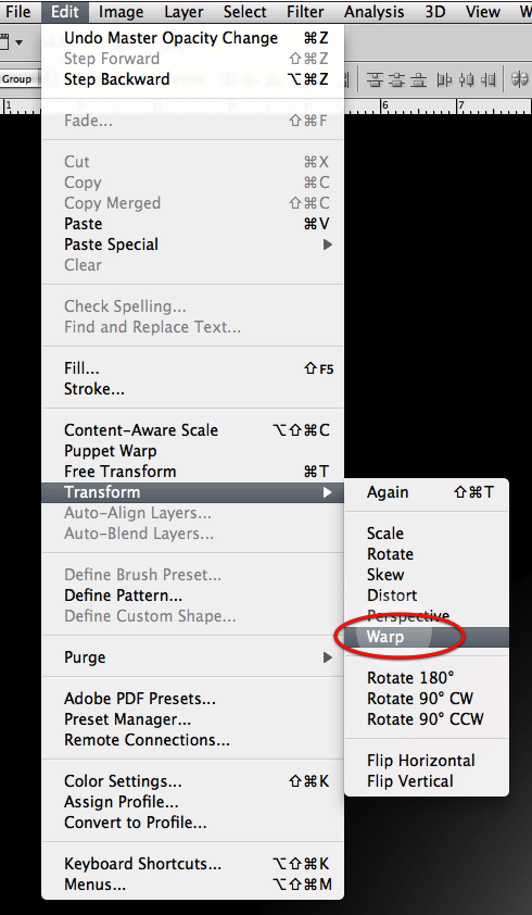
Use the lines to distort the skull a bit more so it fits inside the head boundaries and the eyes and nose align with the model.
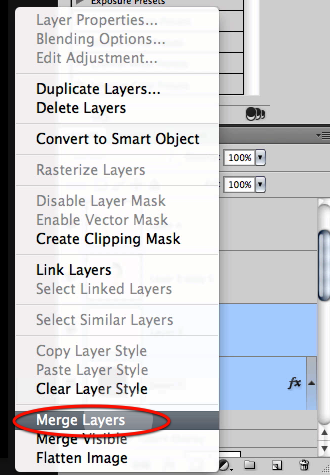
OK now to finalize we will access the puppet warp command from the edit menu.
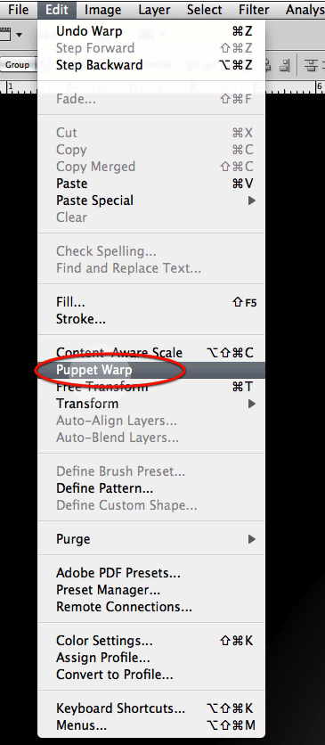
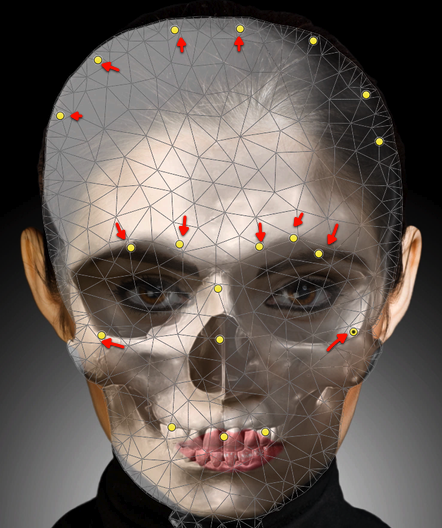
Once you have enabled the puppet warp, you will get a grid that covers all the selected layer content; now each time you click over the image you get a yellow anchor handle; so go ahead and click until you get all these, and then reposition them as shown to alter the shape of the skull a bit.
Now we can drag the layer down and restor its opacity to full.
Also enable the face sections above and hide the full face layer below.
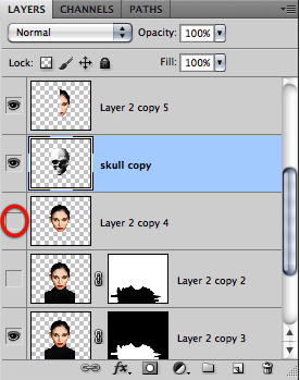
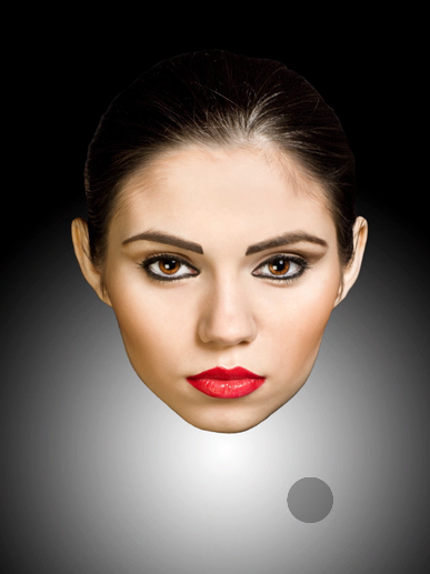
And here is what we have so far.
OK to continue we will ad a shadow layer for our skull; so go ahead and create one over the skull and make it a clipping mask.
Now adjust the layer as shown here and set its mode to multiply.
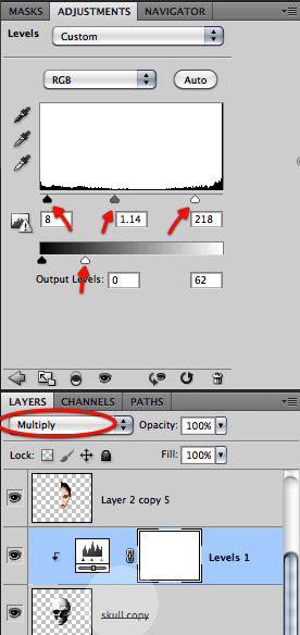
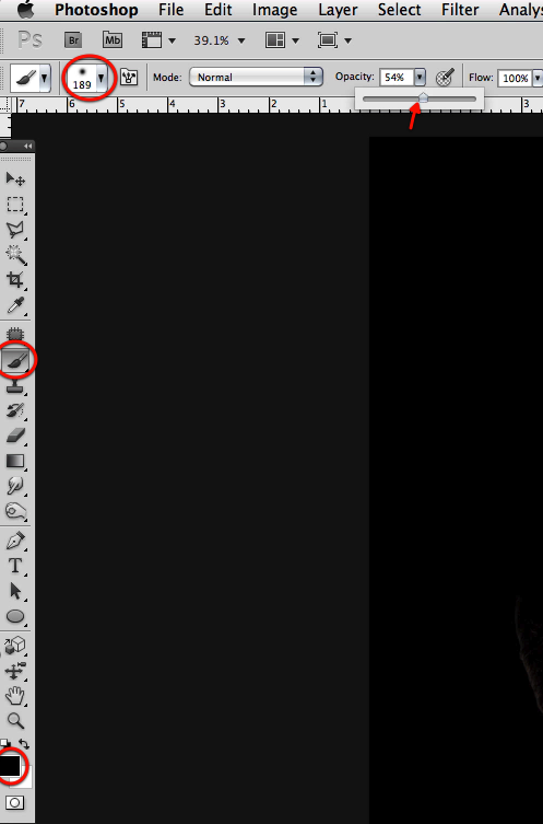
Let’s use a big soft brush and reduce its opacity a bit.
Now mask off the darkening effect of this layer where we would get light on to the skull in between the face pieces.
Now reduce the brush size a bit.
And refine the shading as indicated here.
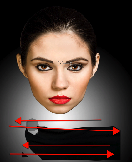
At this point I decided that the face sections are too much on top of the skull so let’s rotate them a bit more; so go ahead and select the three face piece layers.
Access the rotate command.
As we have done before readjust the central anchor point.
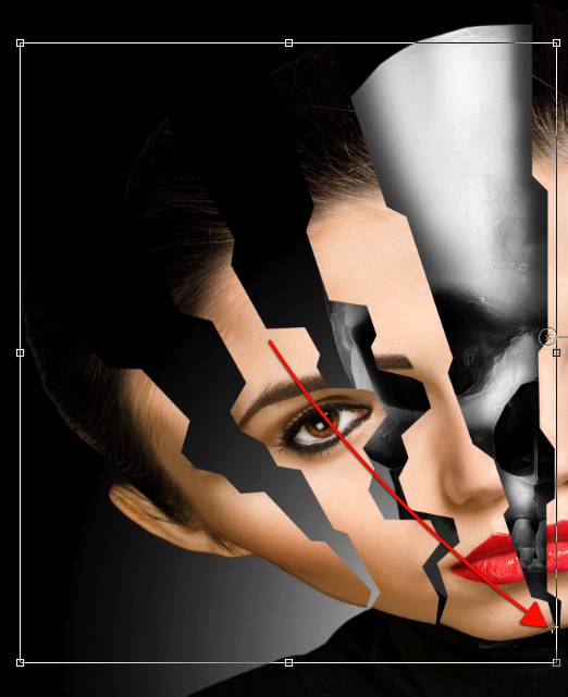
Then rotate a bit more so we can see almost all that half of the skull.
Let’s grab our soft brush again at about 300px
And let’s mask off the shading to adjust for the changes.
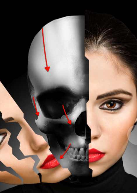
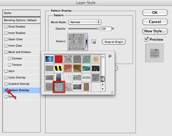
Now we will be adding some texture to the skull so create a new layer as shown here.
Let’s use the rectangular selection tool
Drag a square selection as seen here.
Fill the selection in the new layer with black.

Once you have it filled, access the layer style by double clicking on the layer; and then enable pattern overlay, and select this pattern from the pat. file.
Then simply create a new layer and merge both so they are flattened.
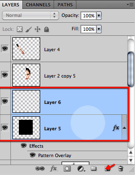
This gives us a layer that now we can manipulate to fit our skull.
Then go ahead and access the warp command again.
We will do extensive use of this tool as shown here so we can reshape the texture to the shape of the skull.
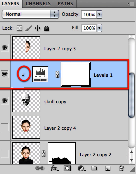
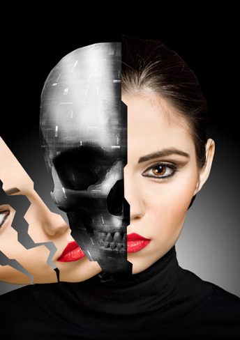
Then make the layer clipped to the skull layer, set its mode to overlay, and drag it on top the levels layer.
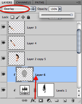
You can clearly see here the effect our texture provides.
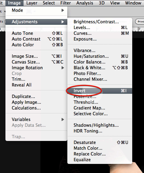
Finally just invert the layer.
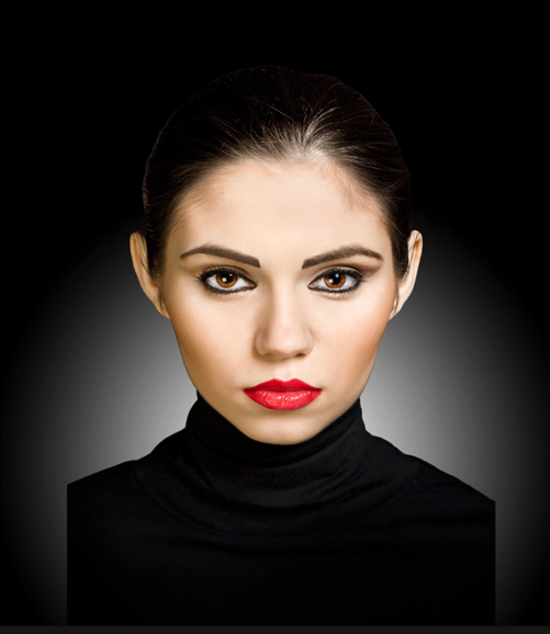
And we have our pieces cutout and a nice looking texture for our skull.
Best of the Web – July 2011
2011-07-31 20:00:40 (читать в оригинале)As you know, each month, we round up some of the best Photoshop-related content from around the web. This month, there were some excellent Photoshop tutorials and articles to choose from so please take a moment to review our favorites from July 2011.
Photoshop Tutorials
-

L.A Noire Neon Style in Photoshop
This tutorial from Abduzeedo demonstrates how to create a cool neon text effect in Photoshop.
Visit Tutorial
-

Create Creepy, Branch Based Typography
This tutorial from Psd Fan demonstrates how to create typography using stock imagery of branches.
Visit Tutorial
-

Video: Planet Photoshop: Masking with Channels
This video tutorial from Layers Magazine explains how to make complex selections using channels in Photoshop.
Visit Tutorial
-

Quick Tips: Instagram your images using Photoshop
Instagram is a popular photo sharing service. This tutorial from Abduzeedo will explain how to apply an Instagram-like effect to your photos.
Visit Tutorial
-

Create a Spectacular Fantasy Sea Monster
This tutorial from Pxleyes explains how to create a spectacular fantasy sea monster in Photoshop.
Visit Tutorial
-

Create a Nebula Cosmo Lady in Photoshop
This tutorial from Art Junks explains how to create a cosmic photo manipulation in Photoshop.
Visit Tutorial
-

Draw A Realistic Classic Pen Using Photoshop
This tutorial from Psdeluxe will explain how to draw a pen in Photoshop.
Visit Tutorial
-

Video: Eyedropper + Layer Blending Modes
This tutorial from Ctrl+Paint will explain how to use layer blending modes to create beautiful and surprising effects in your digital paintings.
Visit Tutorial
Articles and Inspiration
-

Sci-Fi/Futuristic Digital Works & Resources
This showcase from Noupe features some amazing sci-fi and futuristic digital works and resources.
Visit Article
-

Design Inspiration: 35 Photo Manipulations
This round up from Vandelay Design shows us 35 inspiring photo manipulations.
Visit Article
-

A Collection of Re-imagined Movie Posters
Ever wondered what your favorite movie posters would look like re-imagined? This showcase from One Extra Pixel shows us a collection of our favorite movie posters re-imagined.
Visit Article
-

Things Worth Paying For as a Freelancer
When you’re running your own business it can be tough to decide which expenses are worth the cost and which are not. This article from Six Revisions gives some insight into what is a necessity and which are not.
Visit Article
-

40 Lightning Bolt Brushes
Adding lightning to your work can be tough. These brushes from Psd Box make it simple.
Visit Article
-

Is Photoshop Destroying America’s Body Image?
Photoshop has been getting a lot of bad press lately. When working with Photoshop it is important to work responsibility. This article on the Huffington Post asks if Photoshop is destroying America’s body image and calls for regulation. Something we should all be concerned with.
Visit Article
-

Vintage Star Pattern: Texture Pack
This freebie from Design Instruct includes a collection of nice vintage star patterns.
Visit Article
-

45 Creative Typography Print Ads
This showcase from Spyre Studios features 45 creative typography-based print ads.
Visit Article
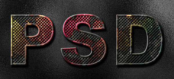
How to Create Eroded Metal Text With Photoshop
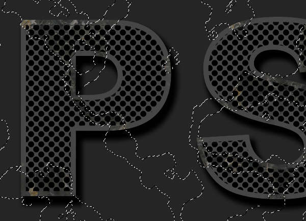
2011-07-29 19:00:38 (читать в оригинале)In this tutorial I’ll show you how to create an eroded metal text effect. Throughout this tutorial we’ll make use of various drawing techniques, channels, and patterns. Let’s get started!
Editor’s note: This tutorial was originally published on Psdtuts in September 2009.
Step 1
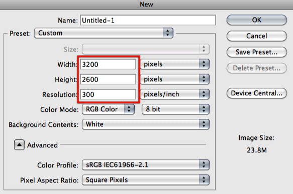
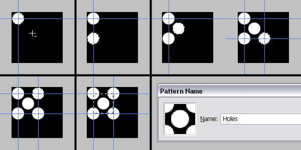
First we need to define a pattern of dots. Lets start by creating a new document 100 pixels wide and 100 pixels high, with a Resolution set to 300 pixels/inch. Fill the "Background" layer with black. Grab the Elliptical Marquee Tool, set the Style to a Fixed Size and set the Width and Height to 24 pixels. Click anywhere inside the canvas, then click inside the selection, drag and position it in the top-left corner of the canvas.
Fill the selection with white. Drag one vertical and one horizontal guide to the center of the selection. Hold down the Shift key, press Down the Arrow key four times to move the selection down 40 pixels. Fill it with white. Now move the selection 20 pixels up and 20 pixels right, then fill it with white again. Move the selection this time, 20 pixels down and 20 pixels right and fill with white.
Now drag two more guides to the center of the selection as in the image below. Move the selection 40 pixels up and fill with white once again. Now grab the Rectangular Marquee Tool and select the area between the crossing guides as shown below. Go to Edit > Define Pattern and name the pattern "Holes." Now that we have defined our pattern, you can close this document.
Step 2
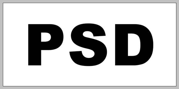
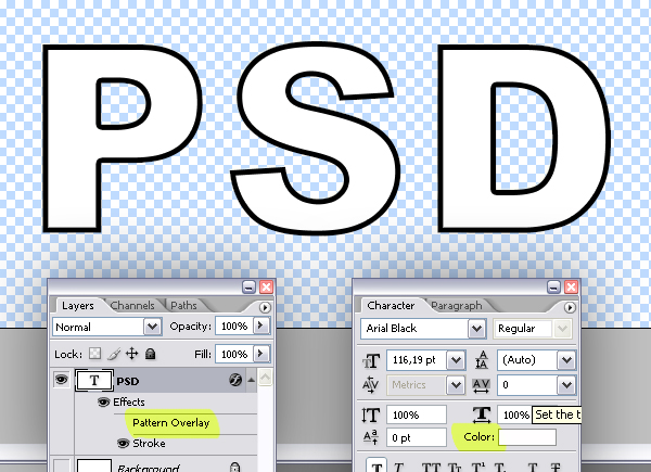
Now create a new document 1450 pixels wide and 700 pixels high at a resolution of 300 pixels/inch. Make sure the Color Mode is set to RGB. Use the Horizontal Type Tool to type your text. I used Arial Black at a size of 116 pt.
Step 3
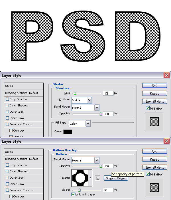
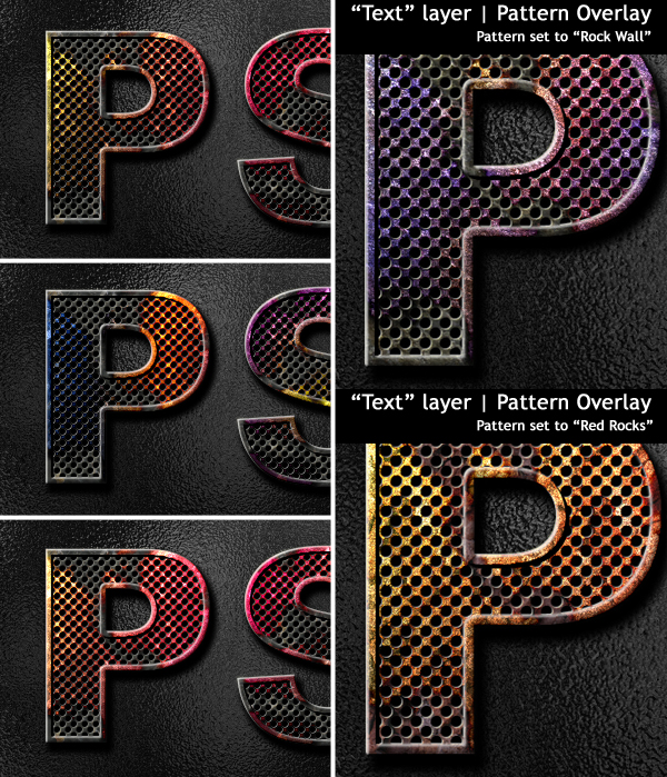
Now we’ll apply two Layer Styles. First apply a Stroke using these settings: Size set to 10 pixels, Position set to Inside, Blend Mode of Normal, Opacity at 100% and color set to black. Then apply a Pattern Overlay and use the following settings: Blend Mode set to Normal, Opacity at 100%, Pattern set to “Holes,” and scale set at 50%.
Step 4
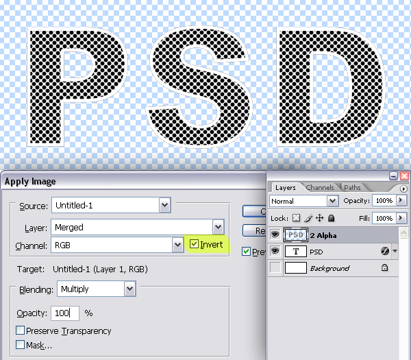
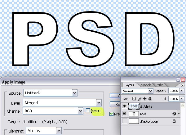
Make the "Background" layer invisible and create a new layer on top and name it "2 Alpha." Go to Image > Apply Image and check Invert. This will flatten the current visible layers in the selected layer and invert it.
Step 5
Command-click the "2 Alpha" layer to load the selection and hit Command + C to copy. Go to the Channels Palette and create a new Channel. Hit Command + V to paste. Hit Command + D to deselect.
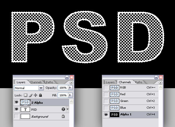
Step 6
Go to the Layers Palette. We don’t need "2 Alpha" layers anymore so delete it. Turn off the visibility of the Pattern Overlay style of the "PSD" layer and set the Text Color to white. The layer is named "PSD" because I typed the text: "PSD". Your text layer is named whatever you typed.
Step 7
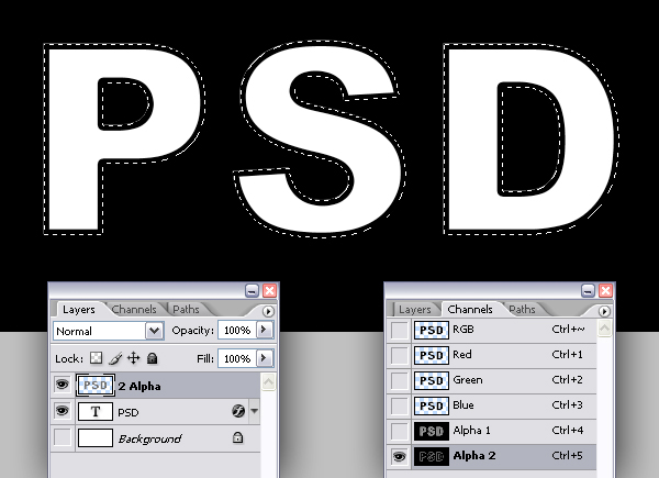
Create a new layer on top and again name it "2 Alpha" because this one will be going to an alpha channel. Make sure the "Background" layer is still invisible. Go to Image > Apply Image and uncheck Invert.
Step 8
Now Command-click the "2 Alpha" layer to load the selection and hit Command + C to copy, go to the Channels Palette and create a new channel, then hit Command + V to paste. While you’re in the Channels Palette, Command-click the "Alpha 1" channel to load the selection.
Step 9
Go to the Layers Palette and create a new layer named "Text." Set your Foreground Color to 80% gray by hitting Alt + Backspace, then Deselect.
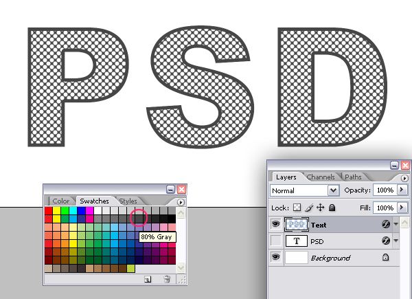
Step 10
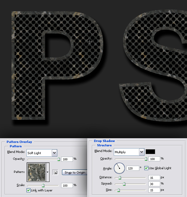
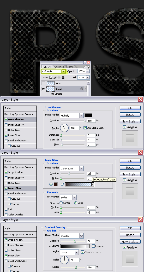
Since we’ll have a dark background in our final image, it’s a good idea to make the background darker now. So fill the "Background" layer with 90% gray. Now we’ll apply two Layer Styles to the "Text" layer. The first one is a Pattern Overlay with these settings: Blend Mode set to Soft Light, Opacity at 100%, Pattern set to “Black Marble,” which is located in the “Rock Patterns” and Scale set at 100%. The second Layer Style is a Drop Shadow with these settings: Blend Mode set to Multiply, Opacity at 100%, Angle set to 120 degrees, Distance set to 16 pixels, Spread set at 30% and Size set to 15 pixels.
Step 11
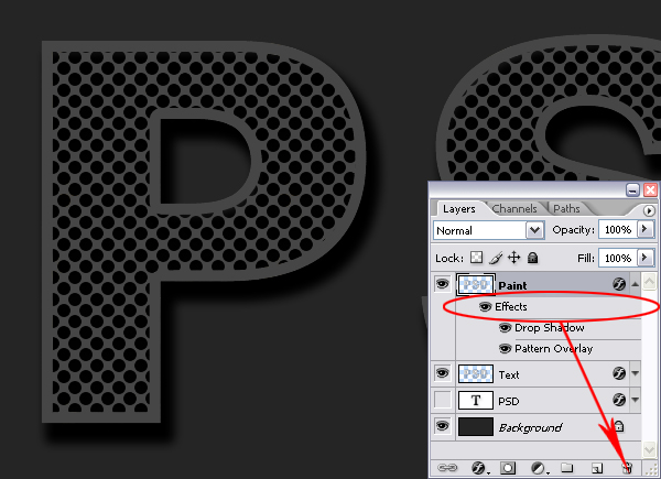
Go to Layer > Duplicate Layer and name the duplicate "Paint." Drag the Effects of this layer to the trash in the Layers Palette as shown below.
Step 12
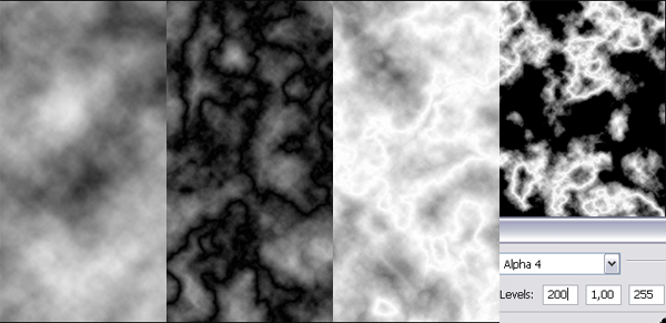
Go to Channels Palette and create a new channel. Go to Filter > Render > Clouds. Now go to Filter > Render > Difference Clouds. We’ll apply this filter twice more, so Press Command + F twice. Now go to Image > Adjustments > Invert. Go to Image > Adjustments > Levels (Command + L) and set the Input Levels to 200, 1, 255. The white areas in this image is going to be the eroded parts of the paint. Command-Click the channel to load the selection.
Step 13
Go to the "Paint" layer in the Layers Palette and hit Delete to clear the selected area. Go to Layer > Duplicate Layer and name it "Grain." Make the "Grain" layer invisible for now, then Deselect.
Step 14
Go back to the "Paint" layer and apply a Drop Shadow Layer Style with these settings: Blend Mode set to Multiply, Opacity at 100%, Angle set to 120 degrees, Distance and Spread set to 0, and Size set to 5 pixels. Apply an Inner Glow and use these settings: Blend Mode of Color Burn, Opacity at 35%, and Size set to 1 pixel. Now apply a Gradient Overlay with these settings: Blend Mode set to Overlay, Opacity at 60%, Gradient set to Black and White, Style set to Linear and Angle set to 90 degrees. Set the "Paint" layer Blending Mode to Soft Light.
Step 15
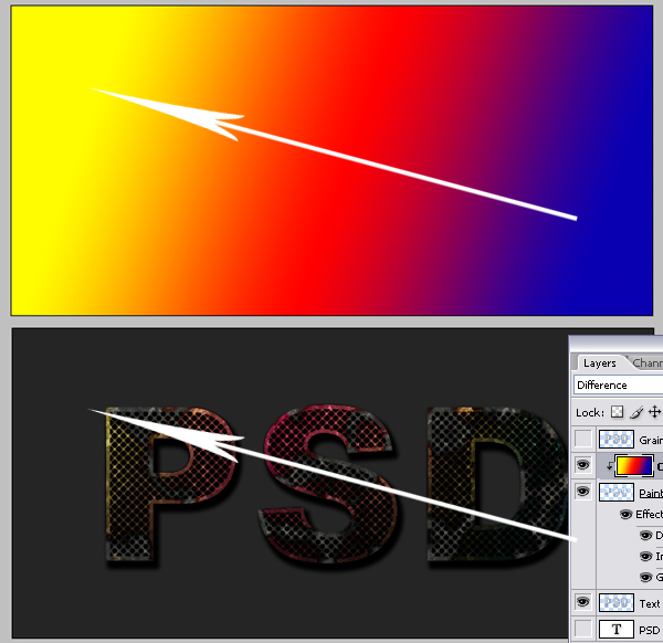
Create a new layer above the "Paint" layer and name it "Color." Grab the Gradient Tool, open the Gradient picker in the Tool Options and pick: Blue, Red, Yellow. Set it to Linear Gradient and fill the layer as shown below. Hold down the Alt key and click the line between the "Paint" and "Color" layers to define the "Paint" layer as a Clipping Mask. Set the "Color" layer Blending Mode to Difference.
Step 16
Go to the "Grain" layer in the Layers Palette and make it visible. Go to Filter > Artistic > Film Grain. Set the Grain to 10, Highlight Area and Intensity to 0, and set the Blending Mode for the layer to Color Dodge.
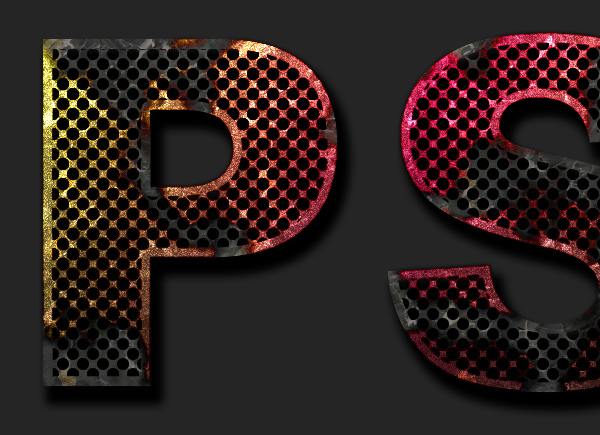
Step 17
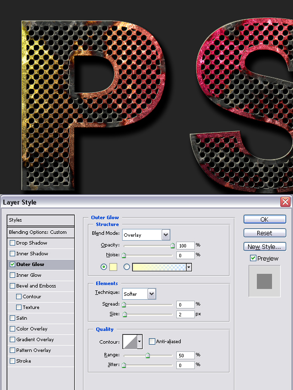
Command-click the "Text" layer to load the selection. Create a new layer on top and name it "Highlight." Grab the Elliptical Marquee Tool and use the Arrow keys to move the selection 1 pixel left and 1 pixel up. Fill the selection with white. Move the selection 1 pixel right and 1 pixel down, back to where it was and hit Delete to clear. Apply an Outer Glow Layer Style to the "Highlight" layer using these settings: Blend Mode of Overlay, Opacity at 100%, and Size set to 2 pixels.
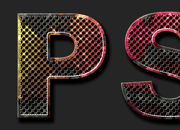
Step 18
Go to the Channels Palette and Command-click "Alpha 2" to load the selection. Go back to the Layers Palette and create a new layer on top. Name it "Highlight 2." Move the selection 2 pixels right and 2 pixels down. Fill the selection with white. Now move the selection 2 pixels left and 2 pixels up and hit Delete to clear. Now deselect.
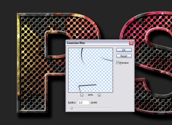
Step 19
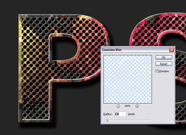
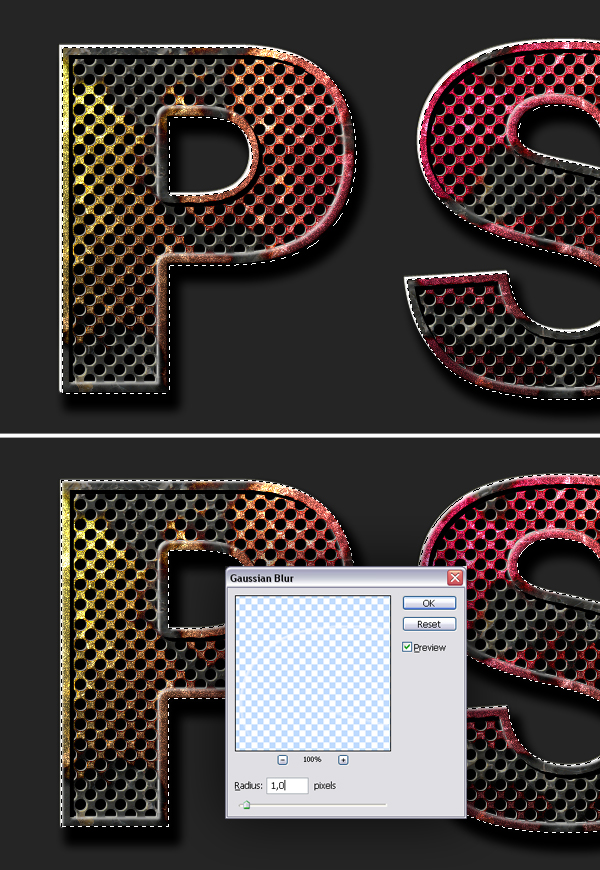
Go to Filter > Blur > Gaussian Blur and apply with a Radius of 1 pixel. This is going to smooth the highlight.
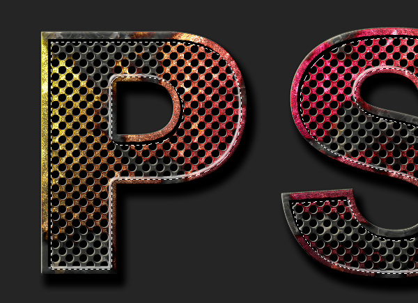
Step 20
Go to the Channels Palette and Command-click "Alpha 2" to load the selection again. Go back to the Layers Palette and create a new layer on top and name it "Shade." Move the selection 2 pixels left and 2 pixels up. Fill the selection with black. Now move the selection 2 pixels right and 2 pixels down and hit Delete to clear.
Step 21
Deselect by hitting Command + D. Go to Filter > Blur > Gaussian Blur and apply with a Radius of 1 pixel.
Step 22
Command-click the "PSD" layer to load the selection. Create a new layer on top and name it "Shade 2." Fill the layer with Black. Move the selection 2 pixels up and 2 pixels left, then hit Delete to clear. Command-click the "PSD" layer again. Go to Filter > Blur > Gaussian Blur and apply with a Radius of 2 pixels.
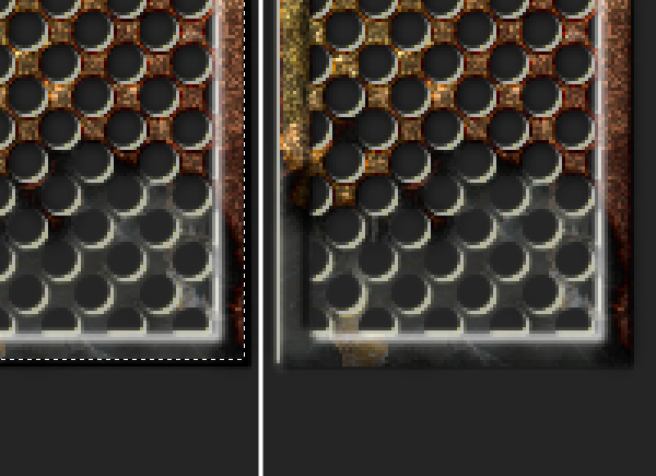
Step 23
Command-click the "PSD" layer again and load it’s pixels. Create a new layer on top and name it "Highlight 3." Fill the selection with black. Move the selection 2 pixels down and 2 pixels right and hit Delete to clear. Command-click the "PSD" layer and load the selection again, because we don’t want this highlight to be blurred towards the outside. Now go to Filter > Blur > Gaussian Blur and apply with a Radius of 1 pixel. Deselect by hitting Command + D.
Step 24
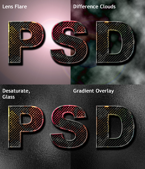
Create a new layer above the "Background" layer and name it "Texture." Fill the layer with black. Go to Filter > Render > Lens Flare. Set the Brightness at 160% and set the Lens Type to 50-300 mm zoom. Then go to Filter > Render > Difference Clouds. Go to Image > Adjustments > Desaturate. Apply a Glass filter by going to Filter > Distort > Glass and use these settings: Distortion set to 20, Smoothness set to 2, and Scaling set at 100%. Finally, apply a Gradient Overlay Style to this layer and use these settings: Blend mode of Multiply and Opacity set at 70%.
Step 25
You can achieve different variations of this effect by changing the gradient or color of the "Color" layer and changing the Texture of the Pattern Overlay Layer Style of the "Text" layer.
Conclusion
Yes that’s it! I hope you learned something new and enjoyed this tutorial!
Subscribe to the Psdtuts+ RSS Feed for the best Photoshop tuts and articles on the web.

|
| ||
|
+1561 |
1596 |
fiona |
|
+1550 |
1597 |
Алексей Чернов |
|
+1529 |
1559 |
Elen_i_rebyata |
|
+1513 |
1584 |
Малти_Ошер |
|
+1512 |
1589 |
Дрочливый_Драчун |
|
| ||
|
-2 |
74 |
Рыжая_Лада |
|
-2 |
1264 |
Сайт визажиста Мокровой Инны блог |
|
-2 |
947 |
G-Traveler | Сайт заметок путешественника |
|
-5 |
53 |
BJohn |
|
-6 |
17 |
Аццкей_Сотона |
Загрузка...
взяты из открытых общедоступных источников и являются собственностью их авторов.